Answered step by step
Verified Expert Solution
Question
1 Approved Answer
Q11: Why do you think the level of PM 10 emissions changed so rapidly in the first part of the graph above (left portion)

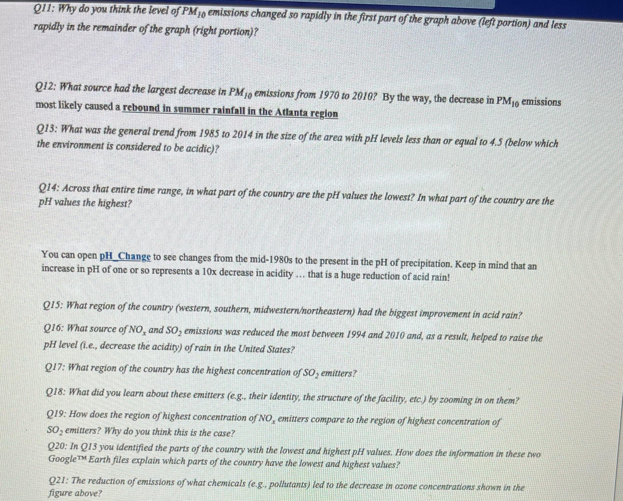
Q11: Why do you think the level of PM 10 emissions changed so rapidly in the first part of the graph above (left portion) and less rapidly in the remainder of the graph (right portion)? Q12: What source had the largest decrease in PMjo emissions from 1970 to 2010? By the way, the decrease in PM10 emissions most likely caused a rebound in summer rainfall in the Atlanta region 013: What was the general trend from 1985 to 2014 in the size of the area with pH levels less than or equal to 4.5 (below which the environment is considered to be acidic)? Q14: Across that entire time range, in what part of the country are the pH values the lowest? In what part of the country are the pH values the highest? You can open pH Change to see changes from the mid-1980s to the present in the pH of precipitation. Keep in mind that an increase in pH of one or so represents a 10x decrease in acidity that is a huge reduction of acid rain! Q15: What region of the country (western, southern, midwestern/northeastern) had the biggest improvement in acid rain? Q16: What source of NO, and SO, emissions was reduced the most between 1994 and 2010 and, as a result, helped to raise the pH level (i.e., decrease the acidity) of rain in the United States? Q17: What region of the country has the highest concentration of SO, emitters? Q18: What did you learn about these emitters (e.g., their identity, the structure of the facility, etc.) by zooming in on them? Q19: How does the region of highest concentration of NO, emitters compare to the region of highest concentration of SO, emitters? Why do you think this is the case? Q20: In Q13 you identified the parts of the country with the lowest and highest pH values. How does the information in these two Google Earth files explain which parts of the country have the lowest and highest values? TM Q21: The reduction of emissions of what chemicals (e.g., pollutants) led to the decrease in ozone concentrations shown in the figure above?
Step by Step Solution
There are 3 Steps involved in it
Step: 1
Q11 The level of PM10 emissions changed rapidly in the first part of the graph left portion and less rapidly in the remainder of the graph right porti...
Get Instant Access to Expert-Tailored Solutions
See step-by-step solutions with expert insights and AI powered tools for academic success
Step: 2

Step: 3

Ace Your Homework with AI
Get the answers you need in no time with our AI-driven, step-by-step assistance
Get Started


