Question 1 - 2 marks Think back over your experience of studying MU123. Think about what has gone well, or what has not gone so
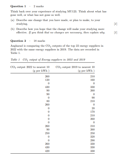
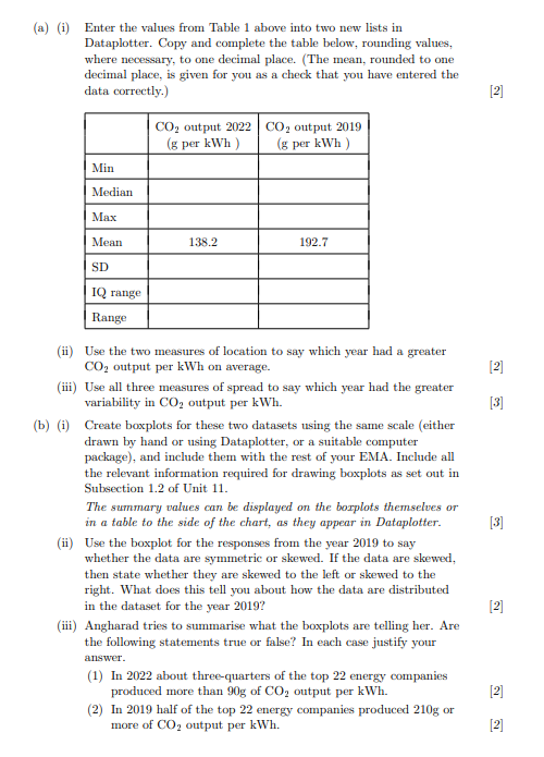
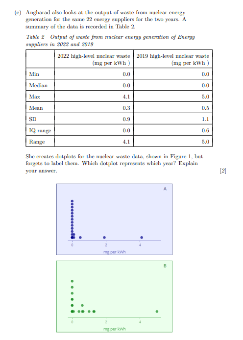
Question 1 - 2 marks Think back over your experience of studying MU123. Think about what has gone well, or what has not gone so well. (a) Describe one change that you have made, or plan to make, to your studying. [1] (b) Describe how you hope that the change will make your studying more effective. If you think that no changes are necessary, then explain why. [1] Question 2 - 18 marks Angharad is comparing the CO, outputs of the top 22 energy suppliers in 2022 with the same energy suppliers in 2019. The data are recorded in Table 1. Table 1 CO, output of Energy suppliers in 2022 and 2019 CO, output 2022 to nearest 10 CO, output 2019 to nearest 10 (g per kWh ) (g per kWh ) 260 210 120 160 0 0 430 330 90 260 90 0 0 90 210 0 20 170 210 260 0 260 210 260 250 250 320 290 260 330 430 330 420 330(a) (i) Enter the values from Table 1 above into two new lists in Dataplotter. Copy and complete the table below, rounding values, where necessary, to one decimal place. (The mean, rounded to one decimal place, is given for you as a check that you have entered the data correctly.) [2] CO, output 2022 CO, output 2019 (g per kWh ) (g per kWh ) Min Median MAX Mean 138.2 192.7 SD IQ range Range (ii) Use the two measures of location to say which year had a greater CO, output per kWh on average. [2] (iii) Use all three measures of spread to say which year had the greater variability in CO, output per kWh. [3] (b) (i) Create boxplots for these two datasets using the same scale (either drawn by hand or using Dataplotter, or a suitable computer package), and include them with the rest of your EMA. Include all the relevant information required for drawing boxplots as set out in Subsection 1.2 of Unit 11. The summary values can be displayed on the borplots themselves or in a table to the side of the chart, as they appear in Dataplotter. [3] (ii) Use the boxplot for the responses from the year 2019 to say whether the data are symmetric or skewed. If the data are skewed, then state whether they are skewed to the left or skewed to the right. What does this tell you about how the data are distributed in the dataset for the year 2019? [2] (iii) Angharad tries to summarise what the boxplots are telling her. Are the following statements true or false? In each case justify your answer. (1) In 2022 about three-quarters of the top 22 energy companies produced more than 90g of CO, output per kWh. [2] (2) In 2019 half of the top 22 energy companies produced 210g or more of CO, output per kWh. [2](c) Angharad also looks at the output of waste from nuclear energy generation for the same 22 energy suppliers for the two years. A summary of the data is recorded in Table 2. Table 2 Output of waste from nuclear energy generation of Energy suppliers in 2022 and 2019 2022 high-level nuclear waste 2019 high-level nuclear waste (mg per kWh ) (mg per kWh ) Min 0.0 0.0 Median 0.0 0.0 MAX 4.1 5.0 Mean 0.3 0.5 SD 0.9 1.1 IQ range 0.0 0.6 Range 4.1 5.0 She creates dotplots for the nuclear waste data, shown in Figure 1, but forgets to label them. Which dotplot represents which year? Explain your answer. [2] A .......... mg per kwh mg per kwh
Step by Step Solution
There are 3 Steps involved in it
Step: 1
Get Instant Access to Expert-Tailored Solutions
See step-by-step solutions with expert insights and AI powered tools for academic success
Step: 2
Step: 3
Ace Your Homework with AI
Get the answers you need in no time with our AI-driven, step-by-step assistance