Answered step by step
Verified Expert Solution
Question
1 Approved Answer
Question 1 8) Using Excel, create a graph which represents the relationship between the variables time and population in both Mali and Ecuador between 1970
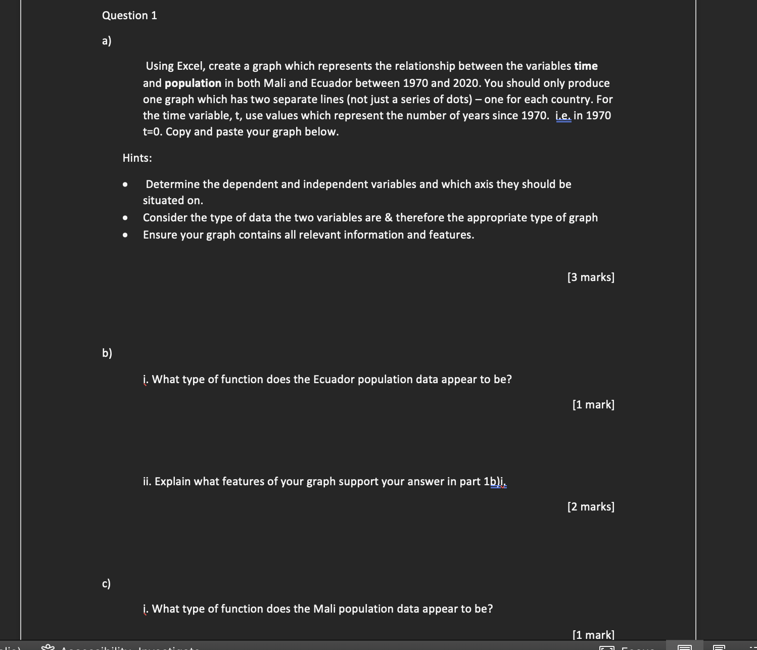
Question 1 8) Using Excel, create a graph which represents the relationship between the variables time and population in both Mali and Ecuador between 1970 and 2020. You should only produce one graph which has two separate lines {not just a series of dots) one for each country. For the time variable, t, use values which represent the number of years since 1970. Le. in 1970 t=0. Copy and paste your graph below. Hints: Determine the dependent and independent variables and which axis they should be situated on. 0 Consider the type of data the two variables are 8.: therefore the appropriate type of graph 0 Ensure your graph contains all relevant information and features. [3 marks] i. What type of function does the Ecuador population data appear to be? ii. Explain what features of your graph support your answer in part lbli. [2 marks] i. What type of function does the Mali population data appear to be
Step by Step Solution
There are 3 Steps involved in it
Step: 1
Get Instant Access to Expert-Tailored Solutions
See step-by-step solutions with expert insights and AI powered tools for academic success
Step: 2
Step: 3
Ace Your Homework with AI
Get the answers you need in no time with our AI-driven, step-by-step assistance
Get Started