Answered step by step
Verified Expert Solution
Question
1 Approved Answer
Question 15 3 pts For the ordered set of data shown, what is the 75th percentile? (do not interpolate - average if between two values
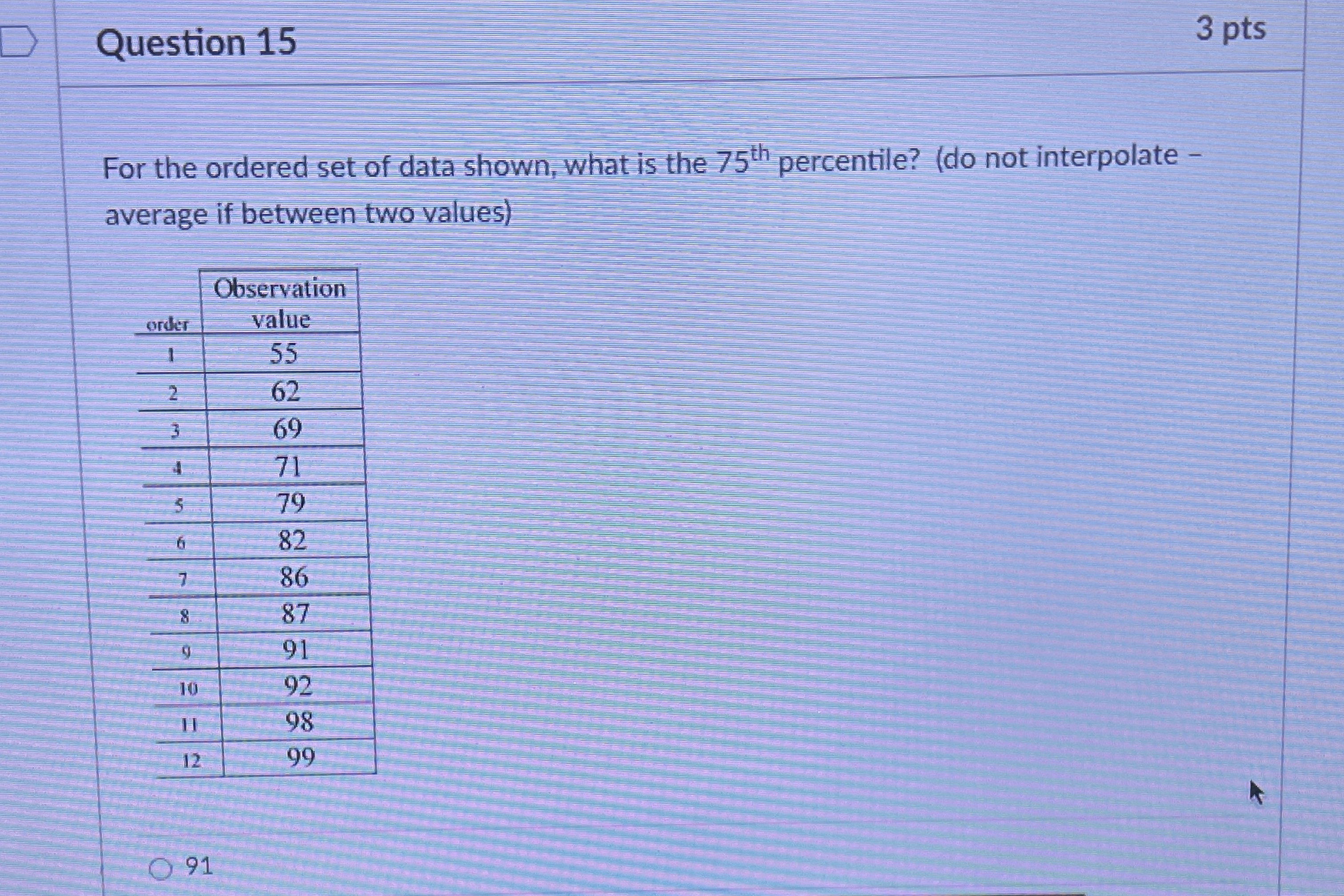
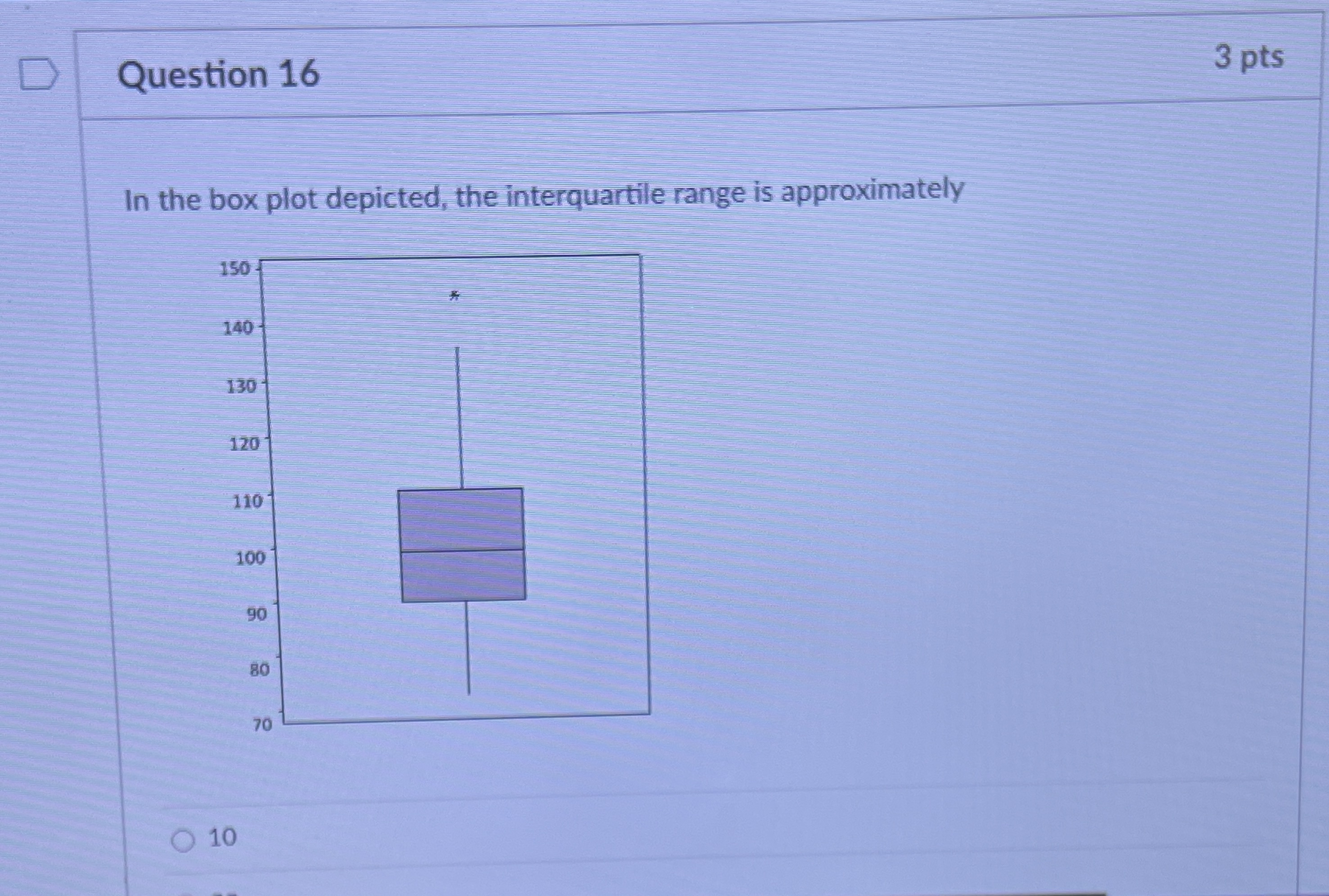
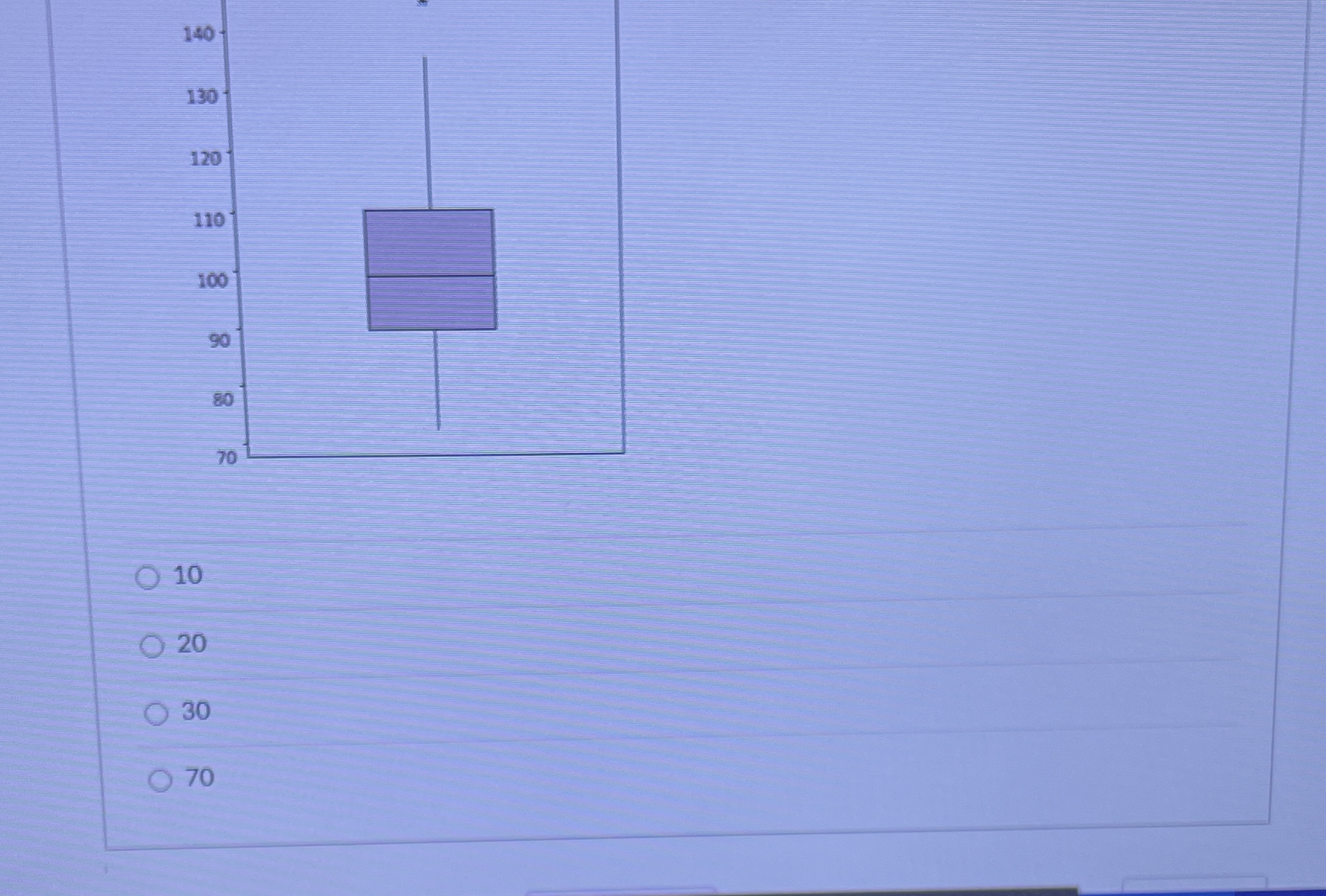
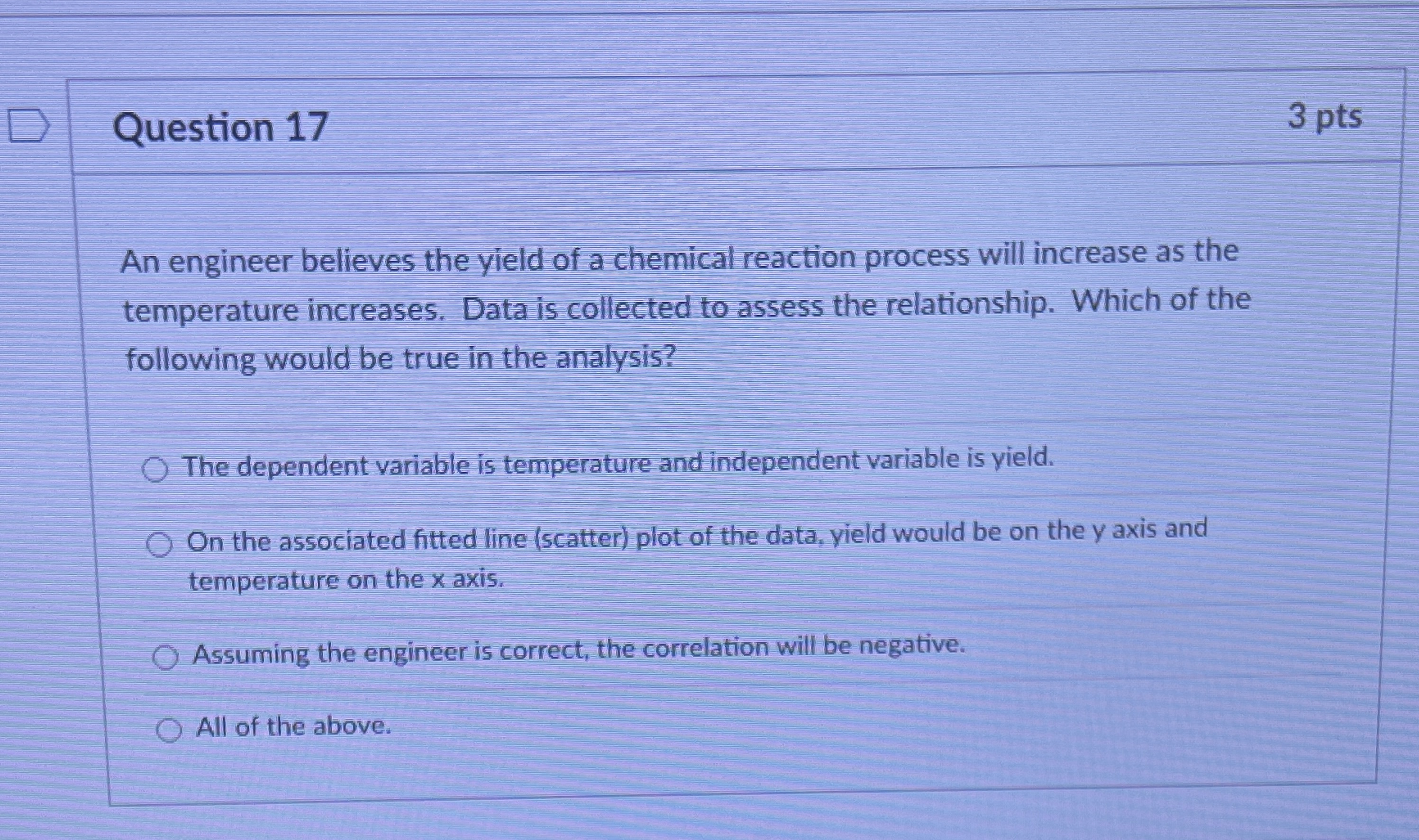
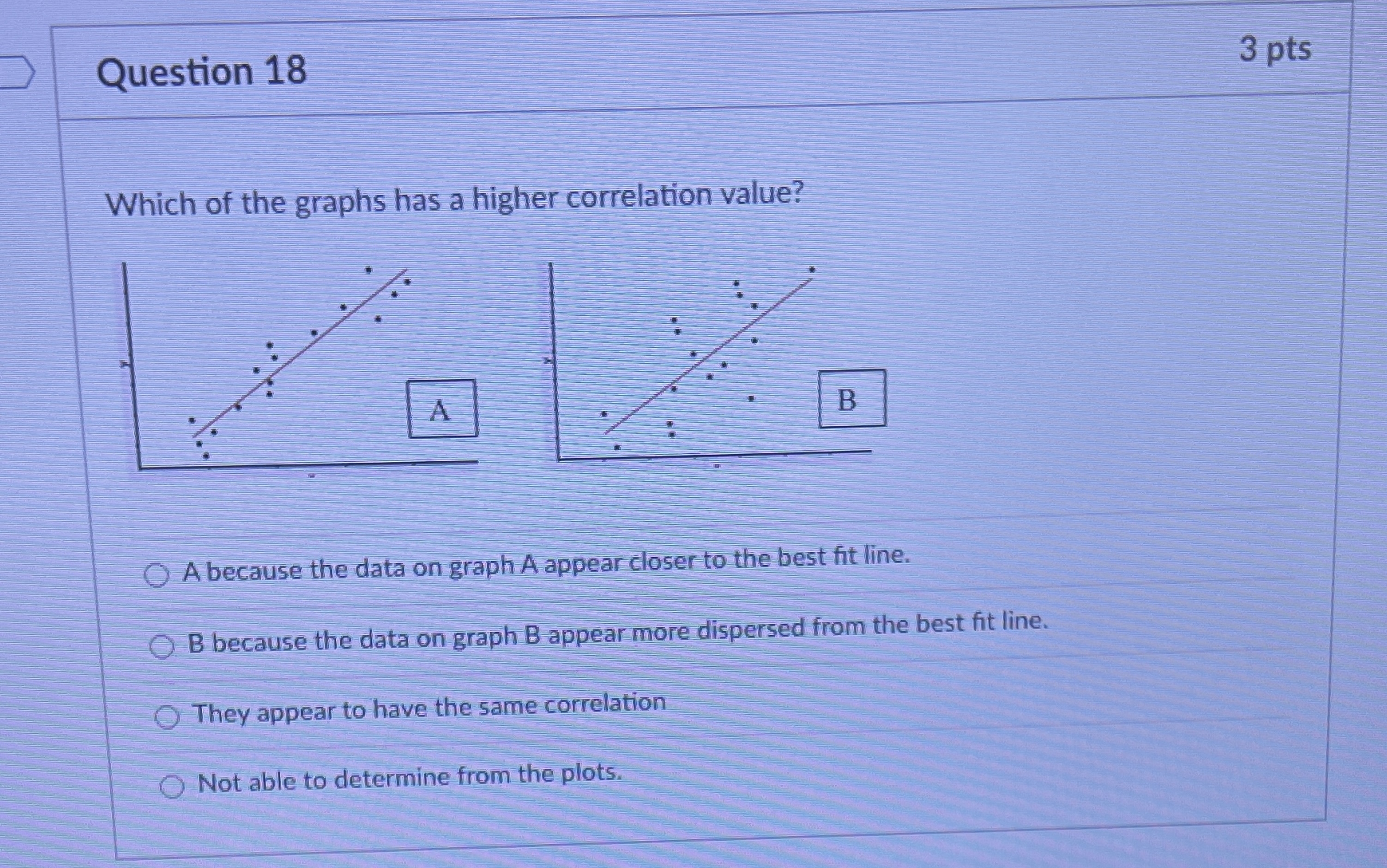
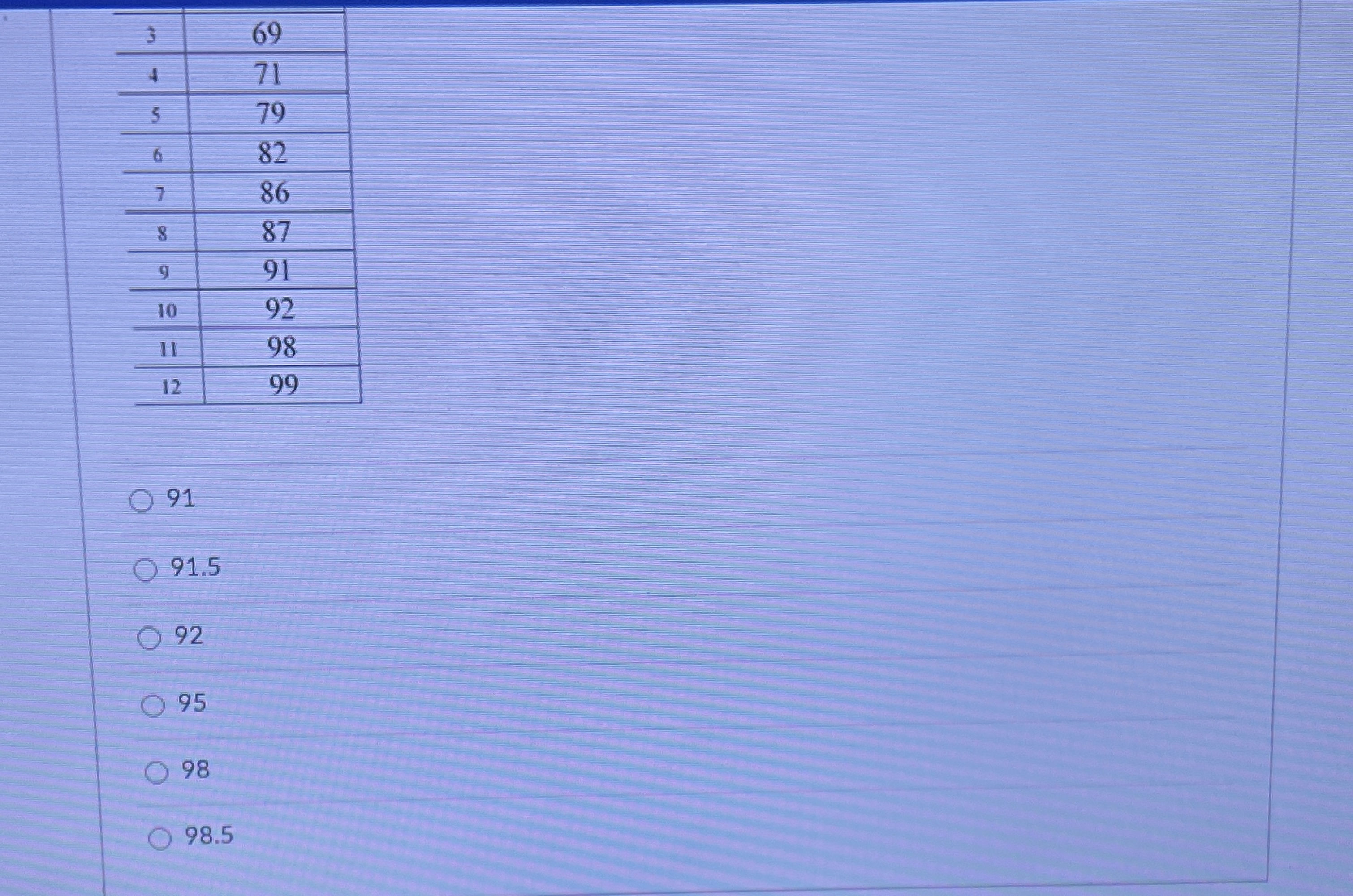
Question 15 3 pts For the ordered set of data shown, what is the 75th percentile? (do not interpolate - average if between two values Observation order value 55 62 69 71 79 82 86 87 91 10 92 98 12 99 O 9169 71 79 82 86 87 9 91 10 92 11 98 12 99 0 91 O 91.5 O 92 O 95 O 98 98.5D Question 16 3 pts In the box plot depicted, the interquartile range is approximately 150 140 130 120 110 100 90 80 70 10140 130 120 110 100 90 80 70 10 O 20 30 70Question 17 3 pts An engineer believes the yield of a chemical reaction process will increase as the temperature increases. Data is collected to assess the relationship. Which of the following would be true in the analysis? O The dependent variable is temperature and independent variable is yield. O On the associated fitted line (scatter) plot of the data, yield would be on the y axis and temperature on the x axis. O Assuming the engineer is correct, the correlation will be negative. O All of the above.Question 18 3 pts Which of the graphs has a higher correlation value? A B A because the data on graph A appear closer to the best fit line. O B because the data on graph B appear more dispersed from the best fit line. O They appear to have the same correlation Not able to determine from the plots
Step by Step Solution
There are 3 Steps involved in it
Step: 1
Get Instant Access to Expert-Tailored Solutions
See step-by-step solutions with expert insights and AI powered tools for academic success
Step: 2
Step: 3
Ace Your Homework with AI
Get the answers you need in no time with our AI-driven, step-by-step assistance
Get Started