Read the following article and write a summary, agreements, and disagreements with justification. Do not assume that everything in the article is correct. Try to read from a different viewpoint from the author.


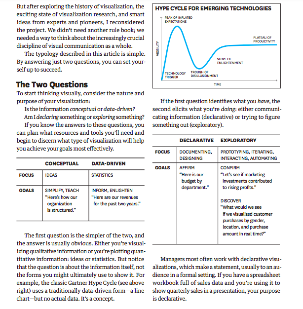
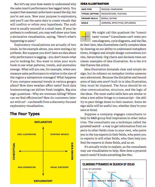
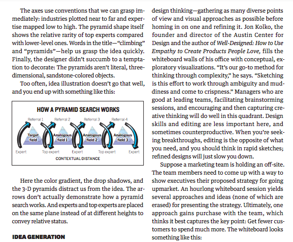
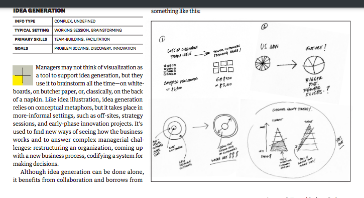
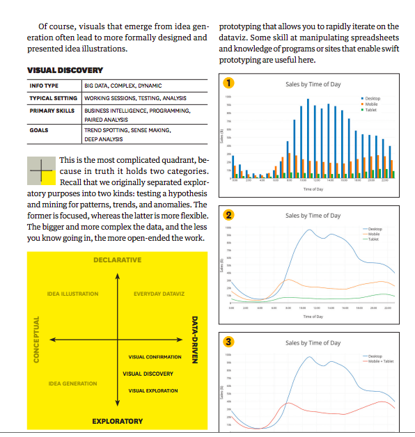
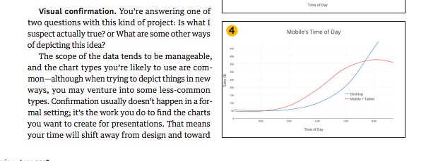
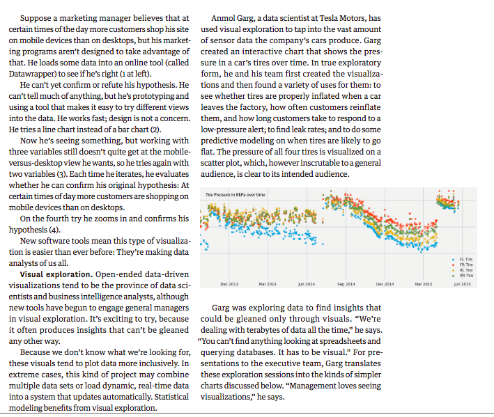
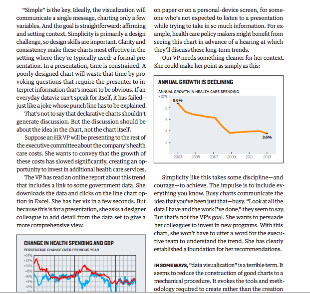
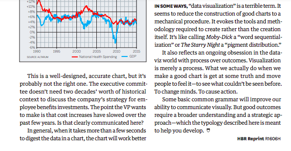
Data is the primary force behind this shift. Decision making increasingly relies on data, which comes at us with such overwhelming velocity, and in such volume, that we can't comprehend it without some layer of abstraction, such as a visual one. A typical example: At Boeing the managers of the Osprey program need to improve the efficiency of the aircraft's takeoffs and landings. But each time the Osprey gets off the ground or touches back down, its sensors create a terabyte of data. Ten takeoffs and landings produce as much data as is held in the Library of Congress. Without visualization, detecting the inefficiencies hidden in the patterns and anomalies of that data would be an impossible slog. But even information that's not statistical demands visual expression. Complex systems-business process workflows, for example, or the way customers move through a store-are hard to understand, much less fix, if you can't first see them. Thanks to the internet and a growing number of affordable tools, translating information into visuals is now easy (and cheap) for everyone, regardless of data skills or design skills. This is largely a positive development. One drawback, though, is that it reinforces the impulse to "click and viz" without first thinking about your purpose and goals. Convenient is a tempting replacement for good, but it will lead to charts that are merely adequate or, worse, ineffective. Automatically converting spreadsheet cells into a chart only visualizes pieces of a spreadsheet; it doesn't capture an idea. As the presentation expert Nancy Duarte puts it, "Don't project the idea that you're showing a chart. Project the idea that you're showing a reflection of human activity, of things people did to make a line go up and down. It's not 'Here are our Q3 financial results,' it's 'Here's where we missed our targets." Managers who want to get better at making charts often start by learning rules. When should I use a bar chart? How many colors are too many? Where should the key go? Do I have to start my y-axis at zero? Visual grammar is important and useful-but knowing it doesn't guarantee that you'll make good charts. To start with chart-making rules is to forgo strategy for execution; it's to pack for a trip without knowing where you're going. Your visual communication will prove far more successful if you begin by acknowledging that it is not a lone action but, rather, several activities, each of which requires distinct types of planning, resources, and skills. The typology I offer here was created as a reaction to my making the very mistake I just described: The book from which this article is adapted started out as something like a rule book. But after exploring the history of visualization, the exciting state of visualization research, and smart ideas from experts and pioneers, I reconsidered the project. We didn't need another rule book; we needed a way to think about the increasingly crucial discipline of visual communication as a whole. The typology described in this article is simple. By answering just two questions, you can set yourself up to succeed. The Two Questions To start thinking visually, consider the nature and purpose of your visualization: Is the information conceptual or data-driven? Am I declaring something or exploring something? If you know the answers to these questions, you can plan what resources and tools you'll need and begin to discern what type of visualization will help you achieve your goals most effectively. The first question is the simpler of the two, and the answer is usually obvious. Either you're visualizing qualitative information or you're plotting quantitative information: ideas or statistics. But notice that the question is about the information itself, not the forms you might ultimately use to show it. For example, the classic Gartner Hype Cycle (see above right) uses a traditionally data-driven form-a line chart-but no actual data. It's a concept. If the first question identifies what you have, the second elicits what you're doing: either communicating information (declarative) or trying to figure something out (exploratory). Managers most often work with declarative visualizations, which make a statement, usually to an audience in a formal setting. If you have a spreadsheet workbook full of sales data and you're using it to show quarterly sales in a presentation, your purpose is declarative. But let's say your boss wants to understand why the sales team's performance has lagged lately. You suspect that seasonal cycles have caused the dip, but you're not sure. Now your purpose is exploratory, and you'll use the same data to create visuals that will confirm or refute your hypothesis. The audience is usually yourself or a small team. If your hypothesis is confirmed, you may well show your boss a declarative visualization, saying, "Here's what's happening to sales." Exploratory visualizations are actually of two kinds. In the example above, you were testing a hypothesis. But suppose you don't have an idea about why performance is lagging-you don't know what you're looking for. You want to mine your workbook to see what patterns, trends, and anomalies emerge. What will you see, for example, when you measure sales performance in relation to the size of the region a salesperson manages? What happens if you compare seasonal trends in various geographies? How does weather affect sales? Such data brainstorming can deliver fresh insights. Big strategic questions-Why are revenues falling? Where can we find efficiencies? How do customers interact with us?-can benefit from a discovery-focused exploratory visualization. The Four Types IDEAILLUSTRATION We might call this quadrant the "consultants' comer." Consultants can't resist process diagrams, cycle diagrams, and the like. At their best, idea illustrations clarify complex ideas by drawing on our ability to understand metaphors (trees, bridges) and simple design conventions (circles, hierarchies). Org charts and decision trees are classic examples of idea illustration. So is the 22 that frames this article. Idea illustration demands clear and simple design, but its reliance on metaphor invites unnecessary adorment. Because the discipline and boundaries of data sets aren't built in to idea illustration, they must be imposed. The focus should be on clear communication, structure, and the logic of the ideas. The most useful skills here are similar to what a text editor brings to a manuscript-the ability to pare things down to their essence. Some design skills will be useful too, whether they're your own or hired. Suppose a company engages consultants to help its R\&D group find inspiration in other industries. The consultants use a technique called the pyramid search-a way to get information from experts in other fields close to your own, who point you to the top experts in their fields, who point you to experts in still other fields, who then help you find the experts in those fields, and so on. It's actually tricky to explain, so the consultants may use visualization to help. How does a pyramid search work? It looks something like this: The axes use conventions that we can grasp immediately: industries plotted near to far and expertise mapped low to high. The pyramid shape itself shows the relative rarity of top experts compared with lower-level ones. Words in the title-"climbing" and "pyramids"-help us grasp the idea quickly. Finally, the designer didn't succumb to a temptation to decorate: The pyramids aren't literal, threedimensional, sandstone-colored objects. Too often, idea illustration doesn't go that well, and you end up with something like this: Here the color gradient, the drop shadows, and the 3-D pyramids distract us from the idea. The arrows don't actually demonstrate how a pyramid search works. And experts and top experts are placed on the same plane instead of at different heights to convey relative status. IDEA EENERATION design thinking-gathering as many diverse points of view and visual approaches as possible before homing in on one and refining it. Jon Kolko, the founder and director of the Austin Center for Design and the author of Well-Designed: How to Use Empathy to Create Products People Love, fills the whiteboard walls of his office with conceptual, exploratory visualizations. "It's our go-to method for thinking through complexity," he says. "Sketching is this effort to work through ambiguity and muddiness and come to crispness." Managers who are good at leading teams, facilitating brainstorming sessions, and encouraging and then capturing creative thinking will do well in this quadrant. Design skills and editing are less important here, and sometimes counterproductive. When you're seeking breakthroughs, editing is the opposite of what you need, and you should think in rapid sketches; refined designs will just slow you down. Suppose a marketing team is holding an off-site. The team members need to come up with a way to show executives their proposed strategy for going upmarket. An hourlong whiteboard session yields several approaches and ideas (none of which are erased) for presenting the strategy. Ultimately, one approach gains purchase with the team, which thinks it best captures the key point: Get fewer customers to spend much more. The whiteboard looks something like this: Managers may not think of visualization as a tool to support idea generation, but they use it to brainstorm all the time-on whiteboards, on butcher paper, or, classically, on the back of a napkin. Like idea illustration, idea generation relies on conceptual metaphors, but it takes place in more-informal settings, such as off-sites, strategy sessions, and early-phase innovation projects. It's used to find new ways of seeing how the business works and to answer complex managerial challenges: restructuring an organization, coming up with a new business process, codifying a system for making decisions. Although idea generation can be done alone, it benefits from collaboration and borrows from Of course, visuals that emerge from idea generation often lead to more formally designed and presented idea illustrations. VISUAL DISCOVERY \begin{tabular}{l|l} \hline INFO TYPE & BIG DATA, COMPLEX, DYNAMIC \\ \hline TYPICAL SETTING & WORKING SESSIONS, TESTNG, ANALYSIS \\ \hline PAIMARY SKILLS & BUSINESSINTELUGENCE,PROGAAMMING,PAREDANALYSIS \\ \hline GOALS & TRENDSPOTTING,SENSEMAKING,DEEPANALYSIS \\ \hline \end{tabular} This is the most complicated quadrant, because in truth it holds two categories. Recall that we originally separated exploratory purposes into two kinds: testing a hypothesis and mining for patterns, trends, and anomalies. The former is focused, whereas the latter is more flexible. The bigger and more complex the data, and the less you know going in, the more open-ended the work. prototyping that allows you to rapidly iterate on the dataviz. Some skill at manipulating spreadsheets and knowledge of programs or sites that enable swift prototyping are useful here. Visual confirmation. You're answering one of two questions with this kind of project: Is what I suspect actually true? or What are some other ways of depicting this idea? The scope of the data tends to be manageable, and the chart types you're likely to use are common-although when trying to depict things in new ways, you may venture into some less-common types. Confirmation usually doesn't happen in a formal setting; it's the work you do to find the charts you want to create for presentations. That means your time will shift away from design and toward Suppose a marketing manager believes that at certain times of the day more customers shop his site on mobile devices than on desktops, but his marketing programs aren't designed to take advantage of that. He loads some data into an online tool (called Datawrapper) to see if he's right (1 at left). He can't yet confirm or refute his hypothesis. He can't tell much of anything, but he's prototyping and using a tool that makes it easy to try different views into the data. He works fast; design is not a concern. He tries a line chart instead of a bar chart (2). Now he's seeing something, but working with three variables still doesn't quite get at the mobileversus-desktop view he wants, so he tries again with two variables (3). Each time he iterates, he evaluates whether he can confirm his original hypothesis: At certain times of day more customers are shopping on mobile devices than on desktops. On the fourth try he zooms in and confirms his hypothesis (4). New software tools mean this type of visualization is easier than ever before: They're making data analysts of us all. Visual exploration. Open-ended data-driven visualizations tend to be the province of data scientists and business intelligence analysts, although new tools have begun to engage general managers in visual exploration. It's exciting to try, because it often produces insights that can't be gleaned any other way. Because we don't know what we're looking for, these visuals tend to plot data more inclusively. In extreme cases, this kind of project may combine multiple data sets or load dynamic, real-time data into a system that updates automatically. Statistical modeling benefits from visual exploration. Anmol Garg, a data scientist at Tesla Motors, has used visual exploration to tap into the vast amount of sensor data the company's cars produce. Garg created an interactive chart that shows the pressure in a car's tires over time. In true exploratory form, he and his team first created the visualizations and then found a variety of uses for them: to see whether tires are properly inflated when a car leaves the factory, how often customers reinflate them, and how long customers take to respond to a low-pressure alert; to find leak rates; and to do some predictive modeling on when tires are likely to go flat. The pressure of all four tires is visualized on a scatter plot, which, however inscrutable to a general audience, is clear to its intended audience. Garg was exploring data to find insights that could be gleaned only through visuals. "We're dealing with terabytes of data all the time," he says. "You can't find anything looking at spreadsheets and querying databases. It has to be visual." For presentations to the executive team, Garg translates these exploration sessions into the kinds of simpler charts discussed below. "Management loves seeing visualizations," he says. "Simple" is the key. Ideally, the visualization will communicate a single message, charting only a few variables. And the goal is straightforward: affirming and setting context. Simplicity is primarily a design challenge, so design skills are important. Clarity and consistency make these charts most effective in the setting where they're typically used: a formal presentation. In a presentation, time is constrained. A poorly designed chart will waste that time by provoking questions that require the presenter to interpret information that's meant to be obvious. If an everyday dataviz can't speak for itself, it has failedjust like a joke whose punch line has to be explained. That's not to say that declarative charts shouldn't generate discussion. But the discussion should be about the idea in the chart, not the chart itself. Suppose an HR VP will be presenting to the rest of the executive committee about the company's health care costs. She wants to convey that the growth of these costs has slowed significantly, creating an opportunity to invest in additional health care services. The VP has read an online report about this trend that includes a link to some government data. She downloads the data and clicks on the line chart option in Excel. She has her viz in a few seconds. But because this is for a presentation, she asks a designer colleague to add detail from the data set to give a more comprehensive view. on paper or on a personal-device screen, for someone who's not expected to listen to a presentation while trying to take in so much information. For example, health care policy makers might benefit from seeing this chart in advance of a hearing at which they'll discuss these long-term trends. Our VP needs something cleaner for her context. She could make her point as simply as this: Simplicity like this takes some discipline-and courage-to achieve. The impulse is to include everything you know. Busy charts communicate the idea that you've been just that-busy. "Look at all the data I have and the work I've done," they seem to say. But that's not the VP's goal. She wants to persuade her colleagues to invest in new programs. With this chart, she won't have to utter a word for the executive team to understand the trend. She has clearly established a foundation for her recommendations. IN SOME WAYS, "data visualization" is a terrible term. It seems to reduce the construction of good charts to a mechanical procedure. It evokes the tools and methodology required to create rather than the creation IN SOME WAYs, "data visualization" is a terrible term. It seems to reduce the construction of good charts to a mechanical procedure. It evokes the tools and methodology required to create rather than the creation itself. It's like calling Moby-Dick a "word sequentialization" or The Starry Night a "pigment distribution." It also reflects an ongoing obsession in the dataviz world with process over outcomes. Visualization is merely a process. What we actually do when we This is a well-designed, accurate chart, but it's probably not the right one. The executive committee doesn't need two decades' worth of historical context to discuss the company's strategy for employee benefits investments. The point the VP wants to make is that cost increases have slowed over the past few years. Is that clearly communicated here? In general, when it takes more than a few seconds to digest the data in a chart, the chart will work better make a good chart is get at some truth and move people to feel it-to see what couldn't be seen before. To change minds. To cause action. Some basic common grammar will improve our ability to communicate visually. But good outcomes require a broader understanding and a strategic approach-which the typology described here is meant to help you develop. HBR Reprint R1606H
