Answered step by step
Verified Expert Solution
Question
1 Approved Answer
Read this article. Try to investigate which year and (by who) was each of the following charts invented ( pie, histogram, Marimekko, Wardley, periodic table)
- Read this article. Try to investigate which year and (by who) was each of the following charts invented ( pie, histogram, Marimekko, Wardley, periodic table)


please only answer the question
Read this page. Try to investigate which year and (by who) was each of the following charts invented ( pie, histogram, Marimekko, Wardley, periodic table)
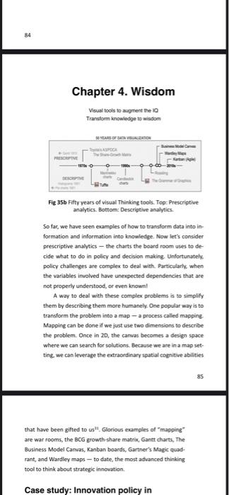
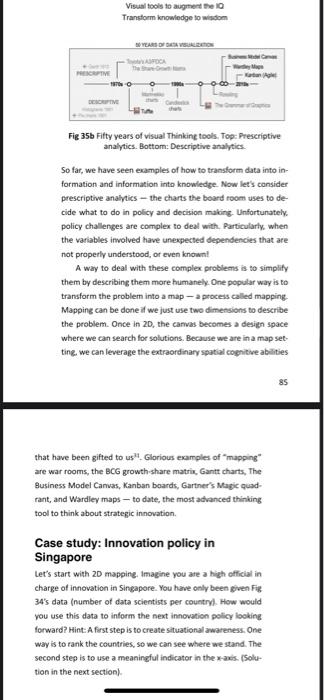
So far, we have seen examples of how to transform data into in formation and information into knowledge. Now let's consider prescriptive analytics - the charts the board room uses to decide what to do in policy and decision making. Unfortunately. policy challenges are complex to deal with. Particularly, when the variables involved have unexpected dependencies that are not properly understood, or even known! A way to deal with these complex problems is to simplify them by describing them more humanely. One popular way is to transform the problem into a map - a process called mapping. Mapping can be done if we just use two dimensions to describe the problem. Once in 20 , the camas becomes a design space where we can search for solutions. Becarase we are in a map setting. we can leverage the extraordinary spatial cogritive abilities 85 that have been gifted to us" , Glorious ekamples of "mapping" are war rooms, the BCG growth-share matrix, Gantt charts, The Fusiness Model Carvas, Kanban boards, Gartner's Magic quadrant, and Wardley maps - to date, the most advanced thinking tool to think about strategic innovation. Fig 35b Fifty years of visual Thinking tools. Top: Frescriptive analytics. Bottom: Descriptive analytics. So far, we have seen examples of how to transform data into information and information into knowledge. Now let's consider prescriptive analytics - the charts the board room uses to decide what to do in policy and decision making. Unfortunately. policy challenges are complex to deal with. Particularty, when the variables involved have unexpected dependencies that are not properly understood, or even knownl A way to deal with these complex problems is to simplify them by describing them more humanely. One popular way is to transform the problem into a map - a process called mapping. Mapping can be done if we just use two dimensions to describe the problem. Once in 2D, the carvas becomes a design space where we can search for solutions. Because we are in a map setting, we can leverage the extraordinary spatial cognitive abilities 85 that have been gifted to us" - Glorious examples of "mapping" are war rooms, the BCG growth share matrix, Gantt charts, The Business Model Canvas, Kanban boards, Gartner's Magic quadrant, and Wardley maps - to date, the most advanced thinking tool to think about strategic innovation. Case study: Innovation policy in Singapore Let's start with 20 mapping, Imagine you are a high official in charge of innovation in Singapore. You have only been given Figs 34 's data (number of data scientists per country). How would you use this data to inform the next inncvation pollcy locking forward? Hint: A first step is to create situational awareness: One way is to rank the countries, so we can see where we stand. The second step is to use a meaningful indicator in the x-axis. (Solution in the next section) Step by Step Solution
There are 3 Steps involved in it
Step: 1

Get Instant Access to Expert-Tailored Solutions
See step-by-step solutions with expert insights and AI powered tools for academic success
Step: 2

Step: 3

Ace Your Homework with AI
Get the answers you need in no time with our AI-driven, step-by-step assistance
Get Started


