Answered step by step
Verified Expert Solution
Question
1 Approved Answer
References: McLean, S. (2018). Exploring Interpersonal Communication (2nd ed) . VitalSource Bookshelf. vbk://9781453390429 Review the three images below considering the image layout, design, font size,
References: McLean, S. (2018).Exploring Interpersonal Communication (2nd ed). VitalSource Bookshelf. vbk://9781453390429
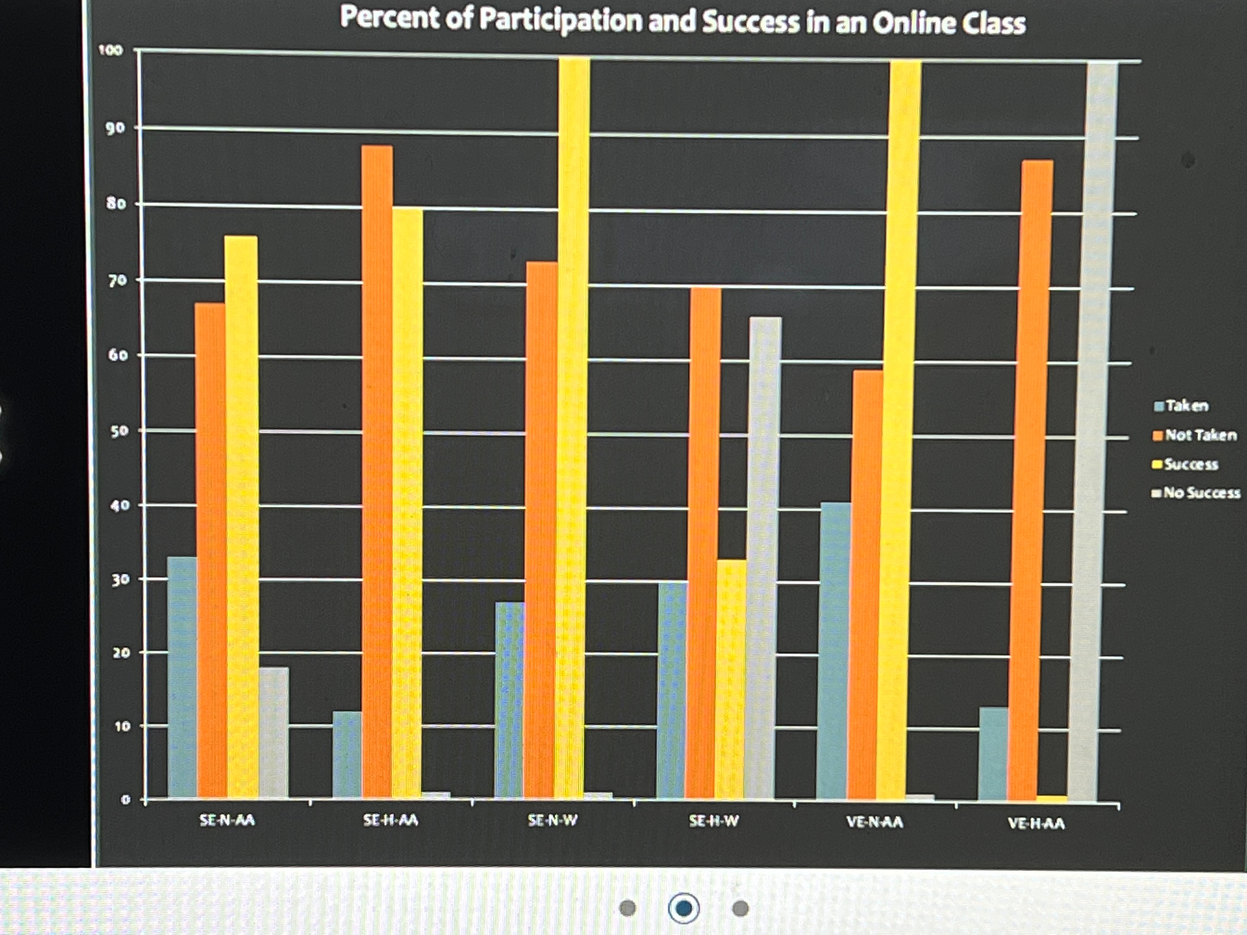
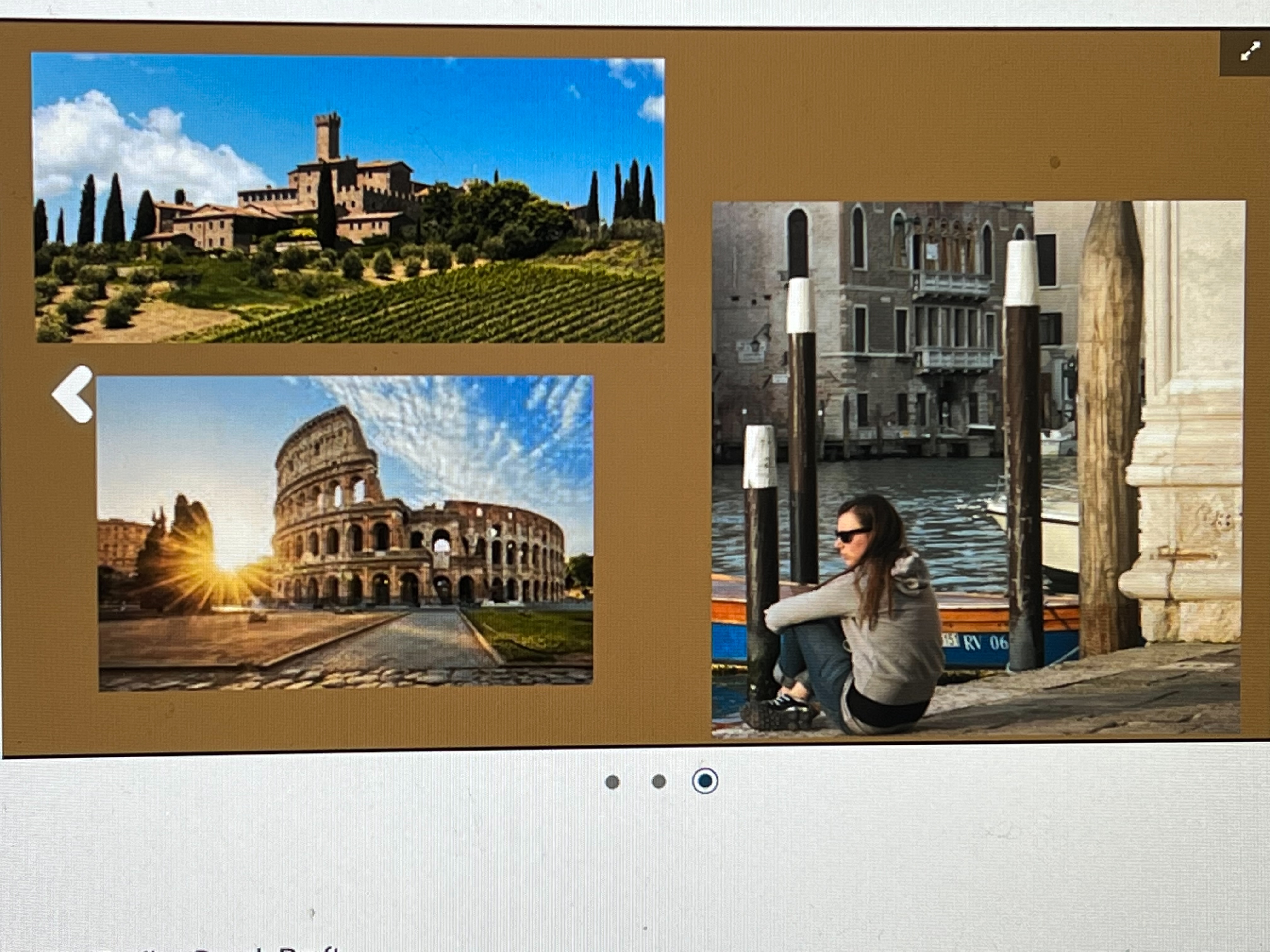
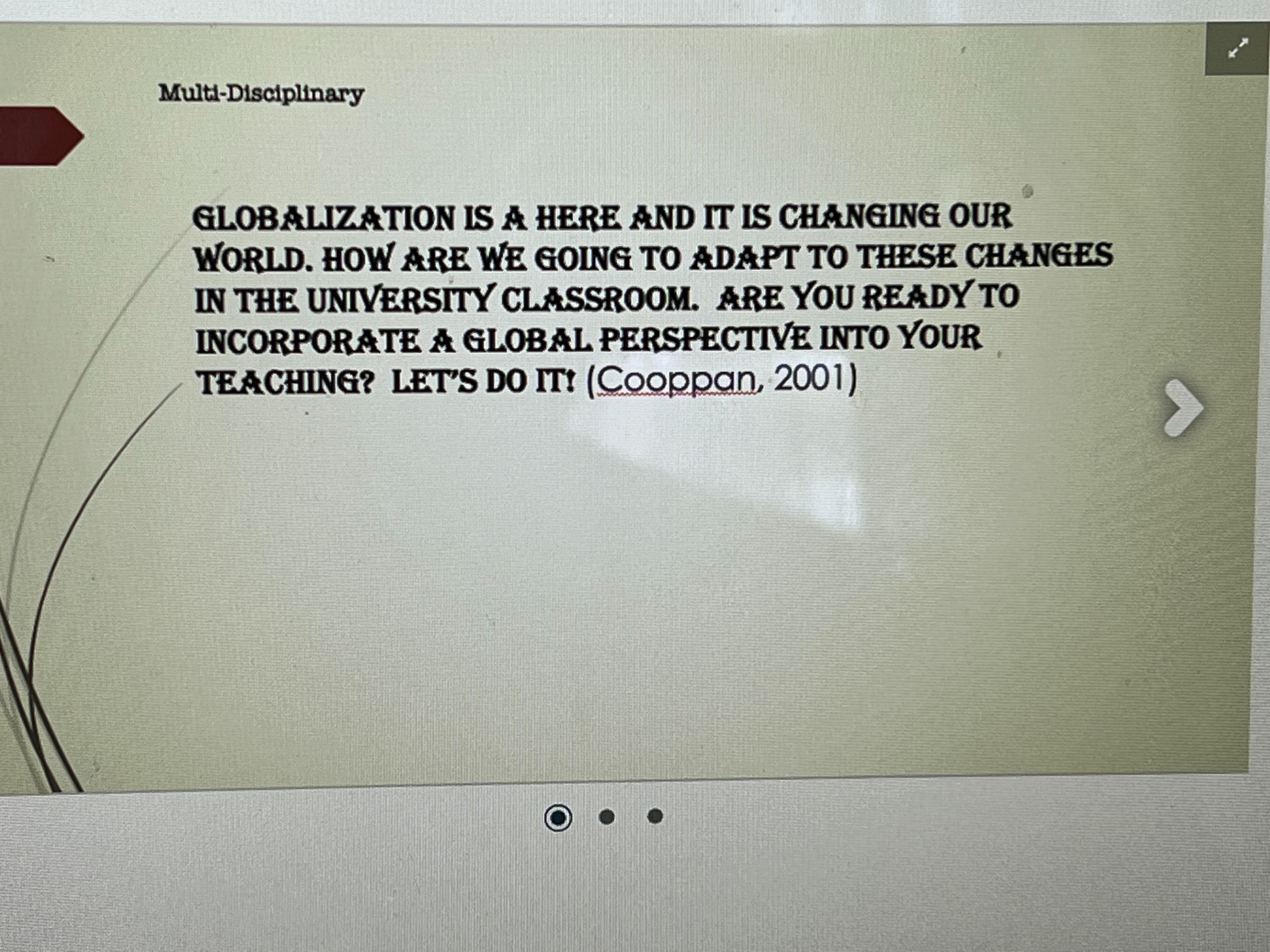
Review the three images below considering the image layout, design, font size, colors used and overall visual appeal. Analyze the three images for what works well and what should be changed to improve each image
Write a summary for each image using the following headings:
- What Works Well
- What Needs to be Improved


100 90 96 So 70 09 60 50 50 Percent of Participation and Success in an Online Class 40 30 20 20 10 Taken Not Taken Success No Success 0 SE-N-AA SE-H-AA SE-N-W SE-H-W VE-N-AA VE-HAA
Step by Step Solution
There are 3 Steps involved in it
Step: 1
Image Analysis 1 Company Logo Design What Works Well Color Scheme The logo utilizes a professional color scheme that is both appealing and modern The use of blue and white exudes trust and reliability ...
Get Instant Access to Expert-Tailored Solutions
See step-by-step solutions with expert insights and AI powered tools for academic success
Step: 2

Step: 3

Ace Your Homework with AI
Get the answers you need in no time with our AI-driven, step-by-step assistance
Get Started


