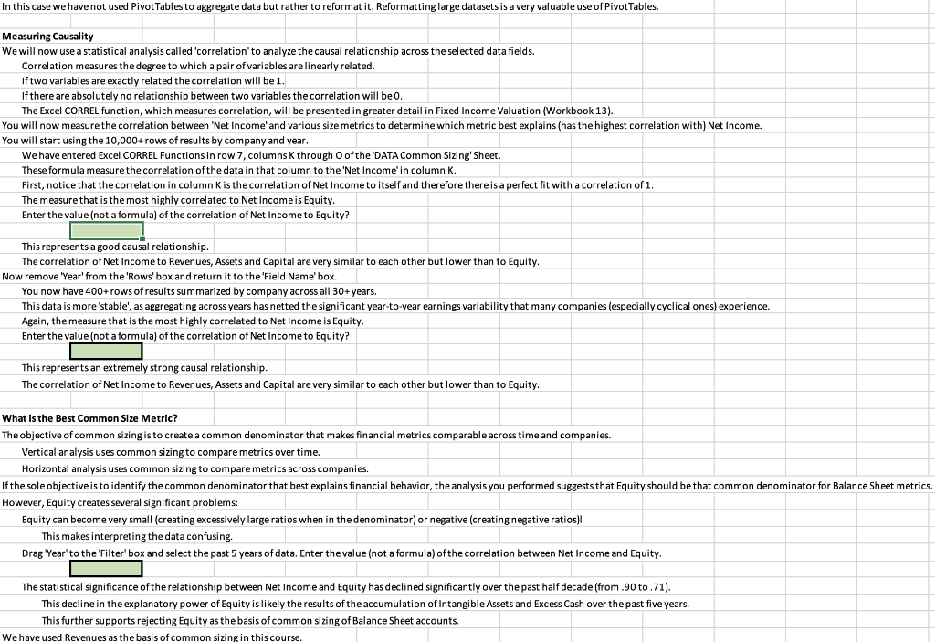

SHEET ROADMAP This entire Sheet is Challenge Homework. In the 'INTRO FSA' Sheet, we introduced the concept of 'Common Sizing' and 'Vertical Analysis'. Common sizing creates a ratio of a financial metric relative to a size metric that makes the ratios comparable across companies of different size. Income Statement accounts are universally common sized using Revenues as the size metric. In this Sheet you are going to execute a data analysis using a Pivot Table to explore what is the best size metric to common size Balance Sheet accounts. The most commonly used size metric for common sizing Balance Sheets is total Assets. This is used because based on the identity Assets = Liabilities + Equity, Assets represent the value to which both sides of the Balance Sheet total. However, if the objective in common sizing is to establish behavioral comparability across companies, total Assets may not be best size metric. Viewing Multiple Sheets You are going to want to complete this Sheet with the 'DATA Common Sizing Sheet arranged vertically to the right. To accomplish this, see instructions on the 'EXCEL Tables' Sheet of Data Analysis (Workbook 2). Hint: Under 'Choose where to place the Pivot Table' Excel will default to 'New Worksheet'which we will not choose. Instead, choose the 'DATA' Sheet following this one. Balance Sheet Common Sizing The 'DATA Common Sizing' Sheet contains selected financial data on the S&P 500 ex Financials since 1989. The financial data fields selected are extremely basic but, if you are not familiar with them and find this too challenging, feel free to skip this optional homework assignment. You will use that data to analyze the most 'causal Balance Sheet drivers of company profitability, the ultimate measure of performance. In Data Analysis (Workbook 2) we provided detailed instructions of how to create each Pivot Table. In this Workbook we are going to outline the broad steps required without providing the details of how to complete them. This is intentional. If you are having difficulty figuring out how to complete the steps, please refer back to Data Analysis (Workbook 2). Aligning the Data Create a PivotTable located in cell J11 of the "DATA Common Sizing' Sheet 1 Drag 'Net Income' from the 'Field Name' box to the Values' box. 2 Drag 'Revenue' from the 'Field Name' box to the 'Values' box. 3 Drag 'Assets' from the 'Field Name' box to the 'Values' box. 4 Drag 'Equity' from the "Field Name'box to the 'Values' box. 5 Drag 'Capital' from the 'Field Name' box to the Values' box. 6 If you choose to, format all of the above totals using the 'Number...' option on the 'Pivot Table Field' menu for each field. The analysis will work if you do not format the cells. ... 7 Select the 'Design' tab that appears when you click into the Pivot Table and eliminate all "Totals' and 'Subtotals. 8 Drag 'Ticker' from the 'Field Name' box to the 'Rows' box. 9 Drag 'Year' from the 'Field Name' box to the "Rows' box below "Ticker'. ' You now should have a PivotTable of more than 10,000 rows by ticker and year of the select financial data. In this case we have not used Pivot Tables to aggregate data but rather to reformat it. Reformatting large datasets is a very valuable use of Pivot Tables In this case we have not used PivotTables to aggregate data but rather to reformat it. Reformatting large datasets is a very valuable use of PivotTables. Measuring Causality We will now use a statistical analysis called 'correlation' to analyze the causal relationship across the selected data fields. Correlation measures the degree to which a pair of variables are linearly related. If two variables are exactly related the correlation will be 1. If there are absolutely no relationship between two variables the correlation will be 0. The Excel CORREL function, which measures correlation will be presented in greater detail in Fixed Income Valuation (Workbook 13). You will now measure the correlation between "Net Income' and various size metrics to determine which metric best explains (has the highest correlation with) Net Income. You will start using the 10,000+ rows of results by company and year. We have entered Excel CORREL Functions in row 7, columns through of the 'DATA Common Sizing Sheet These formula measure the correlation of the data in that column to the 'Net Income'in column K. First, notice that the correlation in column is the correlation of Net Income to itself and therefore there is a perfect fit with a correlation of 1. The measure that is the most highly correlated to Net Income is Equity. Enter the value (not a formula) of the correlation of Net Income to Equity? This represents a good causal relationship. The correlation of Net Income to Revenues, Assets and Capital are very similar to each other but lower than to Equity. Now remove 'Year' from the 'Rows' box and return it to the 'Field Name' box. You now have 400+ rows of results summarized by company across all 30+ years. This data is more stable', as aggregating across years has netted the significant year-to-year earnings variability that many companies (especially cyclical ones) experience. Again, the measure that is the most highly correlated to Net Income is Equity. Enter the value (not a formula) of the correlation of Net Income to Equity? This represents an extremely strong causal relationship. The correlation of Net Income to Revenues, Assets and Capital are very similar to each other but lower than to Equity. What is the Best Common Size Metric? The objective of common sizing is to create a common denominator that makes financial metrics comparable across time and companies. Vertical analysis uses common sizing to compare metrics over time. Horizontal analysis uses common sizing to compare metrics across companies If the sole objective is to identify the common denominator that best explains financial behavior, the analysis you performed suggests that Equity should be that common denominator for Balance Sheet metrics. However, Equity creates several significant problems: Equity can become very small (creating excessively large ratios when in the denominator) or negative (creating negative ratios) This makes interpreting the data confusing. Drag "Year'to the 'Filter' box and select the past 5 years of data. Enter the value (not a formula) of the correlation between Net Income and Equity. The statistical significance of the relationship between Net Income and Equity has declined significantly over the past half decade (from.90 to 71). This decline in the explanatory power of Equity is likely the results of the accumulation of Intangible Assets and Excess Cash over the past five years. This further supports rejecting Equity as the basis of common sizing of Balance Sheet accounts. We have used Revenues as the basis of common sizing in this course. SHEET ROADMAP This entire Sheet is Challenge Homework. In the 'INTRO FSA' Sheet, we introduced the concept of 'Common Sizing' and 'Vertical Analysis'. Common sizing creates a ratio of a financial metric relative to a size metric that makes the ratios comparable across companies of different size. Income Statement accounts are universally common sized using Revenues as the size metric. In this Sheet you are going to execute a data analysis using a Pivot Table to explore what is the best size metric to common size Balance Sheet accounts. The most commonly used size metric for common sizing Balance Sheets is total Assets. This is used because based on the identity Assets = Liabilities + Equity, Assets represent the value to which both sides of the Balance Sheet total. However, if the objective in common sizing is to establish behavioral comparability across companies, total Assets may not be best size metric. Viewing Multiple Sheets You are going to want to complete this Sheet with the 'DATA Common Sizing Sheet arranged vertically to the right. To accomplish this, see instructions on the 'EXCEL Tables' Sheet of Data Analysis (Workbook 2). Hint: Under 'Choose where to place the Pivot Table' Excel will default to 'New Worksheet'which we will not choose. Instead, choose the 'DATA' Sheet following this one. Balance Sheet Common Sizing The 'DATA Common Sizing' Sheet contains selected financial data on the S&P 500 ex Financials since 1989. The financial data fields selected are extremely basic but, if you are not familiar with them and find this too challenging, feel free to skip this optional homework assignment. You will use that data to analyze the most 'causal Balance Sheet drivers of company profitability, the ultimate measure of performance. In Data Analysis (Workbook 2) we provided detailed instructions of how to create each Pivot Table. In this Workbook we are going to outline the broad steps required without providing the details of how to complete them. This is intentional. If you are having difficulty figuring out how to complete the steps, please refer back to Data Analysis (Workbook 2). Aligning the Data Create a PivotTable located in cell J11 of the "DATA Common Sizing' Sheet 1 Drag 'Net Income' from the 'Field Name' box to the Values' box. 2 Drag 'Revenue' from the 'Field Name' box to the 'Values' box. 3 Drag 'Assets' from the 'Field Name' box to the 'Values' box. 4 Drag 'Equity' from the "Field Name'box to the 'Values' box. 5 Drag 'Capital' from the 'Field Name' box to the Values' box. 6 If you choose to, format all of the above totals using the 'Number...' option on the 'Pivot Table Field' menu for each field. The analysis will work if you do not format the cells. ... 7 Select the 'Design' tab that appears when you click into the Pivot Table and eliminate all "Totals' and 'Subtotals. 8 Drag 'Ticker' from the 'Field Name' box to the 'Rows' box. 9 Drag 'Year' from the 'Field Name' box to the "Rows' box below "Ticker'. ' You now should have a PivotTable of more than 10,000 rows by ticker and year of the select financial data. In this case we have not used Pivot Tables to aggregate data but rather to reformat it. Reformatting large datasets is a very valuable use of Pivot Tables In this case we have not used PivotTables to aggregate data but rather to reformat it. Reformatting large datasets is a very valuable use of PivotTables. Measuring Causality We will now use a statistical analysis called 'correlation' to analyze the causal relationship across the selected data fields. Correlation measures the degree to which a pair of variables are linearly related. If two variables are exactly related the correlation will be 1. If there are absolutely no relationship between two variables the correlation will be 0. The Excel CORREL function, which measures correlation will be presented in greater detail in Fixed Income Valuation (Workbook 13). You will now measure the correlation between "Net Income' and various size metrics to determine which metric best explains (has the highest correlation with) Net Income. You will start using the 10,000+ rows of results by company and year. We have entered Excel CORREL Functions in row 7, columns through of the 'DATA Common Sizing Sheet These formula measure the correlation of the data in that column to the 'Net Income'in column K. First, notice that the correlation in column is the correlation of Net Income to itself and therefore there is a perfect fit with a correlation of 1. The measure that is the most highly correlated to Net Income is Equity. Enter the value (not a formula) of the correlation of Net Income to Equity? This represents a good causal relationship. The correlation of Net Income to Revenues, Assets and Capital are very similar to each other but lower than to Equity. Now remove 'Year' from the 'Rows' box and return it to the 'Field Name' box. You now have 400+ rows of results summarized by company across all 30+ years. This data is more stable', as aggregating across years has netted the significant year-to-year earnings variability that many companies (especially cyclical ones) experience. Again, the measure that is the most highly correlated to Net Income is Equity. Enter the value (not a formula) of the correlation of Net Income to Equity? This represents an extremely strong causal relationship. The correlation of Net Income to Revenues, Assets and Capital are very similar to each other but lower than to Equity. What is the Best Common Size Metric? The objective of common sizing is to create a common denominator that makes financial metrics comparable across time and companies. Vertical analysis uses common sizing to compare metrics over time. Horizontal analysis uses common sizing to compare metrics across companies If the sole objective is to identify the common denominator that best explains financial behavior, the analysis you performed suggests that Equity should be that common denominator for Balance Sheet metrics. However, Equity creates several significant problems: Equity can become very small (creating excessively large ratios when in the denominator) or negative (creating negative ratios) This makes interpreting the data confusing. Drag "Year'to the 'Filter' box and select the past 5 years of data. Enter the value (not a formula) of the correlation between Net Income and Equity. The statistical significance of the relationship between Net Income and Equity has declined significantly over the past half decade (from.90 to 71). This decline in the explanatory power of Equity is likely the results of the accumulation of Intangible Assets and Excess Cash over the past five years. This further supports rejecting Equity as the basis of common sizing of Balance Sheet accounts. We have used Revenues as the basis of common sizing in this course
