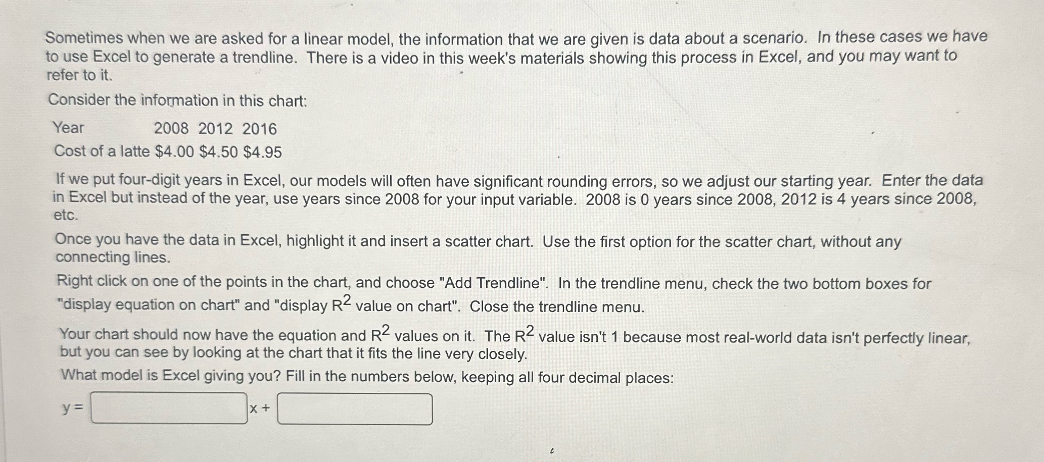
Sometimes when we are asked for a linear model, the information that we are given is data about a scenario. In these cases we

Sometimes when we are asked for a linear model, the information that we are given is data about a scenario. In these cases we have to use Excel to generate a trendline. There is a video in this week's materials showing this process in Excel, and you may want to refer to it. Consider the information in this chart: Year 2008 2012 2016 Cost of a latte $4.00 $4.50 $4.95 If we put four-digit years in Excel, our models will often have significant rounding errors, so we adjust our starting year. Enter the data in Excel but instead of the year, use years since 2008 for your input variable. 2008 is 0 years since 2008, 2012 is 4 years since 2008, etc. Once you have the data in Excel, highlight it and insert a scatter chart. Use the first option for the scatter chart, without any connecting lines. Right click on one of the points in the chart, and choose "Add Trendline". In the trendline menu, check the two bottom boxes for "display equation on chart" and "display R2 value on chart". Close the trendline menu. Your chart should now have the equation and R values on it. The R value isn't 1 because most real-world data isn't perfectly linear, but you can see by looking at the chart that it fits the line very closely. What model is Excel giving you? Fill in the numbers below, keeping all four decimal places: y = X+
Step by Step Solution
There are 3 Steps involved in it
Step: 1
Y 01...
See step-by-step solutions with expert insights and AI powered tools for academic success
Step: 2

Step: 3

Ace Your Homework with AI
Get the answers you need in no time with our AI-driven, step-by-step assistance
Get Started


