Answered step by step
Verified Expert Solution
Question
1 Approved Answer
Study Guide: Unit 1 (STAT 18, Spring 2024). M4 6. For categorical data, students should be able to create and interpret a pie chart

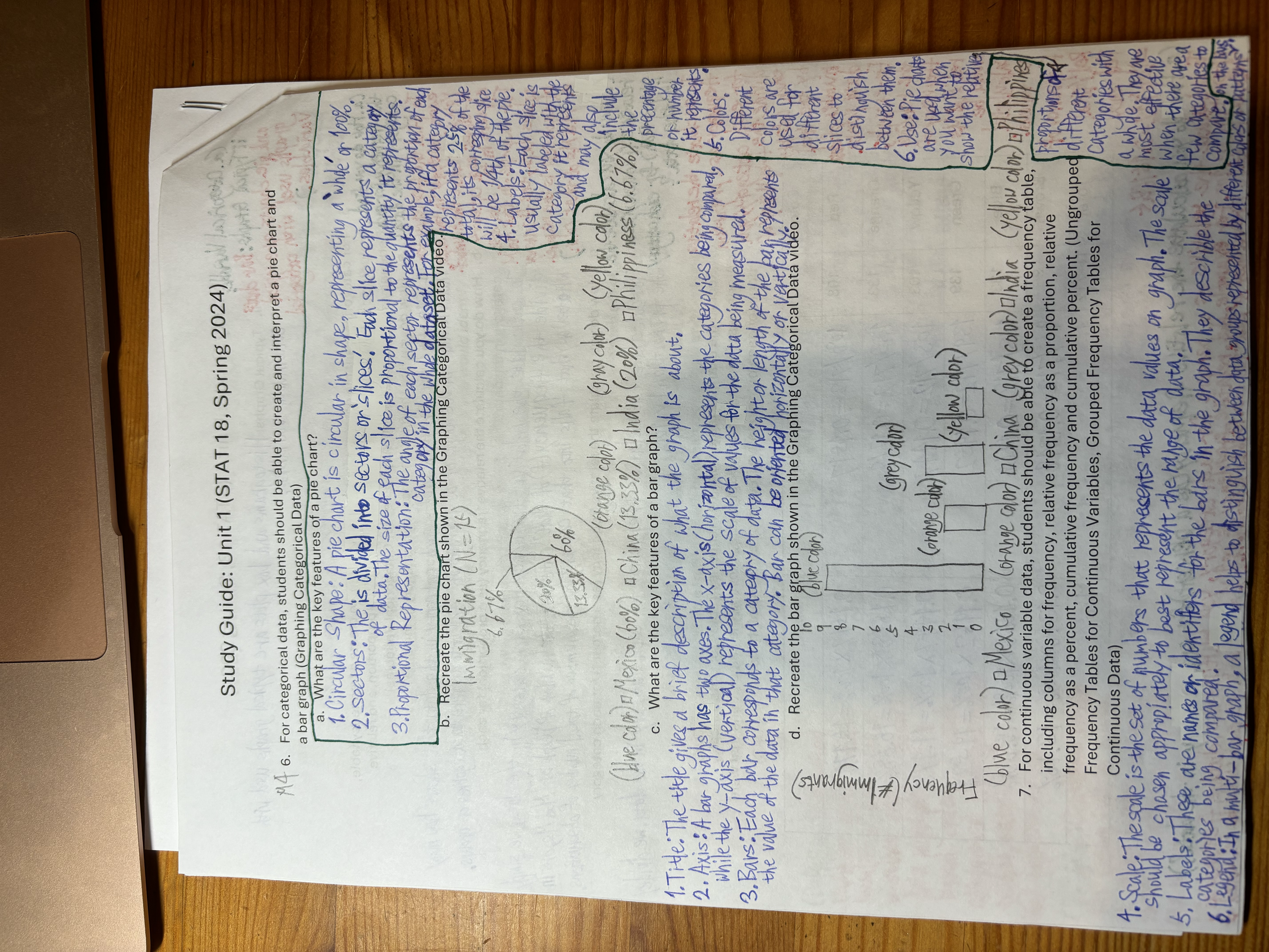
Study Guide: Unit 1 (STAT 18, Spring 2024). M4 6. For categorical data, students should be able to create and interpret a pie chart and a bar graph (Graphing Categorical Data) a. What are the key features of a pie chart? 1. Circular Shape: A pie chart is circular in shape, representing a whole or 100%. ploc 2. sectors: The, is divided into sectors or slices. Each slice represents a category. of data. The size of each slice is proportional to the quantity it represents. 3. Proportional of each Category in the whole dataset. For example, if a category represents 25% of the total, its corresping slice will be 1/4th of the pie. 4. Labels: Each slice is usually labeled with b. Recreate the pie chart shown in the Graphing Categorical Data video. Immigration (N=15) 6.67%- 20% 60% 13.33% (orange color) (gray color) (blue color) Mexico (60%) # China (13.33%) India (20%) c. What are the key features of a bar graph? the Category it represents (and may also (yellow color) Philippiness (6.67%) the 1. Title: The title gives a brief description of what the graph is about. 2. Axis: A bar graphs has two axes. The x-axis (horizontal) represents the categories being compared, while the y-axis (vertical), represents the scale of values for the data being measured. 3. Bars: Each bar, corresponds to a category of data. The height or length of the ban represents the value of the data in that category. Bar can be oriented horizontally or verticall Frequency (#Immigrants) d. Recreate the bar graph shown in the Graphing Categorical Data video. To (blue color) 9 7 6 5 4 2 (grey color) (orange color) 1 (yellow color) 0 5. precentage or humber it represents ht Colors: Different colors are used for different slices to distinguish. Between them. 6. Use: Pie charts are used when you want to Show the relative (blue color) Mexico (orange color) 1 China (grey color) India (yellow color) E Philippined 7. For continuous variable data, students should be able to create a frequency table, including columns for frequency, relative frequency as a proportion, relative proportions off frequency as a percent, cumulative frequency and cumulative percent. (Ungrouped different Frequency Tables for Continuous Variables, Grouped Frequency Tables for Continuous Data) should be chosen appropiately to best represent the range of data. 4. Scale. The spale is the set of numbers that represents the data values on graph. The scule categories being compared. 5. Labels. These are names or identifiers for the bars in the graph. They describle the Legtegories Categories with a whole. They are most effective when there we a few categories to Compare on the bus 6. Legend: In a multi-bar graph, a legend helps to distinguish between data groups represented by different colors or butters
Step by Step Solution
There are 3 Steps involved in it
Step: 1

Get Instant Access to Expert-Tailored Solutions
See step-by-step solutions with expert insights and AI powered tools for academic success
Step: 2

Step: 3

Ace Your Homework with AI
Get the answers you need in no time with our AI-driven, step-by-step assistance
Get Started


