Answered step by step
Verified Expert Solution
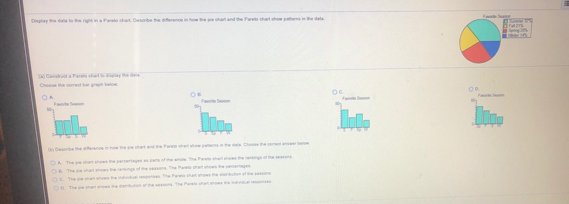
Link Copied!

Question

1 Approved Answer

Thank you for your time. Display the data to the right in a Pareto chart. Describe the difference in how the pie chart and the

Thank you for your time.

image text in transcribed
Display the data to the right in a Pareto chart. Describe the difference in how the pie chart and the Pareto chart show patterns in the data. Favorite Season Summer 37 Fall 21% Spring 28%% Winter 14% (a) Construct a Pareto chart to display the data. Choose the correct bar graph below. O A OB. OC. OD. Favorite Season Favorite Season Favorite Season Favorite Season 50- 50% 50- 50- Sp Sp S S Sp (b) Describe the difference in how the pie chart and the Pareto chart show patterns in the data. Choose the correct answer below. O A. The pie chart shows the percentages as parts of the whole. The Pareto chart shows the rankings of the seasons. B. The pie chart shows the rankings of the seasons. The Pareto chart shows the percentages. () C. The pie chart shows the individual responses. The Pareto chart shows the distribution of the seasons. O) D. The pie chart shows the distribution of the seasons. The Pareto chart shows the individual responses

Step by Step Solution

There are 3 Steps involved in it

Step: 1

blur-text-image

Get Instant Access to Expert-Tailored Solutions

See step-by-step solutions with expert insights and AI powered tools for academic success

Step: 2

blur-text-image

Step: 3

blur-text-image

Ace Your Homework with AI

Get the answers you need in no time with our AI-driven, step-by-step assistance

Get Started

Recommended Textbook for

College Algebra

Authors: Margaret L. Lial, John Hornsby, David I. Schneider, Callie Daniels

12th edition

134697022, 9780134313795 , 978-0134697024

More Books

Students also viewed these Mathematics questions