Question
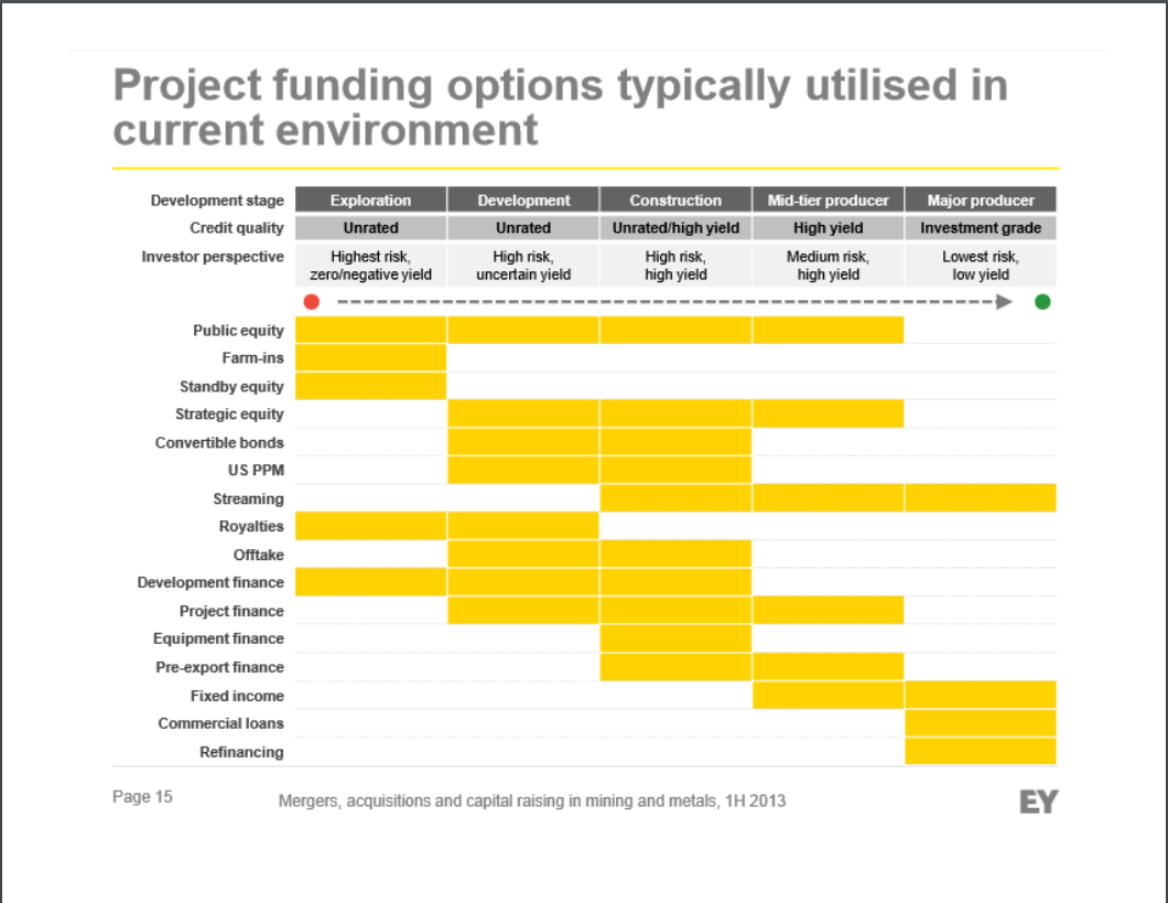
The chart is from a presentation by Ernst & Young related to mining. Looking at the columns, the highest risk mining projects are on the

The chart is from a presentation by Ernst & Young related to mining. Looking at the columns, the highest risk mining projects are on the left side, with the highest risk being pure exploration, where oil might be suspected, but is not established to exist. The lowest risk mining is on the right, where a major producer already has projects in place and is making money from the projects.
The rows are various arrangements by which capital can be raised. Some of these arrangements have colorful names and the details might be sketchy for us; for example a farm-in arrangement derives from sharecropping where one person owned the land and the other did the work. It seems that the same principle could be employed with an oil field. Skipping over these colorful and possibly complex arrangements, the easy arrangements to identify are the first row, public equity, and the last two rows, commercial loans and refinancing. I think the intent of the chart is to order the arrangements by their similarity to the two extremes.
If I squint my eyes while looking at the chart, it seems like the yellow cells of the chart are laid out on a diagonal from northwest to southeast. I cant say for certain that youll see the same thing when you squint your eyes. Whether you squint or not, its clear that the Southwest group of cells are empty.
Required:
1. Why are the Southwest cells empty?
2. What role(s) does accounting play in commercial loans and refinancing loans?
3. What role(s) does accounting play in public equity?
Step by Step Solution
There are 3 Steps involved in it
Step: 1

Get Instant Access to Expert-Tailored Solutions
See step-by-step solutions with expert insights and AI powered tools for academic success
Step: 2

Step: 3

Ace Your Homework with AI
Get the answers you need in no time with our AI-driven, step-by-step assistance
Get Started


