Answered step by step
Verified Expert Solution
Question
1 Approved Answer
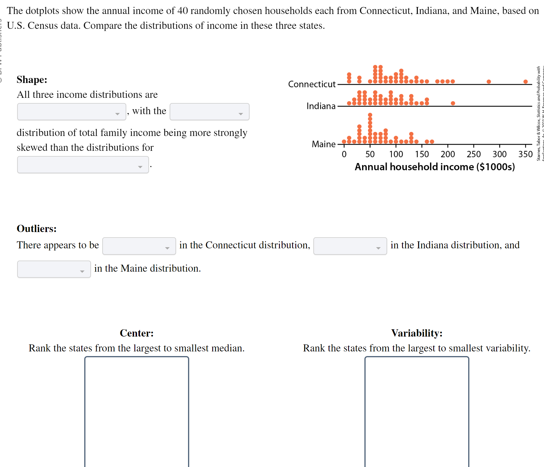
The dotplots show the annual income of 40 randomly chosen households each from Connecticut, Indiana, and Maine, based on U.S. Census data. Compare the distributions
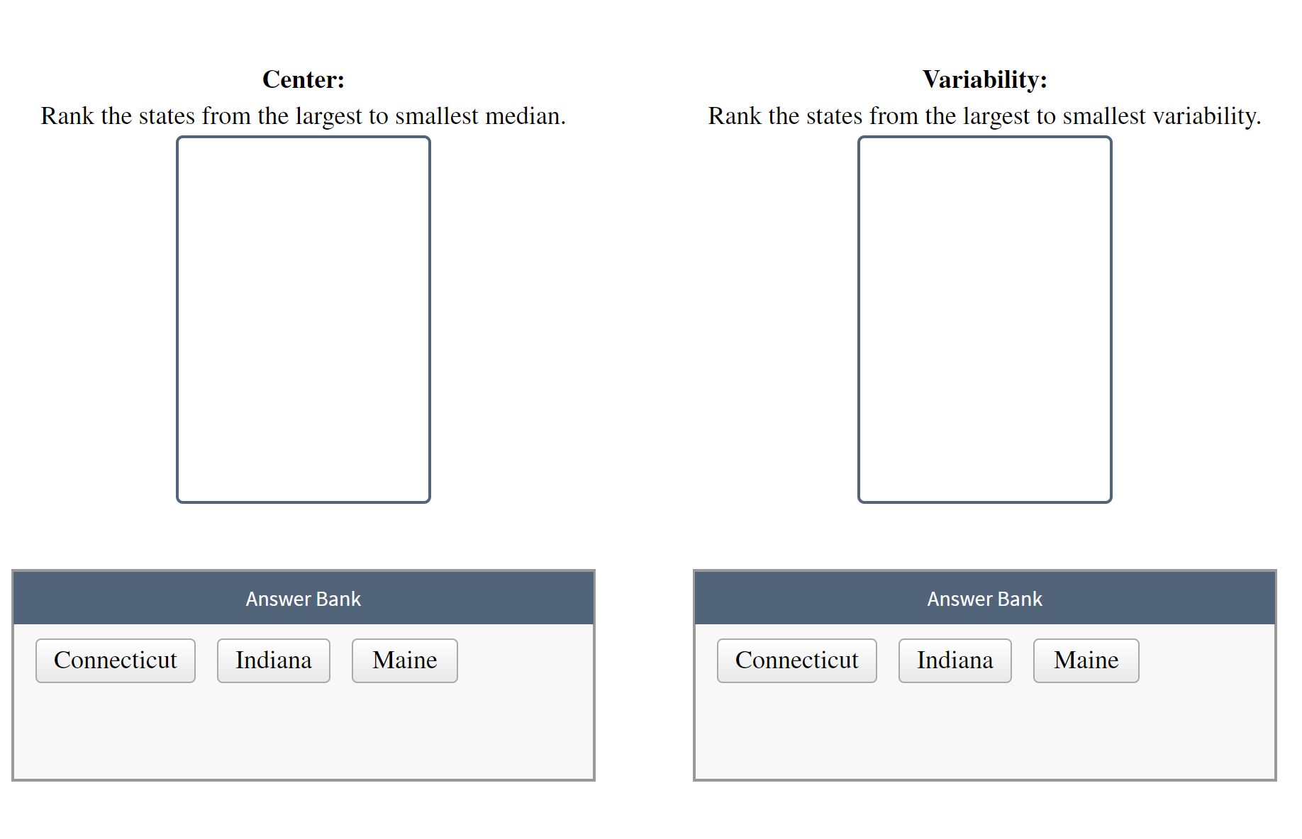
The dotplots show the annual income of 40 randomly chosen households each from Connecticut, Indiana, and Maine, based on U.S. Census data. Compare the distributions of income in these three states. Shape: Connecticut 1s . Math.s.. .. All three income distributions are and Probe , with the Indiana distribution of total family income being more strongly skewed than the distributions for Maine -$2.131fil.4..1. .. 0 50 100 150 200 250 300 350 Annual household income ($1000s) Outliers: There appears to be in the Connecticut distribution, in the Indiana distribution, and in the Maine distribution. Center: Variability: Rank the states from the largest to smallest median. Rank the states from the largest to smallest variability.Center: Variability: Rank the states from the largest to smallest median. Rank the states from the largest to smallest variability Answer Bank Answer Bank
Step by Step Solution
There are 3 Steps involved in it
Step: 1
Get Instant Access to Expert-Tailored Solutions
See step-by-step solutions with expert insights and AI powered tools for academic success
Step: 2
Step: 3
Ace Your Homework with AI
Get the answers you need in no time with our AI-driven, step-by-step assistance
Get Started