Answered step by step
Verified Expert Solution
Question
1 Approved Answer
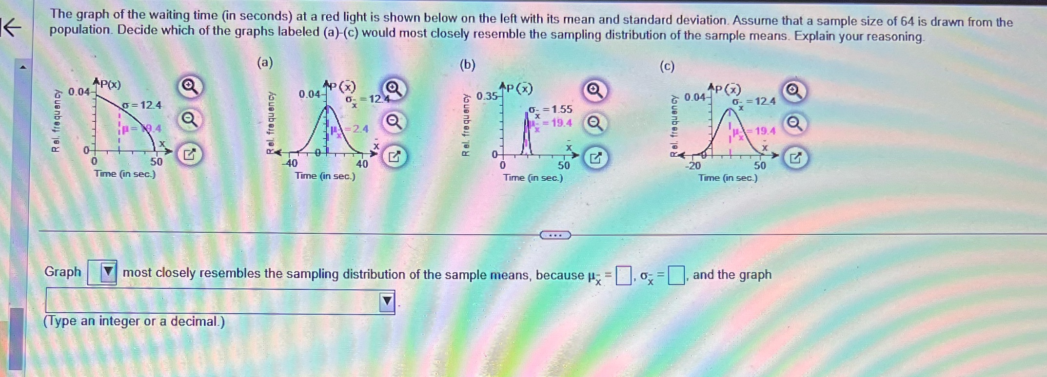
The graph of the waiting time (in seconds) at a red light is shown below on the left with its mean and standard deviation.

The graph of the waiting time (in seconds) at a red light is shown below on the left with its mean and standard deviation. Assume that a sample size of 64 is drawn from the population. Decide which of the graphs labeled (a)-(c) would most closely resemble the sampling distribution of the sample means. Explain your reasoning. *P(x) 0.04- 0-12.4 iP=19.4 (a) P(X) 0.04- 0-12.4 (b) AP(x) 0.35 0- = 1.55 =19.4 (c) AP(x) 0.04- -=12.4 19.4 0 G 0- G 50 -40 40 0 50 Time (in sec.) Time (in sec.) -20 Time (in sec.) 50 Time (in sec.) Graph most closely resembles the sampling distribution of the sample means, because - =, =, and the graph (Type an integer or a decimal.)
Step by Step Solution
There are 3 Steps involved in it
Step: 1

Get Instant Access to Expert-Tailored Solutions
See step-by-step solutions with expert insights and AI powered tools for academic success
Step: 2

Step: 3

Ace Your Homework with AI
Get the answers you need in no time with our AI-driven, step-by-step assistance
Get Started


