Answered step by step
Verified Expert Solution
Question
1 Approved Answer
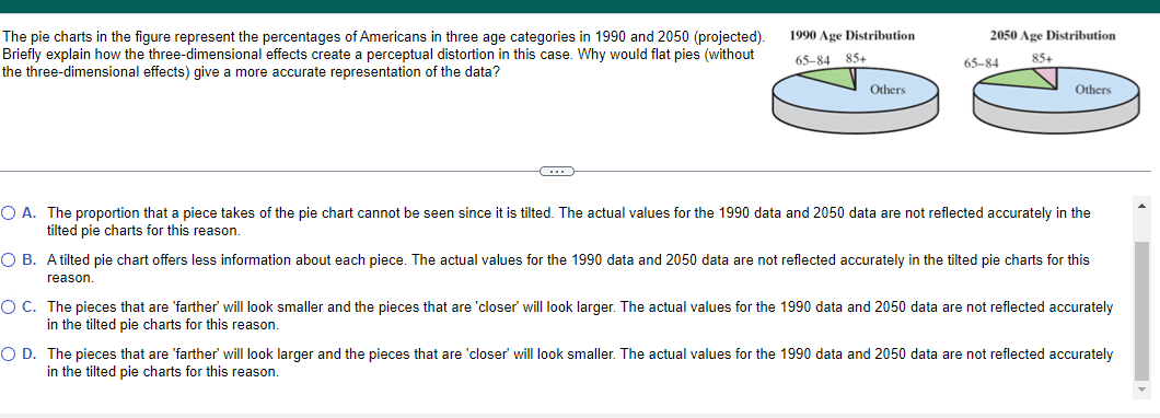
The pie charts in the figure represent the percentages of Americans in three age categories in 1990 and 2050 (projected). 1990 Age Distribution 2050 Age
Step by Step Solution
There are 3 Steps involved in it
Step: 1

Get Instant Access to Expert-Tailored Solutions
See step-by-step solutions with expert insights and AI powered tools for academic success
Step: 2

Step: 3
Ace Your Homework with AI
Get the answers you need in no time with our AI-driven, step-by-step assistance
Get Started