Answered step by step
Verified Expert Solution
Question
1 Approved Answer
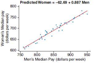
The scatterplot shows the median weekly earning (by quarter) for men and women in the United States for the years from 2005 through 2017. The
The scatterplot shows the median weekly earning (by quarter) for men and women in the United States for the years from 2005 through 2017. The correlation is 0.974.
a. Use the scatterplot to estimate the median weekly income for women in a quarter in which the median pay for men is about $800.
a. Use the scatterplot to estimate the median weekly income for women in a quarter in which the median pay for men is about $800.
b. Use the regression equation shown above the graph to get a more precise estimate of the median pay for women in a quarter in which the median pay for men is $850.
c. What is the slope of the regression equation? Interpret the slope of the regression equation.
d. What is the y-intercept of the regression equation? Interpret the y-intercept of the regression equation or explain why it would be inappropriate to do so.

Predicted Women = -62.69 + 0.887 Men 800 - 750 700 650 600 750 800 850 900 950 Men's Median Pay (dollars per week) Women's Median pay (dollars per week)
Step by Step Solution
★★★★★
3.48 Rating (165 Votes )
There are 3 Steps involved in it
Step: 1
Solution D Using Scatler Plot median weekly have to ...
Get Instant Access to Expert-Tailored Solutions
See step-by-step solutions with expert insights and AI powered tools for academic success
Step: 2

Step: 3

Ace Your Homework with AI
Get the answers you need in no time with our AI-driven, step-by-step assistance
Get Started


