

Question
This assignment is very hard for me, and I am not sure if I am explaining some of this in the correct terms. Especially the

This assignment is very hard for me, and I am not sure if I am explaining some of this in the correct terms. Especially the histogram and scatter plot in the beginning. This is way too technical for me but I have to have this class for my minor. Have I articulated the data correctly? I am sure it is crude but I just want to makes sure the histogram and scatterplot portion is correct. I took out the two tables my professor asked me to remove and inserted different ones, but his comment is attached.
.............................
Our organization, the CDC, has released data on syphilis from time frame of 1984 - 2014. I want to use the data set to evaluate the risks of contracting syphilis in men vs. women in the United States. My research question is, "Is there a statistically significant risk of syphilis for men vs women in the United States?"First, I must make an appropriate model that can estimate the risks for the 2 genders.Iwill examine the data using a linear regression with an ? of .05 to make a model. My statistical questions evaluate Gender and Population and are as follows:
- Nullhypothesis-HO:?gender= 0
- Alternativehypothesis-HA:?gender?0
- Nullhypothesis-HO:?population= 0
- Alternativehypothesis-HA:?population?0
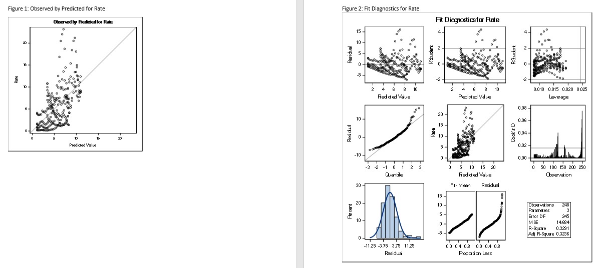
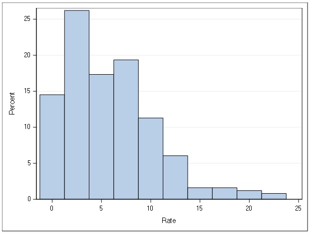
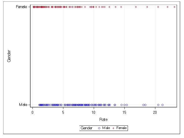
The data used for this analysis was gathered from CDC using the Wonder tool (CDC). I ran a scatter plot (Table 4) and noted that the data points form a straight line, meaning that there is a correlation between the two variables. The Histogram (Table 3) is skewed to the right/ positively scewed. I ran a Correlation Analysis (Table 1) that contained 2 variables, Population and Rate, the Coefficients, N=248.My findings were that there are negative correlations with Population and Rate. Therefore, I used Rate in my model. I used SAS to run a Linear Regression. My number of observations read and used are the same, 248, indicating I have no missing information. I used 1 classification value, which was Gender. Gender has 2 values. I observed in the Analysis of Variance that the F-value is 60.08 and the P-value is <.0001 making it statistically significant. the r-square is and root mse values are drawn from a normally distributed population i observed fit diagnostics for rate to see that model sound.>
The top left graph should check the difference between the actual value and the predictive value. The residual, when plotted against the predictive value, should have a random pattern. I noted that there is a U-pattern, which is indicative of a possible systematic error in my data set. The two bottom normality plots make sure the data points are normally distributed. The histogram follows a bell-shaped curve, which means that the variable is normally distributed. The fit mean plot should only be a diagonal line. I noted that the residual doesn't follow this diagonal pattern. This demonstrates that the variables are possibly afflicted by the systematic error.
The data used for this analysis was gathered from CDC using the Wonder tool (CDC). I downloaded a Data Set, and started with 8 attributes: Disease, Year, Gender, Count, Population, and Rate per 100,000. I chose to reduce the attributes in the Data Set to 4: Gender, Count, Population, and Rate. The Data Set held 248 Records. My Linear Regression ran Rate as a Dependable Variable, Gender as the Independent Variable, and Count and Population as the Constant Variables.
The p-value are all
Nullhypothesis-HO:?gender= 0
Alternativehypothesis-HA:?gender?0
Nullhypothesis-HO:?population= 0
Alternativehypothesis-HA:?population?0
I reject the null hypothesis. Nullhypothesis-HO:?count= 0 Alternativehypothesis-HA:?count?0 cannot be answered because there needs to be an ANOVA test.R-Squared ranges from 0 to 1 and it shows the percentage of variance. The R-Squared value was 0.329, indicating that 32% of the variance is explained. The Root MSE Value, which indicates the regular size of error, was 3.831.
The parameter estimate (Table 2) gives the linear equation to calculate the best estimate of syphilis rate if given a set of predictors - also known as independent variables. The estimated model via a multiple regression analysis is:
y^?=?1.8310?17(Population)?1.445(Female)
The y-intercept is the base value of the equation assuming all other predictors are zero - which is 32.067. We must note that the variable 'gender' is a dummy variable since this is a qualitative variable - you either are a 'male' or a 'female'. Therefore, for females, the variable 'female' is replaced by 1 and for males, the variable "female" is replaced by 0. The variable 'population' is qualitative, so it can be replaced by a counted number. Since all variables resulted in a p
The top left graph is a plot of the actual value and the predictive value. The residual, when plotted against the predictive value, should have a random pattern. I noted that there is a U-pattern, which is indicative of a possible systematic error in my dataset. The two bottom normality plots make sure the predicted values are normally distributed. The histogram follows a bell-shaped curve, which means that such predicted values are normally distributed. The fit mean plot should only be a diagonal line. I noted that the residual doesn't follow this diagonal pattern. This demonstrates that the variables are possibly afflicted by the systematic error, but given the nature of the data and how syphilis affects certain population subgroups more predominantly, these patterns can be expected. Further analyses are to investigate how additional sociodemographic factors may predict syphilis rate - such as schooling level, etc.
All in all, we reject the null hypothesis. We have sufficient evidence that population size and female gender can significantly predict the syphilis rate in the population.
One course of action that can be taken in the prevention of syphilis in either gender is education on how it spreads. This can be done by healthcare providers and public health departments in collaboration with state departments of public health. A second course of action is to educate on the signs, symptoms, and treatments for syphilis, and where to get treatment, to help stop it from spreading. A third course of action is to include a public health prevention and wellness class each year in schools for grades 6 - 12 to help children understand infectious disease.
Table 1: Correlation Analysis Table
PearsonCorrelationCoefficients,N=248 | ||
|---|---|---|
Population | Rate | |
Population | 1.00000 | -0.553 |
Rate | -0.55312 | 1.00000 |
Table 2: Parameter Estimates
Parameter Estimates | ||||||||
|---|---|---|---|---|---|---|---|---|
Variable | Label | DF | Parameter Estimate | Standard Error | tValue | Pr>|t| | 95% Confidence Limits | |
Intercept | Intercept | B | 32.067 | 2.592 | 12.37 | <.0001> | 26.961 | 37.174 |
Population | Population | 1 | -1.839 | 1.887 | -9.75 | <.0001> | -2.211 | -1.468 |
Gender Female | Gender Female | B | -1.444 | 0.497 | -2.91 | 0.004 | -2.42393 | -0.465 |
Gender Male | Gender Male | 0 | 0 | . | . | . | . | . |


Step by Step Solution
There are 3 Steps involved in it
Step: 1

Get Instant Access to Expert-Tailored Solutions
See step-by-step solutions with expert insights and AI powered tools for academic success
Step: 2

Step: 3
Ace Your Homework with AI
Get the answers you need in no time with our AI-driven, step-by-step assistance
Get Started
Mathematics In Middle And Secondary School A Problem Solving Approach
Authors: Alexander Karp, Nicholas Wasserman
1st Edition
1623968143, 9781623968144