Answered step by step
Verified Expert Solution
Link Copied!

Question

1 Approved Answer

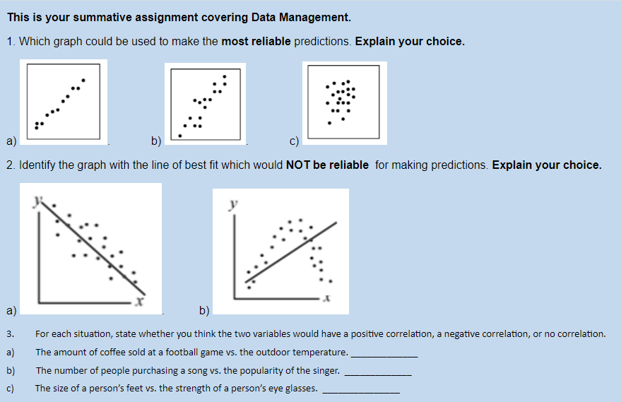
This is your summative assignment covering Data Management. 1. Which graph could be used to make the most reliable predictions. Explain your choice. a) b)
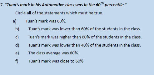
image text in transcribedimage text in transcribed

image text in transcribedimage text in transcribedimage text in transcribedimage text in transcribed
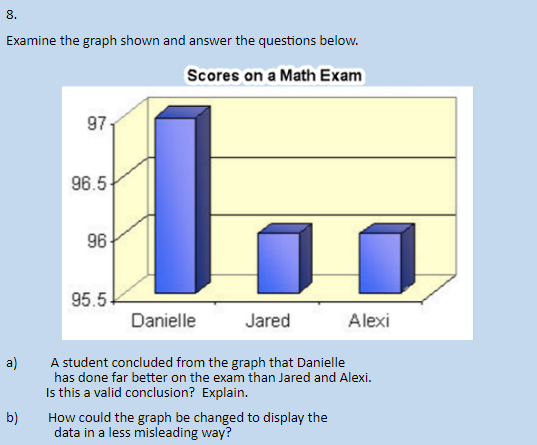
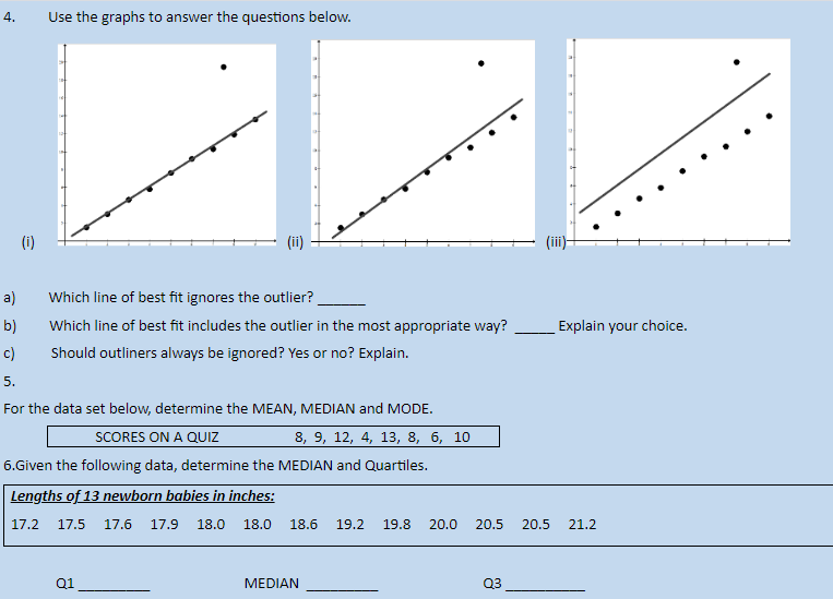
This is your summative assignment covering Data Management. 1. Which graph could be used to make the most reliable predictions. Explain your choice. a) b) 2. Identify the graph with the line of best fit which would NOT be reliable for making predictions. Explain your choice. a) b) 3. For each situation, state whether you think the two variables would have a positive correlation, a negative correlation, or no correlation. a) The amount of coffee sold at a football game vs. the outdoor temperature. b) The number of people purchasing a song vs. the popularity of the singer. C) The size of a person's feet vs. the strength of a person's eye glasses.4. Use the graphs to answer the questions below. (i) (ii) (iii) a) Which line of best fit ignores the outlier? b) Which line of best fit includes the outlier in the most appropriate way? Explain your choice. C) Should outliners always be ignored? Yes or no? Explain. 5. For the data set below, determine the MEAN, MEDIAN and MODE. SCORES ON A QUIZ 8, 9, 12, 4, 13, 8, 6, 10 6. Given the following data, determine the MEDIAN and Quartiles. Lengths of 13 newborn babies in inches: 17.2 17.5 17.6 17.9 18.0 18.0 18.6 19.2 19.8 20.0 20.5 20.5 21.2 Q1 MEDIAN Q37. "Tuan's mark in his Automotive class was in the 60" percentile. Circle all of the statements which must be true. a) Tuan's mark was 60%. b) Tuan's mark was lower than 60% of the students in the class. c) Tuan's mark was higher than 60% of the students in the class. d) Tuan's mark was lower than 40% of the students in the class. e) The class average was 60%. Tuan's mark was close to 60%8. Examine the graph shown and answer the questions below. Scores on a Math Exam 97 96.5 96- 95.5 Danielle Jared Alexi A student concluded from the graph that Danielle has done far better on the exam than Jared and Alexi. Is this a valid conclusion? Explain. b) How could the graph be changed to display the data in a less misleading way
Step by Step Solution

There are 3 Steps involved in it

Step: 1

blur-text-image

Get Instant Access to Expert-Tailored Solutions

See step-by-step solutions with expert insights and AI powered tools for academic success

Step: 2

blur-text-image

Step: 3

blur-text-image

Ace Your Homework with AI

Get the answers you need in no time with our AI-driven, step-by-step assistance

Get Started

Recommended Textbook for

An Introduction To Categorical Data Analysis

Authors: Alan Agresti

2nd Edition

0470653205, 9780470653203

More Books

Students also viewed these Mathematics questions