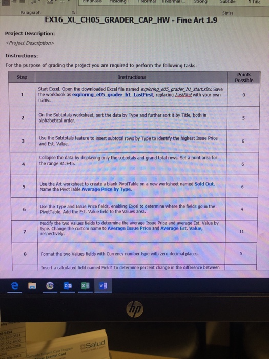
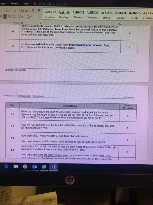
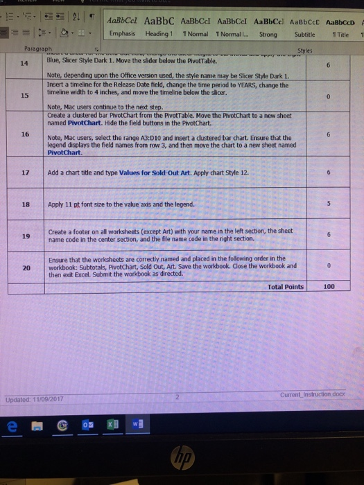
Title Paragraph Styles EX16_XL CHO5_GRADER CAP HW - Fine Art 1.9 Project Description: Project Description> Instructions: For the purpose of grading the project you are required to perform the following tasks: Step Instructions Start Excel. Open the downloaded Excel file named exploring eos grader hi start.xlsx. Save 1 the workbook as exploring e05 grader h1 lastFirst, replacing Lastirst with your own On the Subtotals worksheet, sort the data by Type and further sort it by Title, both in alphabetical order. Use the Subtotals feature to insert subtotall rows by Type to identify the highest Issue Price and Est. Value. Collapse the data by displaying only the subtotals and grand total rows. Set a print area for the range B1:E45 Use the Art worksheet to create a blank PivotTable on a new worksheet named Sold Out Name the PivotTable Average Price by Type. Use the Type and Issue Price fields, enabling Excel to determine where the fields go in the PivotTable. Add the Est. Value field to the Values area. Modify the two Values fields to determine the average Issue Price and average Est. Value by type. Change the custom name to Average Issue Price and Average Est. Value, 7 respectively Format the two Values fields with Currency number type with zero decimal places. Insert a calculated field named Fieldi to determine percent change in the dlifference between 8:9454 Salud lings Review View AaBbCcl AaBbC AaBbCcl AaBbCcl AaBbCel AaBbcec AaBbccD AaBbC Emphasis Heading1 1 Normal 1 Normal I.. Strong Subtitle Title 1 No Spa Pasagraph Styles Insert a calculated field named Fiedi to determine percent change in the difference between the two values, Est. Value and Issue Price. Move the calulated field up so that it displays 9 in Column C (Hint: Click on the drop-down option of the field name in the PvotTable Fields pane, and then dlick Move Up). ne PeraCge a Vabue Apoby Percentage number format with two deamal places. Updated. 11/09/20117 Current Instruction.docx Office 2016-myitlebcgrader-Iestructions Excel Step Instructions Points Select the range 83:03 and apply these formats: wrap text and Align Right horizontal alignment. Set the height of Row 3 to 60 and set the width of Columns 8 through D to 10. 11 (Columns B:D). Type Iype of Art in cell A3 and Average of All Art in cell A1i. Move the Sold Out field from the field list to the Filters area. Set a filter to display only sold 12 out art (indicated by Yes). Apply Light Blue, Pivot Style Light 23 and display banded columns. Note, depending upon Office version used, style name may be Pivot Style Light 23 Insert a slicer for the Sold Out field, change the slicer height to 1.5 inches and apply the Light Blue, Slicer Style Dark 1. Move the slider below the PivotTable. Note, depending upon the Office version used, the style name may be Slicer Style Dark 1. Incert a timeline for tha Relaase nate fiold hanne tha time narind to YFARS channe tha 13 14 e@0 wI Sa Emphasis Heading 1 1 Normal T Normal I... Strong Subtitle Title 1 Paragraph Styles 14 Blue, Slicer Style Dark 1. Move the slider below the PivotTable. Note, depending upon the Office version used, the style name may be Slicer Style Dark 1 Insert a timeline for the Release Date field, change the time period to YEARS, change the timeline width to 4 inches, and move the timeline below the slicer. 15 Note, Mac users continue to the next step Create a dustered bar PivotChart from the PivotTable. Move the PivotChart to a new sheet named PivotChart. Hide the field buttons in the PivotChart. 16 Note, Mac users, select the range A3:D10 and insert a clustered bar chart. Ensure that the legend displays the field names from row 3, and then move the chart to a new sheet named PivotChart 17 Add a chart title and type Values for Sold-Out Art. Apply chart Style 12 18 Apply 11 pt font size to the value axis and the legend. Create a footer on all worksheets (except Art) with your name in the left section, the sheet 9name code in the center section, and the file name code in the right section. Ensure that the worksheets are correctly named and placed in the following order in the 20 workbook: Subtotals, PivotChart, Sold Out, Art. Save the workbook. Close the workbook and then exit Excel. Submit the workbook as directed. Total Points100 Current Instruction.docx Updated: 11/09/2017 rA Title Paragraph Styles EX16_XL CHO5_GRADER CAP HW - Fine Art 1.9 Project Description: Project Description> Instructions: For the purpose of grading the project you are required to perform the following tasks: Step Instructions Start Excel. Open the downloaded Excel file named exploring eos grader hi start.xlsx. Save 1 the workbook as exploring e05 grader h1 lastFirst, replacing Lastirst with your own On the Subtotals worksheet, sort the data by Type and further sort it by Title, both in alphabetical order. Use the Subtotals feature to insert subtotall rows by Type to identify the highest Issue Price and Est. Value. Collapse the data by displaying only the subtotals and grand total rows. Set a print area for the range B1:E45 Use the Art worksheet to create a blank PivotTable on a new worksheet named Sold Out Name the PivotTable Average Price by Type. Use the Type and Issue Price fields, enabling Excel to determine where the fields go in the PivotTable. Add the Est. Value field to the Values area. Modify the two Values fields to determine the average Issue Price and average Est. Value by type. Change the custom name to Average Issue Price and Average Est. Value, 7 respectively Format the two Values fields with Currency number type with zero decimal places. Insert a calculated field named Fieldi to determine percent change in the dlifference between 8:9454 Salud lings Review View AaBbCcl AaBbC AaBbCcl AaBbCcl AaBbCel AaBbcec AaBbccD AaBbC Emphasis Heading1 1 Normal 1 Normal I.. Strong Subtitle Title 1 No Spa Pasagraph Styles Insert a calculated field named Fiedi to determine percent change in the difference between the two values, Est. Value and Issue Price. Move the calulated field up so that it displays 9 in Column C (Hint: Click on the drop-down option of the field name in the PvotTable Fields pane, and then dlick Move Up). ne PeraCge a Vabue Apoby Percentage number format with two deamal places. Updated. 11/09/20117 Current Instruction.docx Office 2016-myitlebcgrader-Iestructions Excel Step Instructions Points Select the range 83:03 and apply these formats: wrap text and Align Right horizontal alignment. Set the height of Row 3 to 60 and set the width of Columns 8 through D to 10. 11 (Columns B:D). Type Iype of Art in cell A3 and Average of All Art in cell A1i. Move the Sold Out field from the field list to the Filters area. Set a filter to display only sold 12 out art (indicated by Yes). Apply Light Blue, Pivot Style Light 23 and display banded columns. Note, depending upon Office version used, style name may be Pivot Style Light 23 Insert a slicer for the Sold Out field, change the slicer height to 1.5 inches and apply the Light Blue, Slicer Style Dark 1. Move the slider below the PivotTable. Note, depending upon the Office version used, the style name may be Slicer Style Dark 1. Incert a timeline for tha Relaase nate fiold hanne tha time narind to YFARS channe tha 13 14 e@0 wI Sa Emphasis Heading 1 1 Normal T Normal I... Strong Subtitle Title 1 Paragraph Styles 14 Blue, Slicer Style Dark 1. Move the slider below the PivotTable. Note, depending upon the Office version used, the style name may be Slicer Style Dark 1 Insert a timeline for the Release Date field, change the time period to YEARS, change the timeline width to 4 inches, and move the timeline below the slicer. 15 Note, Mac users continue to the next step Create a dustered bar PivotChart from the PivotTable. Move the PivotChart to a new sheet named PivotChart. Hide the field buttons in the PivotChart. 16 Note, Mac users, select the range A3:D10 and insert a clustered bar chart. Ensure that the legend displays the field names from row 3, and then move the chart to a new sheet named PivotChart 17 Add a chart title and type Values for Sold-Out Art. Apply chart Style 12 18 Apply 11 pt font size to the value axis and the legend. Create a footer on all worksheets (except Art) with your name in the left section, the sheet 9name code in the center section, and the file name code in the right section. Ensure that the worksheets are correctly named and placed in the following order in the 20 workbook: Subtotals, PivotChart, Sold Out, Art. Save the workbook. Close the workbook and then exit Excel. Submit the workbook as directed. Total Points100 Current Instruction.docx Updated: 11/09/2017 rA


