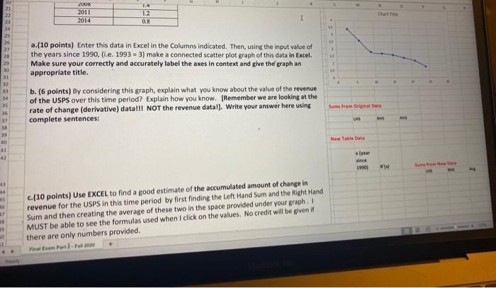
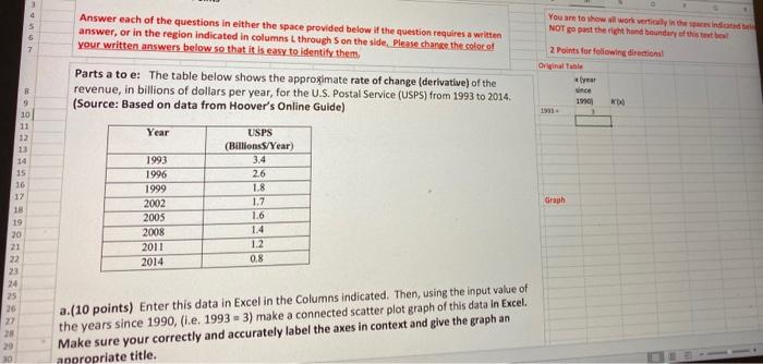
21 2008 2011 2014 1.4. 1.2 0.8 1 22 34 25 26 27 28 29 30 31 32 33 34 35 36 32 a.(10 points) Enter this data in Excel in the Columns indicated. Then, using the input value of the years since 1990, (i.e. 1993 = 3) make a connected scatter plot graph of this data in Excel Make sure your correctly and accurately label the axes in context and give the graph an appropriate title. LI 1 b. (6 points) By considering this graph, explain what you know about the value of the revenue of the USPS over this time period? Explain how you know. [Remember we are looking at the rate of change (derivative) datalll NOT the revenue datal). Write your answer here using complete sentences: Sums Prom Original Data LHS RH New Table Data 29 40 41 42 year ince 19101 17 c.(10 points) Use EXCEL to find a good estimate of the accumulated amount of change in revenue for the USPS in this time period by first finding the Left Hand Sum and the Right Hand Sum and then creating the average of these two in the space provided under your graph. MUST be able to see the formulas used when I click on the values. No credit will be given if there are only numbers provided. in am Fall 2010 10 0 1 You are to show all work with inte NOT go post the right hand boundary of this text 7 2 points for following direction Original Table Kle 1910 B 9 10 11 12 13 14 15 16 17 18 19 20 21 22 23 24 25 26 Answer each of the questions in either the space provided below if the question requires a written answer, or in the region indicated in columns L through on the side. Please change the color of your written answers below so that it is easy to identify them Parts a to e: The table below shows the approximate rate of change (derivative) of the revenue, in billions of dollars per year, for the U.S. Postal Service (USPS) from 1993 to 2014 (Source: Based on data from Hoover's Online Guide) Year USPS (BillionsS/Year) 1993 3.4 1996 2.6 1999 1.8 2002 1.7 2005 1.6 2008 1.4 2011 1.2 2014 0.8 Graph 28 20 a. (10 points) Enter this data in Excel in the Columns indicated. Then, using the input value of the years since 1990, (.e. 1993 = 3) make a connected scatter plot graph of this data in Excel. Make sure your correctly and accurately label the axes in context and give the graph an appropriate title. 10


