Use the following Information from Excel.
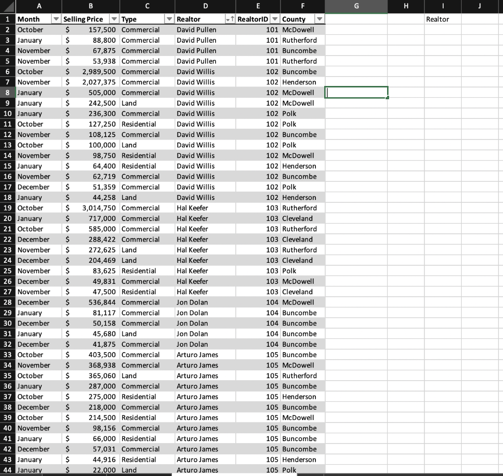
Then
Summarize each countys cumulative sales during the four-month period:
a. Using PivotTable, calculate the cumulative sales for each county during the four-month period.
b. Using PivotChart, create a bar chart that shows each countys cumulative sales during the four-month period.
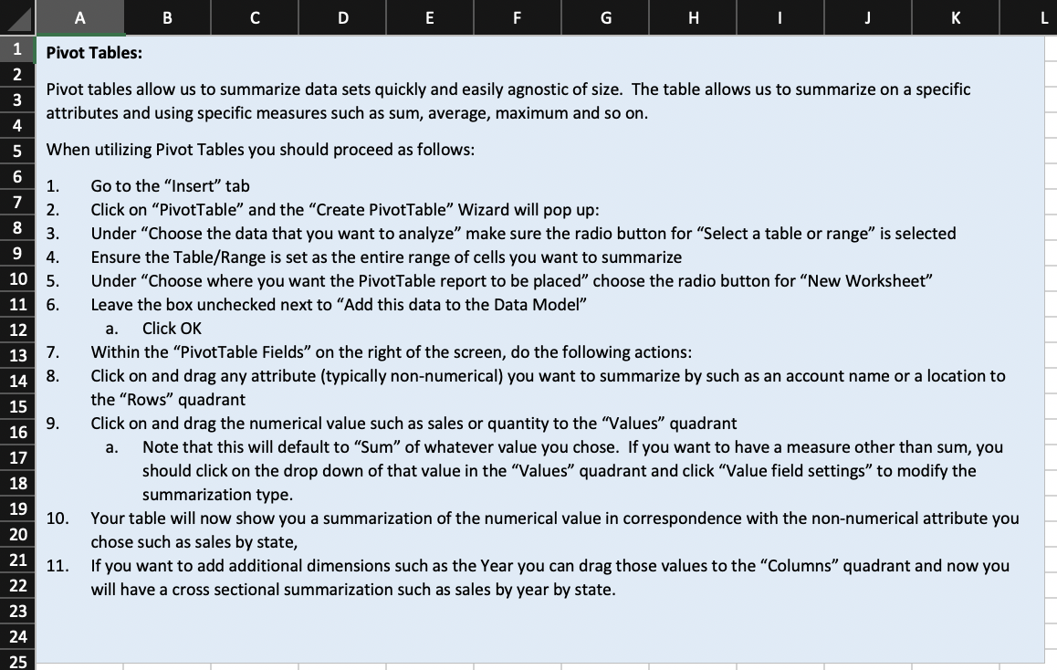
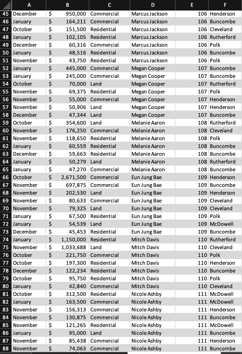
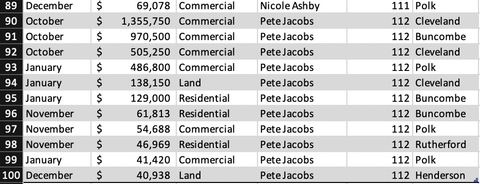
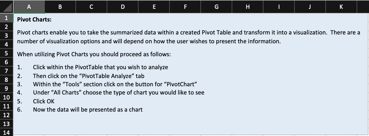
\begin{tabular}{|l|l|r|r|l|l|l|l|} \hline 89 & December & $ & 69,078 & Commercial & Nicole Ashby & 11 & \multicolumn{1}{|l|}{ Polk } \\ \hline 90 & October & $ & 1,355,750 & Commercial & Pete Jacobs & 112 Cleveland \\ \hline 91 & October & $ & 970,500 & Commercial & Pete Jacobs & 112 & Buncombe \\ \hline 92 & October & $ & 505,250 & Commercial & Pete Jacobs & 112 Cleveland \\ \hline 93 & January & $ & 486,800 & Commercial & Pete Jacobs & 112 & Polk \\ \hline 94 & January & $ & 138,150 & Land & Pete Jacobs & 112 Cleveland \\ \hline 95 & January & $ & 129,000 & Residential & Pete Jacobs & 112 & Buncombe \\ \hline 96 & November & $ & 61,813 & Residential & Pete Jacobs & 112 Buncombe \\ \hline 97 & November & $ & 54,688 & Commercial & Pete Jacobs & 112 Polk \\ \hline 98 & November & $ & 46,969 & Residential & Pete Jacobs & 112 Rutherford \\ \hline 99 & January & $ & 41,420 & Commercial & Pete Jacobs & 112 & Polk \\ \hline 100 & December & $ & 40,938 & Land & Pete Jacobs & 112 Henderson \\ \hline \end{tabular} Pivot charts enable you to take the summarized data within a created Pivot Table and transform it into a visualization. There are a number of visualization options and will depend on how the user wishes to present the information. When utilizing Pivot Charts you should proceed as follows: 1. Click within the PivotTable that you wish to analyze 2. Then click on the "PivotTable Analyze" tab 3. Within the "Tools" section click on the button for "PivotChart" 4. Under "All Charts" choose the type of chart you would like to see 5. Click OK 6. Now the data will be presented as a chart Pivot tables allow us to summarize data sets quickly and easily agnostic of size. The table allows us to summarize on a specific attributes and using specific measures such as sum, average, maximum and so on. When utilizing Pivot Tables you should proceed as follows: 1. Go to the "Insert" tab 2. Click on "PivotTable" and the "Create PivotTable" Wizard will pop up: 3. Under "Choose the data that you want to analyze" make sure the radio button for "Select a table or range" is selected 4. Ensure the Table/Range is set as the entire range of cells you want to summarize 5. Under "Choose where you want the PivotTable report to be placed" choose the radio button for "New Worksheet" 6. Leave the box unchecked next to "Add this data to the Data Model" a. Click OK 7. Within the "PivotTable Fields" on the right of the screen, do the following actions: 8. Click on and drag any attribute (typically non-numerical) you want to summarize by such as an account name or a location to the "Rows" quadrant 9. Click on and drag the numerical value such as sales or quantity to the "Values" quadrant a. Note that this will default to "Sum" of whatever value you chose. If you want to have a measure other than sum, you should click on the drop down of that value in the "Values" quadrant and click "Value field settings" to modify the summarization type. 10. Your table will now show you a summarization of the numerical value in correspondence with the non-numerical attribute yo chose such as sales by state, 11. If you want to add additional dimensions such as the Year you can drag those values to the "Columns" quadrant and now you will have a cross sectional summarization such as sales by year by state. \begin{tabular}{|l|l|r|r|l|l|l|l|} \hline 89 & December & $ & 69,078 & Commercial & Nicole Ashby & 11 & \multicolumn{1}{|l|}{ Polk } \\ \hline 90 & October & $ & 1,355,750 & Commercial & Pete Jacobs & 112 Cleveland \\ \hline 91 & October & $ & 970,500 & Commercial & Pete Jacobs & 112 & Buncombe \\ \hline 92 & October & $ & 505,250 & Commercial & Pete Jacobs & 112 Cleveland \\ \hline 93 & January & $ & 486,800 & Commercial & Pete Jacobs & 112 & Polk \\ \hline 94 & January & $ & 138,150 & Land & Pete Jacobs & 112 Cleveland \\ \hline 95 & January & $ & 129,000 & Residential & Pete Jacobs & 112 & Buncombe \\ \hline 96 & November & $ & 61,813 & Residential & Pete Jacobs & 112 Buncombe \\ \hline 97 & November & $ & 54,688 & Commercial & Pete Jacobs & 112 Polk \\ \hline 98 & November & $ & 46,969 & Residential & Pete Jacobs & 112 Rutherford \\ \hline 99 & January & $ & 41,420 & Commercial & Pete Jacobs & 112 & Polk \\ \hline 100 & December & $ & 40,938 & Land & Pete Jacobs & 112 Henderson \\ \hline \end{tabular} Pivot charts enable you to take the summarized data within a created Pivot Table and transform it into a visualization. There are a number of visualization options and will depend on how the user wishes to present the information. When utilizing Pivot Charts you should proceed as follows: 1. Click within the PivotTable that you wish to analyze 2. Then click on the "PivotTable Analyze" tab 3. Within the "Tools" section click on the button for "PivotChart" 4. Under "All Charts" choose the type of chart you would like to see 5. Click OK 6. Now the data will be presented as a chart Pivot tables allow us to summarize data sets quickly and easily agnostic of size. The table allows us to summarize on a specific attributes and using specific measures such as sum, average, maximum and so on. When utilizing Pivot Tables you should proceed as follows: 1. Go to the "Insert" tab 2. Click on "PivotTable" and the "Create PivotTable" Wizard will pop up: 3. Under "Choose the data that you want to analyze" make sure the radio button for "Select a table or range" is selected 4. Ensure the Table/Range is set as the entire range of cells you want to summarize 5. Under "Choose where you want the PivotTable report to be placed" choose the radio button for "New Worksheet" 6. Leave the box unchecked next to "Add this data to the Data Model" a. Click OK 7. Within the "PivotTable Fields" on the right of the screen, do the following actions: 8. Click on and drag any attribute (typically non-numerical) you want to summarize by such as an account name or a location to the "Rows" quadrant 9. Click on and drag the numerical value such as sales or quantity to the "Values" quadrant a. Note that this will default to "Sum" of whatever value you chose. If you want to have a measure other than sum, you should click on the drop down of that value in the "Values" quadrant and click "Value field settings" to modify the summarization type. 10. Your table will now show you a summarization of the numerical value in correspondence with the non-numerical attribute yo chose such as sales by state, 11. If you want to add additional dimensions such as the Year you can drag those values to the "Columns" quadrant and now you will have a cross sectional summarization such as sales by year by state