Question
years of education from 8 through 24 Finally create a chart showing the BLS data as a scatterplot and add an auto trendline this chart


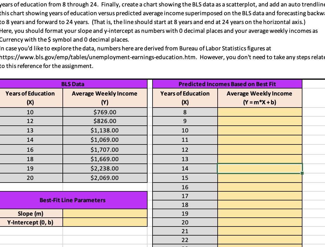
years of education from 8 through 24 Finally create a chart showing the BLS data as a scatterplot and add an auto trendline this chart showing years of education versus predicted average income superimposed on the BLS data and forecasting backwa to 8 years and forward to 24 years That is the line should start at 8 years and end at 24 years on the horizontal axis Here you should format your slope and y intercept as numbers with 0 decimal places and your average weekly incomes as Currency with the symbol and 0 decimal places In case you d like to explore the data numbers here are derived from Bureau of Labor Statistics figures at https www bls gov emp tables unemployment earnings education htm to this reference for the assignment Years of Education X 10 12 13 14 16 18 19 20 BLS Data Slope m Y Intercept 0 b Average Weekly Income Y 769 00 826 00 1 138 00 1 069 00 1 707 00 1 669 00 2 238 00 2 069 00 Best Fit Line Parameters Predicted Incomes Based on Best Fit Years of Education Average Weekly Income X Y m X b 8 9 10 11 12 13 14 15 16 17 However you don t need to take any steps relate 18 19 20 21 22
Step by Step Solution
There are 3 Steps involved in it
Step: 1

Get Instant Access to Expert-Tailored Solutions
See step-by-step solutions with expert insights and AI powered tools for academic success
Step: 2

Step: 3

Ace Your Homework with AI
Get the answers you need in no time with our AI-driven, step-by-step assistance
Get Started


