

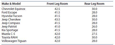
(Scatterplots, Correlation, and the Regression Line) The data from Example 2.17 give the front and rear leg...
Question:
(Scatterplots, Correlation, and the Regression Line) The data from Example 2.17 give the front and rear leg rooms (in inches) for 10 different compact sports utility vehicles
1. If you did not save the Excel spreadsheet from Chapter 2, enter the data into the first three columns of another Excel spreadsheet, using the labels in the table. Highlight the front and rear leg room data (columns B and C), click the Insert tab, select the Scatter icon in the Charts group, and select the first option in the drop-down list. The scatterplot appears as in Figure 3.13(a), and will need to be edited!
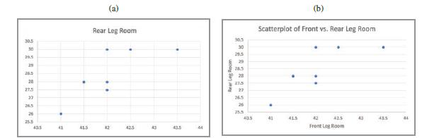
2. Editing the scatterplot: With the scatterplot selected, click on “Quick Layout” in the Chart Layouts group. Find a layout that allows titles on both axes (we chose layout 1)
and select it. Label the axes, remove the “legend entry” and retitle the chart as “Scatterplot of Front vs. Rear Leg Room.” The scatterplot now appears in Figure 3.13(b).
3. To plot the best-fitting line, simply right-click on one of the data points and select Add Trendline. In the Format menu that opens, make sure that the radio button marked “Linear”
is selected, and check the boxes marked “Display Equation on Chart” and “Display R-squared value on Chart.” The final scatterplot is shown in Figure 3.14.
Step by Step Answer:

This question has not been answered yet.
You can Ask your question!

Introduction To Probability And Statistics
ISBN: 9780357114469
15th Edition
Authors: William Mendenhall Iii , Robert Beaver , Barbara Beaver
