

Question: Examine Figure 2-20, Everyone Agrees: Slobs Make Worst Roommates. This is a clustered bar graph because two percentages are given for each response category: responses
Examine Figure 2-20, “Everyone Agrees: Slobs Make Worst Roommates.” This is a clustered bar graph because two percentages are given for each response category: responses from men and responses from women. Comment about how the artistic rendition has slightly changed the format of a bar graph. Do the bars seem to have lengths that accurately reflect the relative percentages of the responses? In your own opinion, does the artistic rendition enhance or confuse the information? Explain. Which characteristic of “worst roommates” does the graphic seem to illustrate? Can this graph be considered a Pareto chart for men? for women? Why or why not? From the information given in the figure, do you think the survey just listed the four given annoying characteristics? Do you think a respondent could choose more than one characteristic? Explain your answer in terms of the percentages given and in terms of the explanation given in the graphic. Could this information also be displayed in one circle graph for men and another for women? Explain.
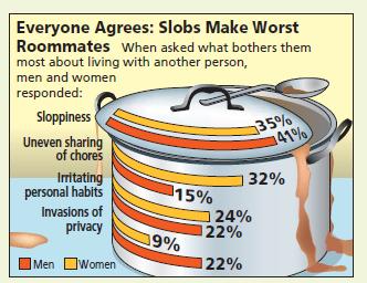
Everyone Agrees: Slobs Make Worst Roommates When asked what bothers them most about living with another person, men and women responded: Sloppiness Uneven sharing of chores Irritating personal habits Invasions of privacy Men Women 15% 19% 124% 22% 122% 35% 41% 32%
Step by Step Solution
3.40 Rating (175 Votes )
There are 3 Steps involved in it
The artistic rendition of this clustered bar graph has slightly changed the format of a bar graph in ... View full answer

Get step-by-step solutions from verified subject matter experts