

Question: The relative frequency table below shows yesterdays closing share price changes for the 100 most actively traded stocks on the NYSE. a. Draw the relative
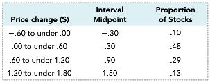
The relative frequency table below shows yesterday’s closing share price changes for the 100 most actively traded stocks on the NYSE.
a. Draw the relative frequency histogram for the data.
b. Use the grouped data table to approximate the mean, the variance and the standard deviation for the data represented.
Interval Midpoint -.30 30 90 1.50 Proportion Price change (S) -.60 to under .00 00 to under.60 60 to under 1.20 1.20 to under 1.80 of Stocks 10 48 .29 13
Step by Step Solution
3.39 Rating (180 Votes )
There are 3 Steps involved in it
a b Estimated Mean 57 Estimate... View full answer

Get step-by-step solutions from verified subject matter experts
Document Format (1 attachment)
486-M-S-D-A (2405).docx
120 KBs Word File