

Light it up! The graph below is a cumulative relative frequency graph showing the lifetimes (in hours)
Question:
Light it up! The graph below is a cumulative relative frequency graph showing the lifetimes
(in hours) of 200 lamps.4
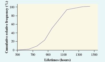
(a) Estimate the 60th percentile of this distribution.
Show your method.
(b) What is the percentile for a lamp that lasted 900 hours?
(c) Draw a histogram that corresponds to this graph.
Step by Step Answer:

This question has not been answered yet.
You can Ask your question!
Related Book For 
Question Posted:
