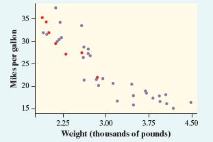
The following graph plots the gas mileage (miles per gallon) of various cars from the same model
Question:
The following graph plots the gas mileage (miles per gallon) of various cars from the same model year versus the weight of these cars in thousands of pounds.
The points marked with red dots correspond to cars made in Japan. From this plot, we may conclude that
(a) there is a positive association between weight and gas mileage for Japanese cars.
(b) the correlation between weight and gas mileage for all the cars is close to 1.
(c) there is little difference between Japanese cars and cars made in other countries.
(d) Japanese cars tend to be lighter in weight than other cars.
(e) Japanese cars tend to get worse gas mileage than other cars.

Step by Step Answer:
Related Book For 

Question Posted:


