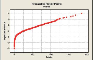
The following Normal probability plot shows the distribution of points scored for the 551 players in the
Question:
The following Normal probability plot shows the distribution of points scored for the 551 players in the 2011–2012 NBA season.

If the distribution of points was displayed in a histogram, what would be the best description of the histogram’s shape?
(a) Approximately Normal
(b) Symmetric but not approximately Normal
(c) Skewed left
(d) Skewed right
(e) Cannot be determined
Step by Step Answer:
Related Book For 

Question Posted:


