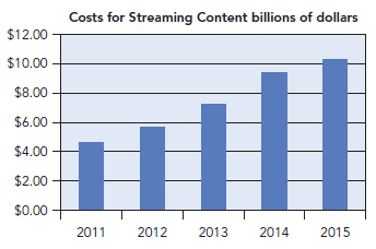
The Wall Street Journal on January 19, 2016, used a chart resembling the following one to illustrate
Question:

Transcribed Image Text:
Costs for Streaming Content billions of dollars $12.00 $10.00 $8.00 $6.00 $4.00 $2.00 $0.00 2011 2013 2014 2015 2012
Fantastic news! We've Found the answer you've been seeking!
Step by Step Answer:
Answer rating: 92% (14 reviews)
No this is not a bar chart in the sense of ...View the full answer

Answered By

Muhammad Umair
I have done job as Embedded System Engineer for just four months but after it i have decided to open my own lab and to work on projects that i can launch my own product in market. I work on different softwares like Proteus, Mikroc to program Embedded Systems. My basic work is on Embedded Systems. I have skills in Autocad, Proteus, C++, C programming and i love to share these skills to other to enhance my knowledge too.
3.50+
1+ Reviews
10+ Question Solved
Related Book For 

Statistics For Business Decision Making And Analysis
ISBN: 9780134497167
3rd Edition
Authors: Robert A. Stine, Dean Foster
Question Posted:
Students also viewed these Mathematics questions
-
The Wall Street Journal reported that the age at first startup for 55% of entrepreneurs was 29 years of age or less and the age at first startup for 45% of entrepreneurs was 30 years of age or more...
-
The Wall Street Journal Subscriber Study showed data on the employment status of subscribers. Sample results corresponding to subscribers of the eastern and western editions are shown here. Use =...
-
The Wall Street Journal's Shareholder Scoreboard tracks the performance of 1000 major U.S. companies (The Wall Street Journal, March 10, 2003). The performance of each company is rated based on the...
-
Picasso Co. issued 5,000 shares of its $1 par common stock, valued at $100,000, to acquire shares of Seurat Company in an all-stock transaction. Picasso paid the investment bankers $35,000 and will...
-
1. Prepare an income statement under throughput costing for the year ended December 31, 2017 for Garvis Company 2. Reconcile the different between the contribution margin and throughput margin for...
-
In a certain city, the daily consumption of water (in millions of liters) follows approximately a gamma distribution with Q = 2 and = 3. If the daily capacity of that city is 9 million liters of...
-
how to build and interpret confidence intervals
-
On September 30, 2017, Ericson Company negotiated a two-year, 1,000,000 dudek loan from a foreign bank at an interest rate of 2 percent per year. It makes interest payments annually on September 30...
-
Equipment was purchased on July 1 for $10,000 with a 5-year useful life and no residual value. a. On the Dec 31 year-end financial statements, please record the depreciation expense. b. After the...
-
An article reports the results of an analysis of salespersons performance level as a function of two factors: task difficulty and effort. Included in the article is the following ANOVA table: a. How...
-
Share of bank loans that are in good standing, 30 days past due, and in default Match this description of variables to a bar chart, Pareto chart, pie chart, or frequency table. Some are counts and...
-
These percentages summarize the responses of 530 senior executives when asked the question, Which strategies have proved successful in promoting a data-driven culture in your organization? Do these...
-
How do you think the supply of labour curve was affected when the UK left the EU?
-
How do I record these entries? January 1: Purchased a fleet of vehicles for $350,000 via a loan from the bank. The trucks have a useful life of six years. The loan is for six years with an interest...
-
How do feedback mechanisms and performance evaluation systems contribute to individual and team development within a corporate context ?
-
How do ideological frameworks underpin political movements, and what is their role in legitimizing or challenging power structures?
-
According to the 8-step communication model, what should one do once the crisis has passed?
-
Who is PGR and what do they do? How much premium did the company (consolidated) write in the most recent complete fiscal year? Was it a good, average, or bad year for them? Comment on the premium...
-
Glens taxable income is $50,000 and he pays income tax of $6,617. If his income were $60,000, he would pay taxes of $8,817. What is Glens marginal tax rate? a. 18.23% b. 22.00% c. 12.00% d. 25.00% e....
-
2. In the circuit given in Figure 2, i,(t) = 5.67cos(5t)A and v (t) = 70.71 cos(5t 60) V a) Find the equivalent load impedance. State whether the load is inductive or capacitive. b) Calculate the...
-
Which has larger variance, the prices of items in a grocery or the prices of cars at a new car dealer? Which has the larger coefficient of variation?
-
In a study of how the environment affects spending, researchers varied the presence of music and scents in a shopping mall. Interviews with shoppers who made unplanned purchases revealed the...
-
The following table summarizes sales by day of the week at a convenience store operated by a major domestic gasoline retailer. The data cover about one year, with 52 values for each day of the week....
-
An 8%, 30-year semi-annual corporate bond was recently being priced to yield 10%. The Macaulay duration for this bond is 10.2 years. What is the bonds modified duration? How much will the price of...
-
Question 7 of 7 0/14 W PIERDERY Current Attempt in Progress Your answer is incorrect Buffalo Corporation adopted the dollar value LIFO retail inventory method on January 1, 2019. At that time the...
-
Cost of debt with fees . Kenny Enterprises will issue a bond with a par value of $1,000, a maturity of twenty years, and a coupon rate of 9.9% with semiannual payments, and will use an investment...

Study smarter with the SolutionInn App


