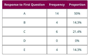
In Example 8.5, we computed the following proportions: Draw a bar chart to visualize this frequency distribution.
Question:
In Example 8.5, we computed the following proportions:

Draw a bar chart to visualize this frequency distribution.
Data from Example 8.5
Recall Example 8.2, in which a teacher recorded the responses on the first question of a multiple choice quiz, with five possible responses (A, B, C, D, and E). The raw data was as follows:

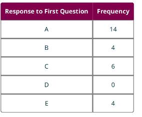
We computed a frequency distribution that looked like this:

Proportion of a category \(=\) Category frequency/Total number of data units Now, let's compute the proportions for each category.
Data from Example 8.2
A teacher records the responses of the class (28 students) on the first question of a multiple choice quiz, with five possible responses ( \(A, B, C, D\), and \(E\) ):

Create a categorical frequency distribution that organizes the responses.
Step by Step Answer:


