

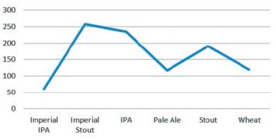
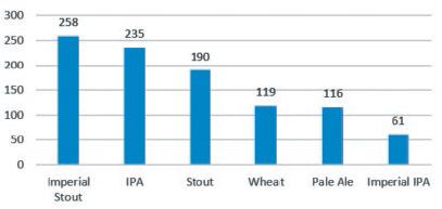
The following four charts represent the exact same data quantity of each beer sold. Which do you
Question:
The following four charts represent the exact same data quantity of each beer sold. Which do you prefer, the line chart or the column chart? Whichever you chose, line or column, which of the pair do you think is the easiest to digest?
a.
b.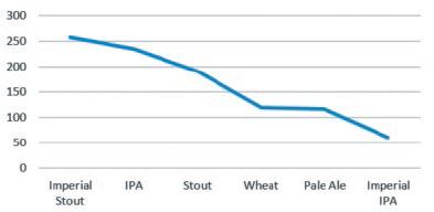
c.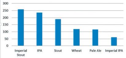
d.
Fantastic news! We've Found the answer you've been seeking!
Step by Step Answer:

Answered By
Atuga Nichasius
I am a Highly skilled Online Tutor has a Bachelor’s Degree in Engineering as well as seven years of experience tutoring students in high school, bachelors and post graduate levels. I have a solid understanding of all learning styles as well as using asynchronous online platforms for tutoring needs. I individualise tutoring for students according to content tutoring needs assessments.
My strengths include good understanding of all teaching methods and learning styles and I am able to convey material to students in an easy to understand manner. I can also assists students with homework questions and test preparation strategies and I am able to help students in math, gre, business , and statistics
I consider myself to have excellent interpersonal and assessment skills with strong teaching presentation verbal and written communication
I love tutoring. I love doing it. I find it intrinsically satisfying to see the light come on in a student's eyes.
My first math lesson that I taught was when I was 5. My neighbor, still in diapers, kept skipping 4 when counting from 1 to 10. I worked with him until he could get all 10 numbers in a row, and match them up with his fingers.
My students drastically improve under my tutelage, generally seeing a two grade level improvement (F to C, C to A, for example), and all of them get a much clearer understanding!
I am committed to helping my students get the top grades no matter the cost. I will take extra hours with you, repeat myself a thousand times if I have to and guide you to the best of my ability until you understand the concept that I'm teaching you.
2+ Reviews
10+ Question Solved
Related Book For 
ISE Data Analytics For Accounting
ISBN: 9781265094454
3rd Edition
Authors: Ryan A. Teeter, Vernon Richardson, Katie L. Terrell
Question Posted:
