

Question: The observational unit and explanatory variable are the same as in Exercise 9.CE.17. Th e dotplots for Exercise 9.CE.19 are for a third set of
The observational unit and explanatory variable are the same as in Exercise 9.CE.17. Th e dotplots for Exercise 9.CE.19 are for a third set of response variables: precipitation (a state€™s annual average), temperature (again, a state€™s annual average), a state€™s high school graduation rate, and a state€™s cremation rate. (Note that all four plots use the same horizontal scale, from 0 to 100.)
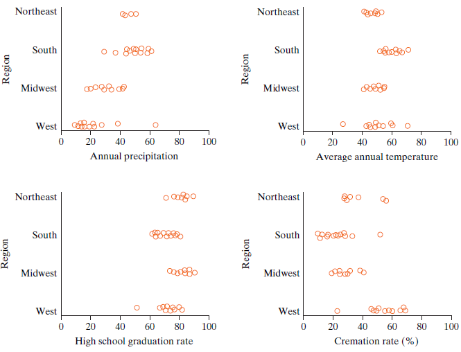
a. Use the dotplots to choose a label according to the value of the mean absolute pairwise difference (MAD), choosing from (a) one of the two smallest, (b) the largest, and (c) in between.
b. Choose a label for each plot based on the size of the variability within groups, choosing from (a) one of the two smallest and (b) one of the two largest.
c. All four p-values are miniscule: The largest of the four is 0.00002. Clearly, the evidence of an association is extremely strong. Discuss the scope of inference for these data sets.
The next set of five questions illustrates what an outlier can do. (We don€™t expect you to know in advance about the effect of an outlier. Rather, these questions ask about your conceptual understanding of the ideas from the chapter.) The key thing to know is that when D.C. is included, the Census Bureau puts it in the South.
d. The two panels in the 9.CE.19(d) dotplots show the number of attorneys per 10,000 people for the U.S. states. The panel on the left is for the 50 states only, excluding D.C. The plot on the right includes D.C. (Note that the horizontal scales differ.) What is it about the District of Columbia that makes it an outlier?
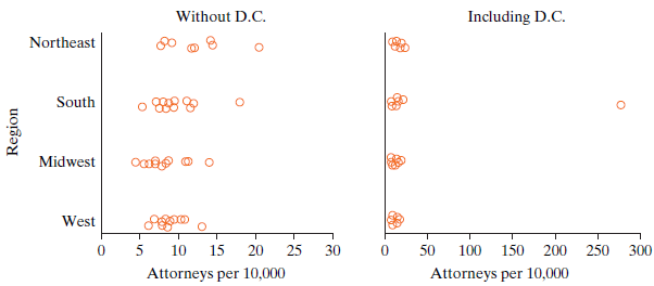
e. If we use the MAD statistic, what will including D.C. do to its value? (Choose one.)
A. Cause it to get a lot larger
B. Cause it to get a lot smaller
C. Leave it pretty much the same
D. No way to tell
f. If we use the MAD statistic, what will including D.C. do to the variability of the null distribution? (Choose one.)
A. Cause it to get a lot larger
B. Cause it to get a lot smaller
C. Leave it pretty much the same
D. No way to tell
g. Can you tell from just the size of the MAD statistic which analysis will give the stronger evidence of a difference (smaller p-value)? Why or why not?
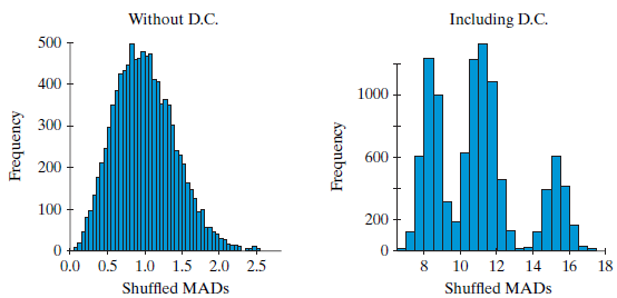
h. The two histograms for 9.CE.19(h) show null distributions for the MAD without D.C. (left panel) and with D.C. included (right panel). Both null distributions come from scrambling to break the association. On the left (no D.C.) the shape is familiar. On the right (outlier included) the distribution has three peaks and looks like nothing you€™ve seen before. Explain where the peaks come from and why scrambling gives only three peaks instead of four when you have four groups.
Northeast Northeast South South Midwest Midwest West B80 o West 20 40 60 80 100 40 60 80 100 Annual precipitation Average annual temperature Northeast Northeast South COmBo South Midwest Midwest West West 20 40 60 80 100 20 40 60 80 100 Cremation rate (%) High school graduation rate uord uord Region Region Without D.C. Including D.C. Northeast South Midwest West 5 10 15 20 25 30 100 150 200 300 Attorneys per 10,000 Attorneys per 10,000 Region
Step by Step Solution
3.56 Rating (174 Votes )
There are 3 Steps involved in it
a The two smallest MADs are for HS Grad and Ave Temp The largest MAD is for Precip Cremation is in b... View full answer

Get step-by-step solutions from verified subject matter experts