

Comparative Line and Bar Charts Suppose that the 105 students whose status was tabulated in Example 1.14
Question:
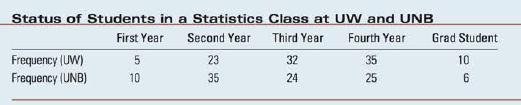
Comparative Line and Bar Charts Suppose that the 105 students whose status was tabulated in Example 1.14 were from the University of Windsor (UW), and that an- other 100 students from an introductory statistics class at the University of New Bruns- wick (UNB) were also interviewed. Table 3.6 shows the status distribution for both sets of students.
1. Enter the data into an Excel spreadsheet just as it appears in the table, including the labels. Highlight the data in the spreadsheet, click the Insert tab and select Line in the Charts group. In the drop-down list, you will see a variety of styles to choose from. Select the first option to produce the line chart.
2. Editing the line chart: Again, you can experiment with the various options in the Chart Layout and Chart Styles groups to change the look of the chart. We have chosen a design that allows a title on the vertical axis; we have added the title and have changed the "line style" of the UW students to a "dashed" style, by double-clicking on that line. The line chart is shown in Figure 3.12(a).
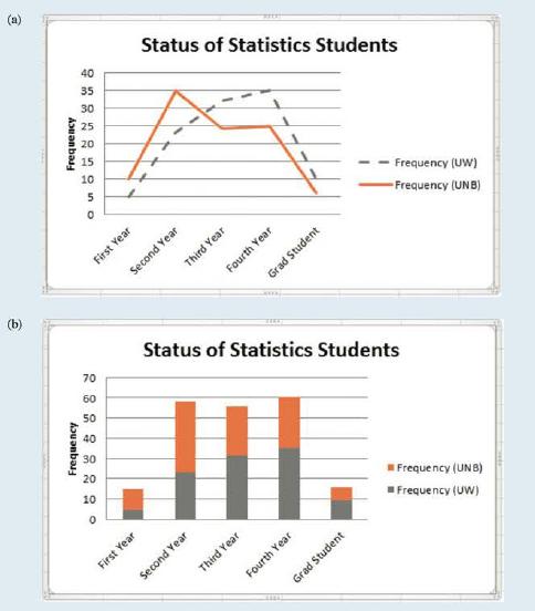
3. Once the line chart has been created, right-click on the chart area and select Change Chart Type. Then choose either Stacked Column or Clustered Column. The comparative bar chart (a stacked bar chart), with the same editing that you chose for the line chart, will appear as shown in Figure 3.12(b).
Step by Step Answer:


Introduction To Probability And Statistics
ISBN: 9780176509804
3rd Edition
Authors: William Mendenhall
