

The data in Table 3.11 are the closing prices for the Dow Jones average for a week
Question:
The data in Table 3.11 are the closing prices for the Dow Jones average for a week in November, 2014.
A. Input this information into two columns in an Excel spreadsheet.
Then, create a line graph using the first column to label the horizontal axis, and the second column as the data to plot. Excel’s automatic setting does not start the vertical axis at zero. Print or save this graph.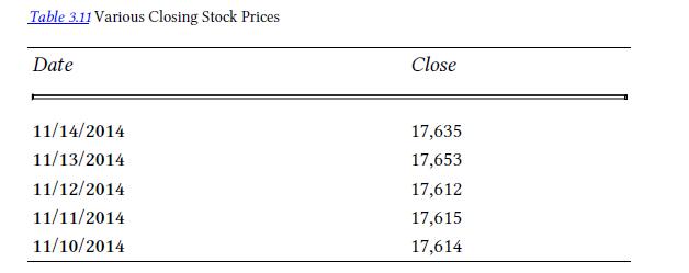
B. Copy the first graph into another part of your spreadsheet, and then modify the graph by moving the cursor to a number on the vertical axis, and then clicking “format axis.” Then, reset the minimum figure from “automatic” to zero. Save or print this graph.
C. Copy the first graph (with a vertical axis that does not start at zero)
into another part of your spreadsheet. If you move the cursor over this graph, and right click, the borders of the graph should change from a straight line to a thick one. If you move the cursor to the middle of a side, Excel should give you the ability to move the sides of the graph in or out by using the cursor. Move the top down by about one-third of the original height, and move the right side outward by about half the original width. You should have a shorter, wider graph. Print it or save it.
D. Copy the first graph to a new part of the spreadsheet. Place the cursor on the graph, and right click. When Excel gives you option, select “change chart type.” Change it to an “area” shape. Save it or print it.
E. Compare the graphs you have made.
a. Do some seem to exaggerate the actual changes in the Dow Jones index during the week?
b. On the other hand, is the graph that shows the index almost unchanged useful to stock traders?
Step by Step Answer:

This question has not been answered yet.
You can Ask your question!


Introductory Accounting A Measurement Approach For Managers
ISBN: 9781138956216
1st Edition
Authors: Daniel P. Tinkelman
