

The graph in Figure 3.2 is a reconstruction of one that was shown on television, in a
Question:
The graph in Figure 3.2 is a reconstruction of one that was shown on television, in a 2012 story about the effects on personal income tax rates if the
“Bush tax cuts” were allowed to expire. The top pearsonal income tax rate would rise from 35% to 39.6%.
A. In what way do you think this graph violates the rules set forth in the chapter?
B. Using Excel, produce a graph with a vertical axis that starts at zero.
C. Compare your graph with Figure 3.2. Comment on whether you believe the graph in Figure 3.2 was likely drawn by someone favoring, or opposing the expiration of the tax cuts.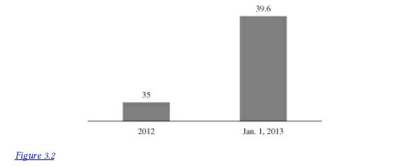
Step by Step Answer:

This question has not been answered yet.
You can Ask your question!
Related Book For 
Introductory Accounting A Measurement Approach For Managers
ISBN: 9781138956216
1st Edition
Authors: Daniel P. Tinkelman
Question Posted:
