1. How do colors and graphics sequencing differ across cultures? 2. What implications does this have for visual design in business and the marketplace? 3.
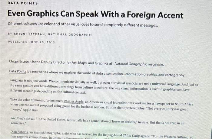
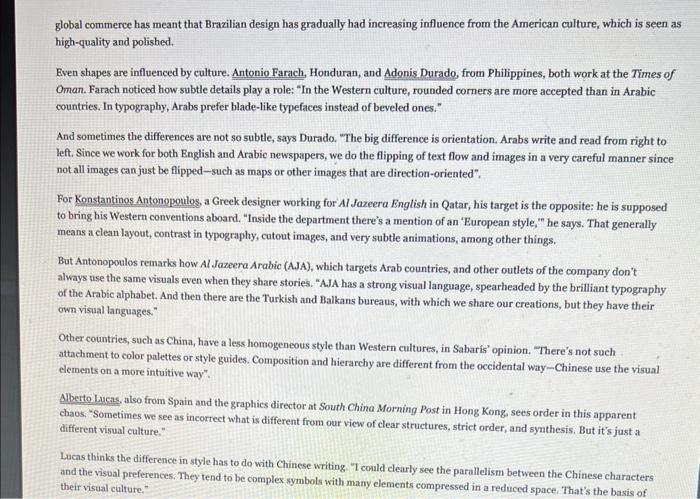
1. How do colors and graphics sequencing differ across cultures? 2. What implications does this have for visual design in business and the marketplace? 3. Attach a visual example to illustrate your point.DATA POINTS Even Graphics Can Speak With a Foreign Accent Different cultures use color and other visual cues to send completely different messages. BY CHIQUI ESTEBAN, NATIONAL GEOGRAPHIC PUBLISHED JUNE 26. 2015 Chiqui Esteban is the Deputy Director for Art, Maps, and Graphics at National Geographic magazine. Data Points is a new series where we explore the world of data visualization, information graphics, and cartography. Language is not just words. We communicate visually as well, but even our visual symbols are not a universal language. And just as the same gesture can have different meanings from culture to culture, the way visual information is used in graphics can have different meanings depending on the cultural context. Take the color of money, for instance. Charles Apple, an American visual journalist, was working for a newspaper in South Africa when one consultant proposed using green for the business section. But the client prefered blue. "Not every country has green money," Apple says. And that's not all. "In the United States, red usually has a connotation of losses or deficits," he says. But that's not true in all countries," Xan Sabaris, an Spanish infographic artist who has worked for the Beijing-based China Daily agrees: "For the Western culture, red has negative connotations, In China it's theglobal commerce has meant that Brazilian design has gradually had increasing influence from the American culture, which is seen as high-quality and polished. Even shapes are influenced by culture. Antonio Farach, Honduran, and Adonis Durado, from Philippines, both work at the Times of Oman. Farach noticed how subtle details play a role: "In the Western culture, rounded corners are more accepted than in Arabic countries. In typography, Arabs prefer blade-like typefaces instead of beveled ones." And sometimes the differences are not so subtle, says Durado, "The big difference is orientation. Arabs write and read from right to left. Since we work for both English and Arabic newspapers, we do the flipping of text flow and images in a very careful manner since not all images can just be flipped-such as maps or other images that are direction-oriented". For Konstantinos Antonopoulos, a Greek designer working for Al Jazeera English in Qatar, his target is the opposite; he is supposed to bring his Western conventions aboard. "Inside the department there's a mention of an 'European style," he says. That generally means a clean layout, contrast in typography, cutout images, and very subtle animations, among other things. But Antonopoulos remarks how Al Jazeera Arabic (AJA), which targets Arab countries, and other outlets of the company don't always use the same visuals even when they share stories. "AJA has a strong visual language, spearheaded by the brilliant typography of the Arabic alphabet. And then there are the Turkish and Balkans bureaus, with which we share our creations, but they have their own visual languages." Other countries, such as China, have a less homogeneous style than Western cultures, in Sabaris' opinion. "There's not such attachment to color palettes or style guides. Composition and hierarchy are different from the occidental way-Chinese use the visual clements on a more intuitive way". Alberto Lucas, also from Spain and the graphics director at South China Morning Post in Hong Kong, sees order in this apparent chaos: "Sometimes we see as incorrect what is different from our view of clear structures, strict order, and synthesis. But it's just a different visual culture." Lucas thinks the difference in style has to do with Chinese writing. "I could clearly see the parallelism between the Chinese characters and the visual preferences. They tend to be complex symbols with many elements compressed in a reduced space, That's the basis of their visual culture."
Step by Step Solution
There are 3 Steps involved in it
Step: 1
Get Instant Access to Expert-Tailored Solutions
See step-by-step solutions with expert insights and AI powered tools for academic success
Step: 2
Step: 3
Ace Your Homework with AI
Get the answers you need in no time with our AI-driven, step-by-step assistance