Answered step by step
Verified Expert Solution
Question
1 Approved Answer
1. Imagine taking an irregularly shaped bottle and filling it with different amounts of water. Construct a graph* with the Height of the Water Level
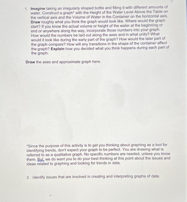
1. Imagine taking an irregularly shaped bottle and filling it with different amounts of water. Construct a graph* with the Height of the Water Level Above the Table on the vertical axis and the Volume of Water in the Container on the horizontal axis. Draw roughly what you think the graph would look like. Where would the graph start? If you know the actual volume or height of the water at the beginning or end or anywhere along the way, incorporate those numbers into your graph. How would the numbers be laid out along the axes and in what units? What would it look like during the early part of the graph? How would the later part of the graph compare? How will any transitions in the shape of the container affect the graph? Explain how you decided what you think happens during each part of the graph. Draw the axes and approximate graph here. *Since the purpose of this activity is to get you thinking about graphing as a tool for identifying trends, don't expect your graph to be perfect. You are drawing what is referred to as a qualitative graph. No specific numbers are needed, unless you know them. But, we do want you to do your best thinking at this point about the issues and ideas related to graphing and looking for trends in data. 2. Identify issues that are involved in creating and interpreting graphs of data.

Step by Step Solution
There are 3 Steps involved in it
Step: 1

Get Instant Access to Expert-Tailored Solutions
See step-by-step solutions with expert insights and AI powered tools for academic success
Step: 2

Step: 3

Ace Your Homework with AI
Get the answers you need in no time with our AI-driven, step-by-step assistance
Get Started


