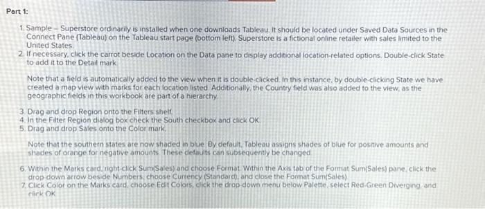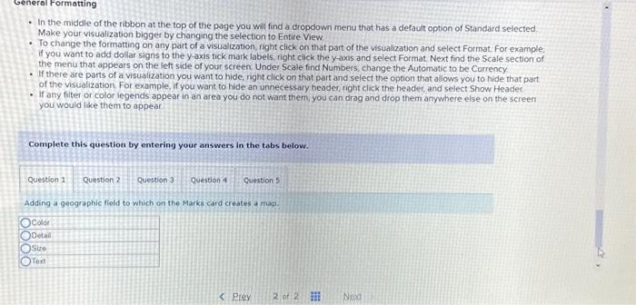

1. Sample - Superstore ordinarily is installed when one downloads Tableau it should be located under Saved Data Sources in the Connect Pane (Tableau) on the Tableau start page (bottom left) Superstore is a fictionat online retailer with sales limited to the United States 2. If necessary, click the carrot beside Location on the Data pane to display additional location-related options. Double-click State to add it to the Detail mark Note that a field is automatically added to the view when it is double-clicked. In this instance, by double-clicking State we have created a map view with marks for each location listed Additionally, the Country field was also added to the view, as the geographic fields in this workbook are part of a hierarchy 3. Drag and drop Region onto the Filters shelf. 4. In the Fiter Region dialog box check the South checkbox and click OK. 5. Drag and drop Sales onto the Color mark. Note that the southern states are now shaced in blue By defaut. Tableau assigns shades of blue for positive amounts and shades of orange for negative amounts These defouits can subsequently be changed 6. Within the Marks card, ngbt-cick Sum(Sales) and choose Format Within the Axis tab of the Format Sum(Sales) pane, click the drop-down ariow beside Numbers, choose Curtency (Standarch. and close the Format Sum(Sales) 7. Click Color on the Marks card choose Edit Colors, click the drop-down menu below Palette, select Red-Green Diverging and riek OK - In the middle of the ribbon at the top of the page you wil find a dropdown menu that has a default option of Standard selected. Make your visualization bigger by changing the selection to Entire View - To change the formatting on any part of a visualization, right click on that part of the visualization and select Format. For example. if you want to add dollar signs to the y-axis tick mark labels, right click the y-axis and select Format Next find the Scale section of the menu that appears on the left side of your screen Under Scale find Numbers, change the Automatic to be Currency - If there are parts of a visualization you want to hide, right click on that part and select the option that allows you to hide that part of the visualization. For example, if you want to hide an unnecessary beader right click the header, and select Show Header - If any filter or color legends appeat in an area you do not want them, you can drag and drop them anywhere else on the screen you would like them to appear Complete this question by entering your answers in the tabs below. Adding a geographic fiold to which on the Marks card creates a map
