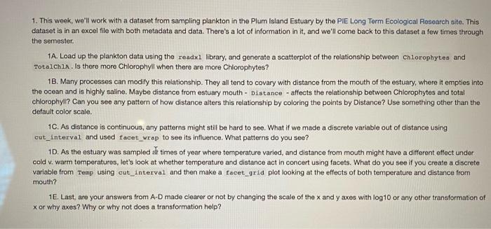
1. This week, we'll work with a dataset from sampling plankton in the Plum Island Estuary by the PIE Long Term Ecological Research site. This dataset is in an excel file with both metadata and data. There's a lot of information in it, and we'll come back to this dataset a few times through the semester. 1A. Load up the plankton data using the zeadxi library, and generate a scatterplot of the relationship between chlorophytes and TotalCh1A. Is there more Chlorophyli when there are more Chlorophytes? 1B. Many processes can modify this relationship. They all tend to covary with distance from the mouth of the estuary, where it empties into the ocean and is highly saline. Maybe distance from estuary mouth - Distance - affects the relationship between Chlorophytes and total chlorophyll? Can you see any pattern of how distance alters this relationship by coloring the points by Distance? Use something other than the default color scale. 1C. As distance is continuous, any patterns might still be hard to see. What if we made a discrete variable out of distance using cut_Interval and used facet_wrap to see its influence. What patterns do you see? 1D. As the estuary was sampled ts times of year where temperature varied, and distance from mouth might have a different effoct undor oold v. warm temperatures, let's look at whether temperature and distance act in concert using facets. What do you see if you create a discrete variable from Temp using cut_interval and then make a facet_grid plot looking at the effects of both temperature and distance from mouth? 1E. Last, are your answers trom A-D made clearer or not by changing the scale of the x and y axes with log 10 or any other transformation of x or why axes? Why or why not does a transformation help