Answered step by step
Verified Expert Solution
Link Copied!

Question

1 Approved Answer

1. What is misleading about the way that the data is presented? A.The area of the figures is misleading compared to the actual percentages of

1.What is misleading about the way that the data is presented?

A.The area of the figures is misleading compared to the actual percentages of stem majors compared to total students.

B.A vertical axis is not provided.

C.The use of the solid blue overlaying the outlined figures can distort the perception of the graph.

D.All of the above.
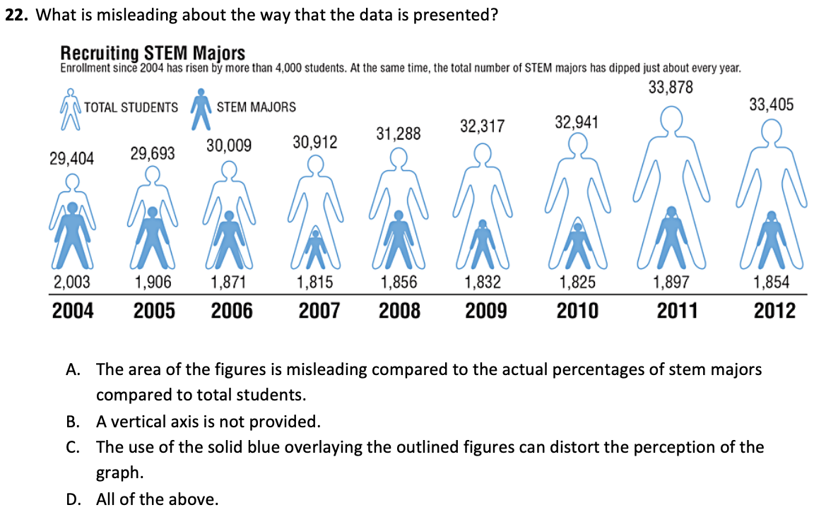
image text in transcribed
22. What is misleading about the way that the data is presented? Recruiting STEM Majors Enrollment since 2004 has risen by more than 4,000 students. At the same time, the total number of STEM majors has dipped just about every year. 33,878 TOTAL STUDENTS STEM MAJORS 33,405 31,288 32,317 32,941 29,404 29,693 30,009 30,912 2,003 1,906 1,871 1,815 1,856 1,832 1,825 1,897 1,854 2004 2005 2006 2007 2008 2009 2010 2011 2012 A. The area of the figures is misleading compared to the actual percentages of stem majors compared to total students. B. A vertical axis is not provided. C. The use of the solid blue overlaying the outlined figures can distort the perception of the graph. D. All of the above

Step by Step Solution

There are 3 Steps involved in it

Step: 1

blur-text-image

Get Instant Access to Expert-Tailored Solutions

See step-by-step solutions with expert insights and AI powered tools for academic success

Step: 2

blur-text-image_2

Step: 3

blur-text-image_3

Ace Your Homework with AI

Get the answers you need in no time with our AI-driven, step-by-step assistance

Get Started

Recommended Textbook for

Introduction to graph theory

Authors: Douglas B. West

2nd edition

131437372, 978-0131437371

More Books

Students also viewed these Mathematics questions