Answered step by step
Verified Expert Solution
Link Copied!

Question

1 Approved Answer

18 A study was conducted to determine how people get jobs. The table below lists data from Choose the correct pie chart. 400 randomly selected

18
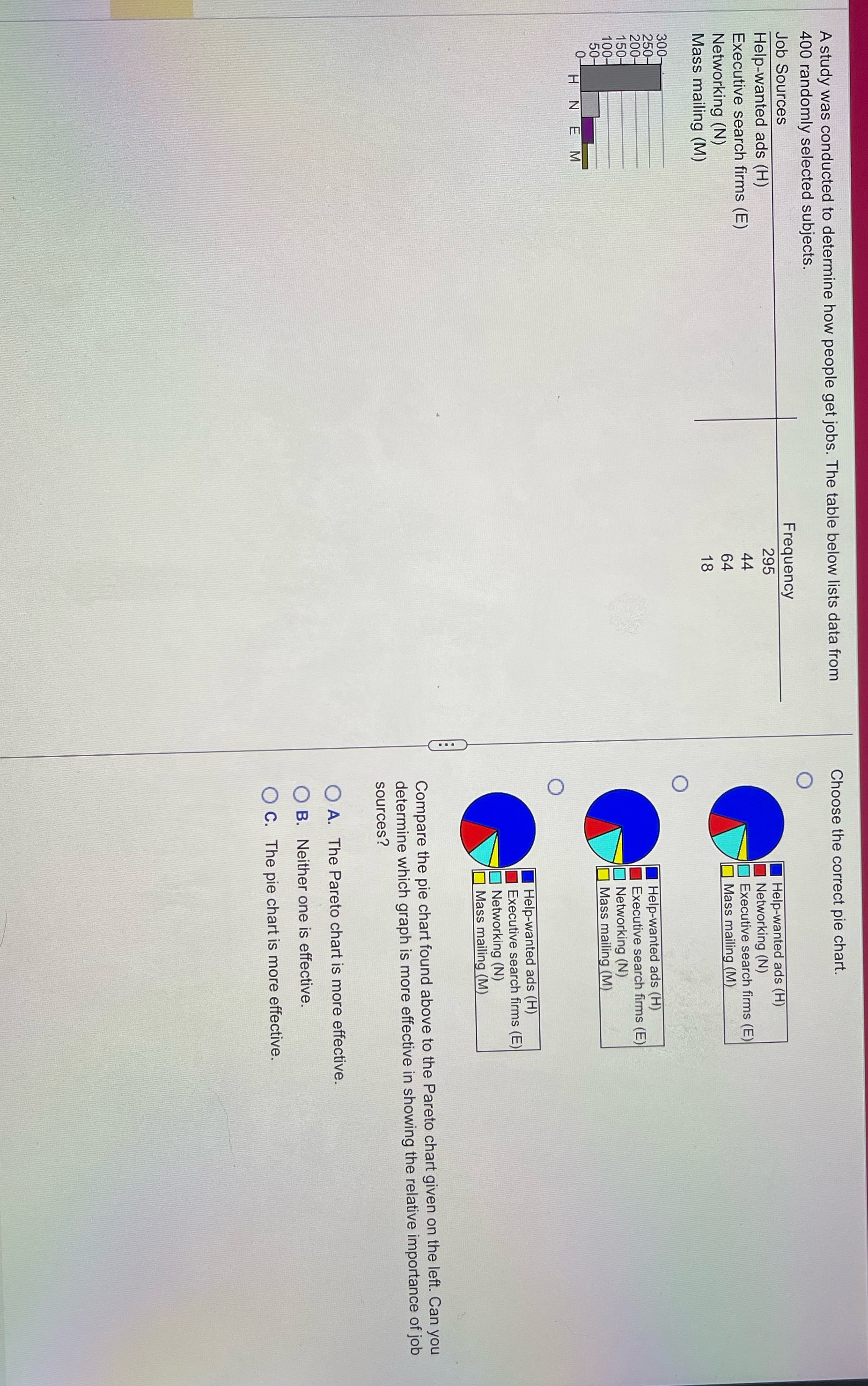
image text in transcribed
A study was conducted to determine how people get jobs. The table below lists data from Choose the correct pie chart. 400 randomly selected subjects. O Job Sources Frequency Help-wanted ads (H) 295 Help-wanted ads (H) Executive search firms (E) Networking (N) Networking (N) Executive search firms (E) Mass mailing (M) Mass mailing (M) 300- 250- 200- Help-wanted ads (H) 150- Executive search firms (E) 100- 50- Networking (N) 0- Mass mailing (M) HN EM Help-wanted ads (H) Executive search firms (E) Networking (N) Mass mailing (M) Compare the pie chart found above to the Pareto chart given on the left. Can you determine which graph is more effective in showing the relative importance of job sources? O A. The Pareto chart is more effective. O B. Neither one is effective. O C. The pie chart is more effective

Step by Step Solution

There are 3 Steps involved in it

Step: 1

blur-text-image

Get Instant Access to Expert-Tailored Solutions

See step-by-step solutions with expert insights and AI powered tools for academic success

Step: 2

blur-text-image

Step: 3

blur-text-image

Ace Your Homework with AI

Get the answers you need in no time with our AI-driven, step-by-step assistance

Get Started

Recommended Textbook for

Trigonometry

Authors: Mark Dugopolski

3rd Edition

0321899830, 9780321899835

More Books

Students also viewed these Mathematics questions