

Answered step by step
Verified Expert Solution
Question
1 Approved Answer
200 200 100 202 201 Sales Analysis Cups of Coffee Sold January February March April May June Regular 250 780 703 400 300 French Vanilla
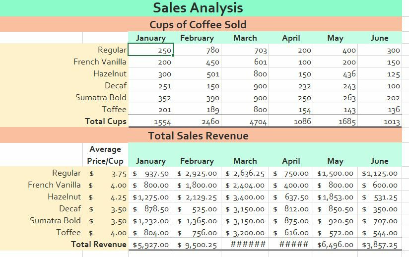
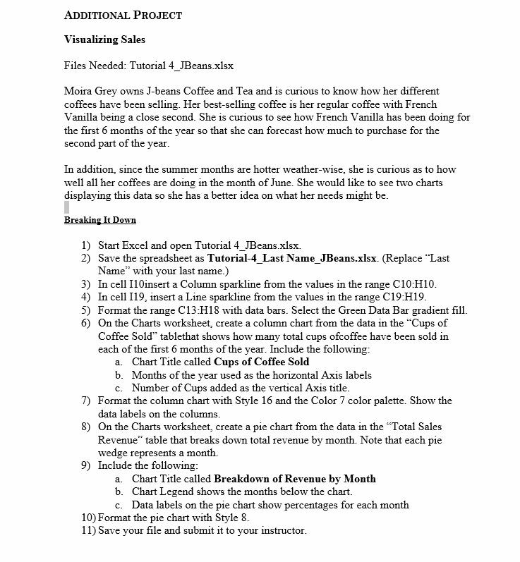
200 200 100 202 201 Sales Analysis Cups of Coffee Sold January February March April May June Regular 250 780 703 400 300 French Vanilla 200 450 601 100 150 Hazelnut 300 501 800 150 436 125 Decaf 251 150 900 232 243 Sumatra Bold 352 390 900 250 263 Toffee 189 800 154 143 136 Total Cups 1554 2460 4704 1086 1685 1013 Total Sales Revenue Average Price/Cup January February March April May June Regular $ 3.75 $ 937.50 $ 2,925.00 $ 2,636.25 $ 750.00 $1,500.00 $1,125.00 French Vanilla $ 4.00 $ 800.00 $ 1,800.00 $ 2,404.00 $ 400.00 $ 800.00 $ 600.00 Hazelnut $ 4.25 $1,275.00 $ 2,129.25 $ 3,400.00 $ 637.50 $1,853.00 $ 531.25 Decaf $ 3.50 $ 878.50 $ 525.00 $ 3,150.00 $ 812.00 $ 850.50 $ 350.00 Sumatra Bold $ 3.50 $1,232.00 $ 1,365.00 $ 3,150.00 $ 875.00 $ 920.50 $ 707.00 Toffee $ 4.00 $ 804.00 $ 756.00 $ 3,200.00 $ 616.00 572.00 $ 544.00 Total Revenue $5.927.00 $ 9,500.25 ###### ##### $6,496.00 $3,857.25 $ ADDITIONAL PROJECT Visualizing Sales Files Needed: Tutorial 4_JBeans.xlsx Moira Grey owns J-beans Coffee and Tea and is curious to know how her different coffees have been selling. Her best-selling coffee is her regular coffee with French Vanilla being a close second. She is curious to see how French Vanilla has been doing for the first 6 months of the year so that she can forecast how much to purchase for the second part of the year. In addition, since the summer months are hotter weather-wise, she is curious as to how well all her coffees are doing in the month of June. She would like to see two charts displaying this data so she has a better idea on what her needs might be. Breaking It Down 1) Start Excel and open Tutorial 4_JBeans.xlsx 2) Save the spreadsheet as Tutorial-4_Last Name_JBeans.xlsx. (Replace "Last Name" with your last name.) 3) In cell 110insert a Column sparkline from the values in the range C10:H10. 4) In cell 119, insert a Line sparkline from the values in the range C19:H19. 5) Format the range C13:H18 with data bars. Select the Green Data Bar gradient fill. 6) On the Charts worksheet, create a column chart from the data in the "Cups of Coffee Sold tablethat shows how many total cups ofcoffee have been sold in each of the first 6 months of the year. Include the following: a. Chart Title called Cups of Coffee Sold b. Months of the year used as the horizontal Axis labels c. Number of Cups added as the vertical Axis title. 7) Format the column chart with Style 16 and the Color 7 color palette. Show the data labels on the columns. 8) On the Charts worksheet, create a pie chart from the data in the "Total Sales Revenue table that breaks down total revenue by month. Note that each pie wedge represents a month. 9) Include the following: a. Chart Title called Breakdown of Revenue by Month b. Chart Legend shows the months below the chart. c. Data labels on the pie chart show percentages for each month 10) Format the pie chart with Style 8. 11) Save your file and submit it to your instructor
Step by Step Solution
There are 3 Steps involved in it
Step: 1

Get Instant Access to Expert-Tailored Solutions
See step-by-step solutions with expert insights and AI powered tools for academic success
Step: 2

Step: 3
Ace Your Homework with AI
Get the answers you need in no time with our AI-driven, step-by-step assistance
Get Started
Financial Statements The Ultimate Guide To Financial Statements Analysis For Business Owners And Investors
Authors: Greg Shields
1st Edition
172643320X, 978-1726433204