5. Short-run equilibrium
Consider a perfectly competitive market for wheat in New York City. There are 120 firms in the industry, each of which has the cost curves shown on the following graph:
SCREENSHOT 1
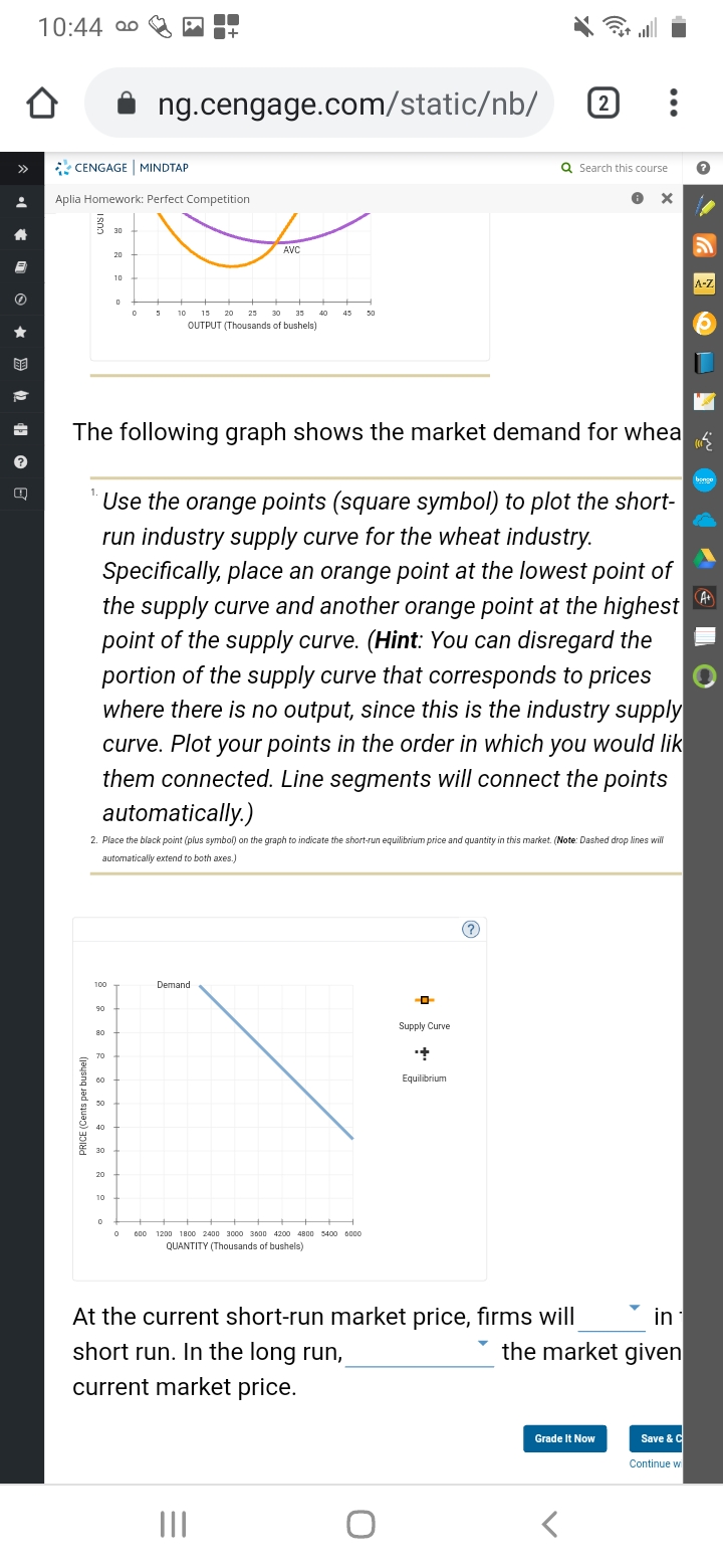
The following graph shows the market demand for wheat.
How would you Use the orange points (square symbol) to plot the short-run industry supply curve for the wheat industry???
Specifically, place an orange point at the lowest point of the supply curve and another orange point at the highest point of the supply curve.
(Hint: You can disregard the portion of the supply curve that corresponds to prices where there is no output, since this is the industry supply curve. Plot your points in the order in which you would like them connected. Line segments will connect the points automatically.)
How would you Place the black point (plus symbol) on the graph to indicate the short-run equilibrium price and quantity in this market???
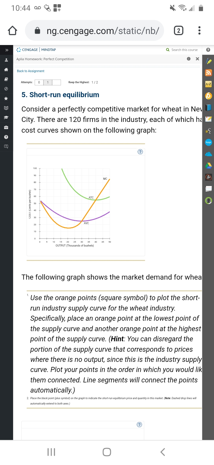
10:44 00 ng.cengage.com/staticb/ 2 . . . CENGAGE | MINDTAP Q Search this course Aplia Homework: Perfect Competition X Back to Assignment Attempts: 0 1 Keep the Highest: 1 / 2 A-Z 5. Short-run equilibrium Consider a perfectly competitive market for wheat in New City. There are 120 firms in the industry, each of which ha cost curves shown on the following graph: ? 100 MC A+ CUSI (Cents per bushel) ATC AVC 10 13 20 23 30 35 45 OUTPUT (Thousands of bushels) The following graph shows the market demand for whea Use the orange points (square symbol) to plot the short- run industry supply curve for the wheat industry. Specifically, place an orange point at the lowest point of the supply curve and another orange point at the highest point of the supply curve. (Hint: You can disregard the portion of the supply curve that corresponds to prices where there is no output, since this is the industry supply curve. Plot your points in the order in which you would lik them connected. Line segments will connect the points automatically.) 2. Place the black point (plus symbol) on the graph to indicate the short-run equilibrium price and quantity in this market. (Note: Dashed drop lines will automatically extend to both axes.) ? O10:44 20 + ng.cengage.com/staticb/ 2 . . . CENGAGE | MINDTAP Q Search this course Aplia Homework: Perfect Competition X CUSI 30 20 AVC 10 A-Z 10 13 25 30 33 40 45 50 OUTPUT (Thousands of bushels) The following graph shows the market demand for wheat Use the orange points (square symbol) to plot the short- run industry supply curve for the wheat industry. Specifically, place an orange point at the lowest point of the supply curve and another orange point at the highest point of the supply curve. (Hint: You can disregard the portion of the supply curve that corresponds to prices where there is no output, since this is the industry supply curve. Plot your points in the order in which you would lik them connected. Line segments will connect the points automatically.) 2. Place the black point (plus symbol) on the graph to indicate the short-run equilibrium price and quantity in this market. (Note: Dashed drop lines will automatically extend to both axes.) 100 Demand 8 8 Supply Curve PRICE (Cents per bushel Equilibrium 20 600 1200 1800 2400 3000 3600 4200 4800 5400 6000 QUANTITY (Thousands of bushels) At the current short-run market price, firms will in short run. In the long run, the market given current market price. Grade It Now Save & C Continue wi O