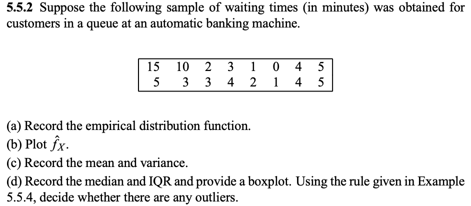
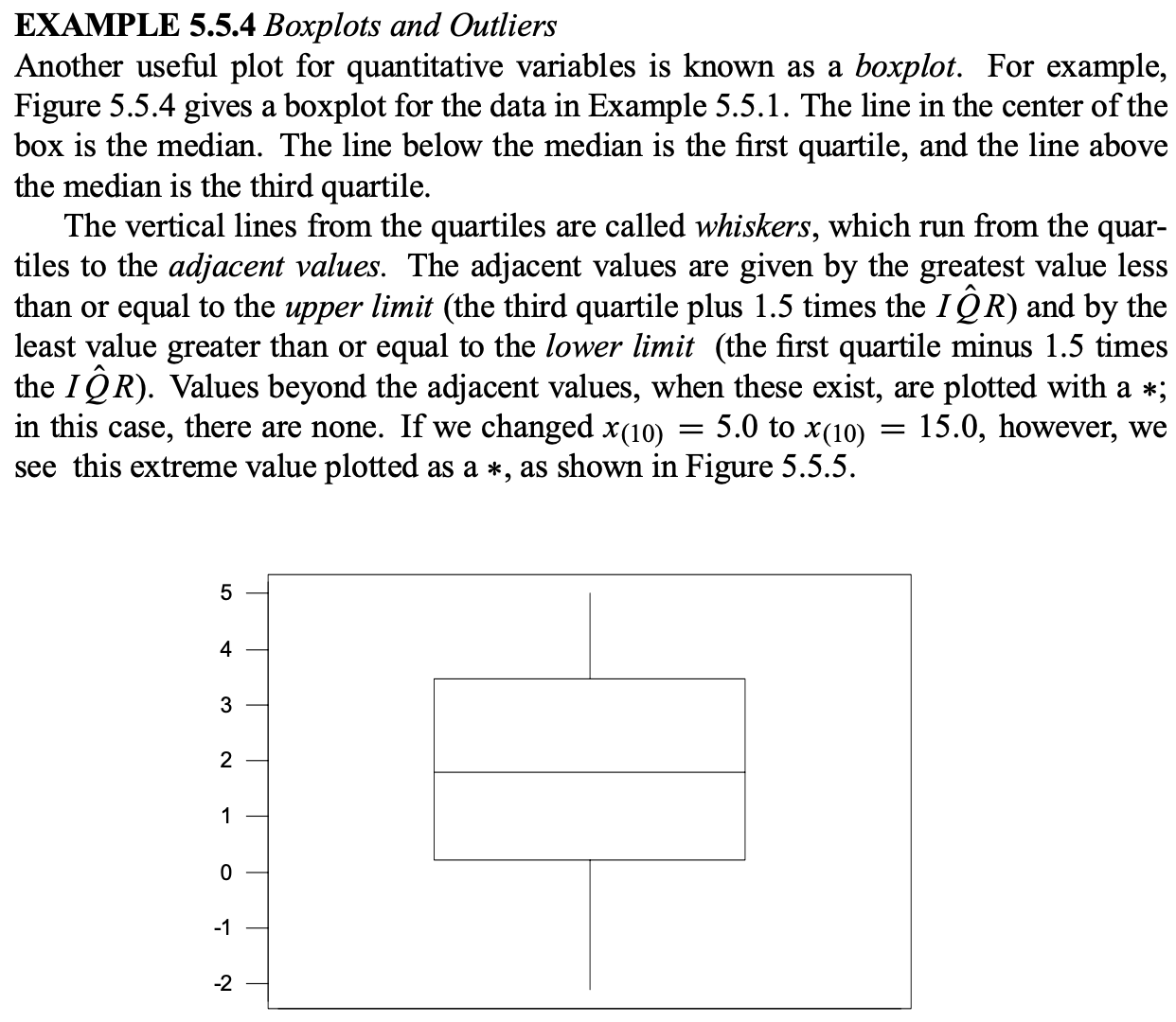
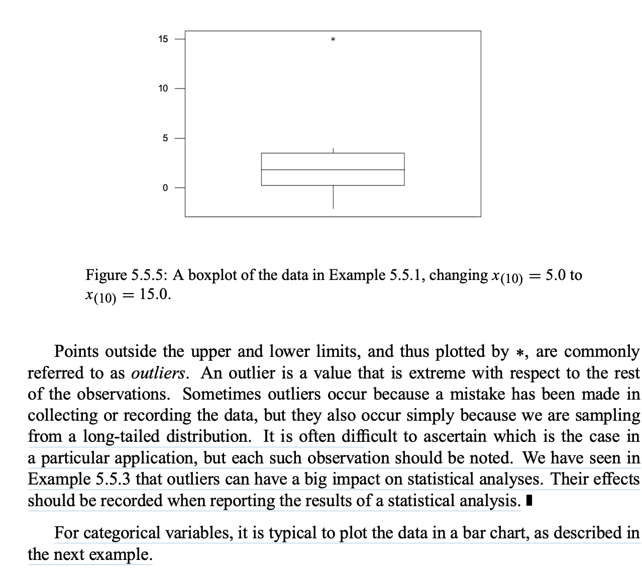
5.5.2 Suppose the following sample of waiting times (in minutes) was obtained for customers in a queue at an automatic banking machine. 15102 33 0 5 1 3145 42 45 (a) Record the empirical distribution function. (b) Plot fx. (0) Record the mean and variance. (d) Record the median and IQR and provide a boxplot. Using the rule given in Example 5.5 .4, decide whether there are any outliers. EXAMPLE 5.5.4 Boxplots and Outliers Another useful plot for quantitative variables is known as a boxplot. For example, Figure 5.5.4 gives a boxplot for the data in Example 5.5.1. The line in the center of the box is the median. The line below the median is the rst quartile, and the line above the median is the third quartile. The vertical lines from the quartiles are called whiskers, which run from the quar- tiles to the adjacent values. The adjacent values are given by the greatest value less than or equal to the upper limit (the third quartile plus 1.5 times the I QR) and by the least value greater than or equal to the lower limit (the rst quartile minus 1.5 times the I QR). Values beyond the adjacent values, when these exist, are plotted with a ale; in this case, there are none. If we changed x00) = 5.0 to M10) = 15.0, however, we see this extreme value plotted as a 1:, as shown in Figure 5.5.5. 1 _ 15 9e 10 .- Figure 5.5.5: A boxplot of the data in Example 5.5.1, changing xuo) = 5.0 to 36(10) 2 15.0. Points outside the upper and lower limits, and thus plotted by *, are commonly referred to as outliers. An outlier is a value that is extreme with respect to the rest of the observations. Sometimes outliers occur because a mistake has been made in collecting or recording the data, but they also occur simply because we are sampling from a long-tailed distribution. It is often dicult to ascertain which is the case in a particular application, but each such observation should be noted. We have seen in Example 5.5.3 that outliers can have a big impact on statistical analyses. Their effects should be recorded when reporting the results of a statistical analysis. I For categorical variables, it is typical to plot the data in a bar chart, as described in the next example


