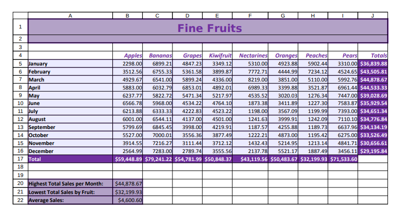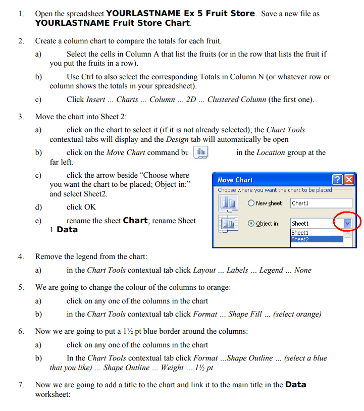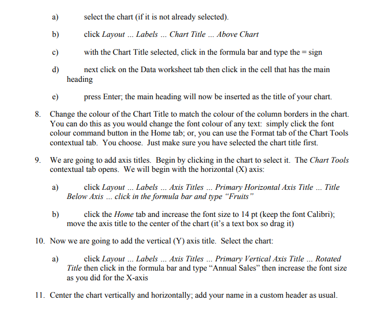


A E F H 1 Fine Fruits 2 3 4 5 January 6 February 7 March 8 April 9 May 10 June 11 July 12 August 13 September 14 October 15 November 16 December 17 Total 18 19 20 Highest Total Sales per Month: 21 Lowest Total Sales by Fruit: 22 Average Sales: Apples Bananas Grapes Kiwifruit Nectarines Oranges Peaches Pears Totals 2298.00 6899.21) 4847.23 3349.12 5310.00 4923.88 5902.44 3310.00 $36,839.88 3512.561 6755.33 5361.58 3899.87 7772.71 4444.99 7234.12 4524.65 $43,505.81 4929.67 6541.00 5899.24 4336.00 8219.00 3851.00 5110.000 5992.76 $44,878.67 5883.00 6032.791 6853.01 4892.01 6989.33 3399.88 3521.87 6961.44 $44,533.33 6237.77 5822.721 5471.34 5217.97 4535.52 3020.03 1276.34 7447.00 $39,028.69 6566.78 5968.00 4534.22 4764.10 1873.38 3411.89 1227.30 7583.87 $35,929.54 6213.88 6333.33 4222.83 4523.22 1198.00 3567.09 1199.99 7393.00 $34,651.34 6001.00 6544.11 4137.00 4501.00 1241.63 3999.91 1242.09 7110.10 $34,776.84 5799.691 6845.451 3998.00 4219.91 1187.57 4255.88 1189.731 6637.96 $34,134.19 5527.00 7000.01 3556.36 3877.49 1222.21 4873.00 1195.42) 6275.00 $33,526.49 3914.55 7216.27 3111.44 3712.12 1432.43 5214.95 1213.14 4841.71 $30,656.61 2564.99 7283.00 2789.74 3555.56 2137.78 5521.17 1887.49 3456.11 $29,195.84 $59,448.89 $79,241.22 $54,781.99 $50,848.37 $43,119.56 $50,483.67 $32,199.93 $71,533.60 $44,878.67 $32,199.93 $4,600.60 1. Open the spreadsheet YOURLASTNAME Ex 5 Fruit Store. Save a new file as YOURLASTNAME Fruit Store Chart. 2. Create a column chart to compare the totals for each fruit. a) Select the cells in Column A that list the fruits (or in the row that lists the fruit if you put the fruits in a row). b) Use Ctrl to also select the corresponding Totals in Column N (or whatever row or column shows the totals in your spreadsheet). c) Click Insert ... Charts ... Column ... 2D ... Clustered Column (the first one). 3. Move the chart into Sheet 2: a) click on the chart to select it (if it is not already selected); the Chart Tools contextual tabs will display and the Design tab will automatically be open b) click on the Move Chart command bu in the Location group at the far left. c) click the arrow beside Choose where Move Chart you want the chart to be placed; Object in: ? X and select Sheet2 Choose where you want the chart to be placed: d) click OK New sheet: Chart 1 e) rename the sheet Chart; rename Sheet Object in: Sheet1 1 Data Sheet1 Sheet2 4. 5. Remove the legend from the chart: a) in the Chart Tools contextual tab click Layout ... Labels ... Legend ... None We are going to change the colour of the columns to orange: a) click on any one of the columns in the chart b) in the Chart Tools contextual tab click Format ... Shape Fill ... (select orange) Now we are going to put a 1/2 pt blue border around the columns a) click on any one of the columns in the chart b) In the Chart Tools contextual tab click Format ...Shape Outline ... (select a blue that you like) ... Shape Outline ... Weight ... 112 pt Now we are going to add a title to the chart and link it to the main title in the Data worksheet: 6. 7. a) select the chart (if it is not already selected). b) click Layout ... Labels ... Chart Title ... Above Chart c) with the Chart Title selected, click in the formula bar and type the = sign d) next click on the Data worksheet tab then click in the cell that has the main heading e) press Enter; the main heading will now be inserted as the title of your chart. 8. Change the colour of the Chart Title to match the colour of the column borders in the chart. You can do this as you would change the font colour of any text: simply click the font colour command button in the Home tab; or, you can use the Format tab of the Chart Tools contextual tab. You choose. Just make sure you have selected the chart title first. 9. We are going to add axis titles. Begin by clicking in the chart to select it. The Chart Tools contextual tab opens. We will begin with the horizontal (X) axis: a) click Layout ... Labels ... Axis Titles ... Primary Horizontal Axis Title ... Title Below Axis ... click in the formula bar and type Fruits b) click the Home tab and increase the font size to 14 pt (keep the font Calibri); move the axis title to the center of the chart (it's a text box so drag it) 10. Now we are going to add the vertical (Y) axis title. Select the chart: a) click Layout ... Labels ... Axis Titles ... Primary Vertical Axis Title ... Rotated Title then click in the formula bar and type "Annual Sales then increase the font size as you did for the X-axis 11. Center the chart vertically and horizontally; add your name in a custom header as usual
