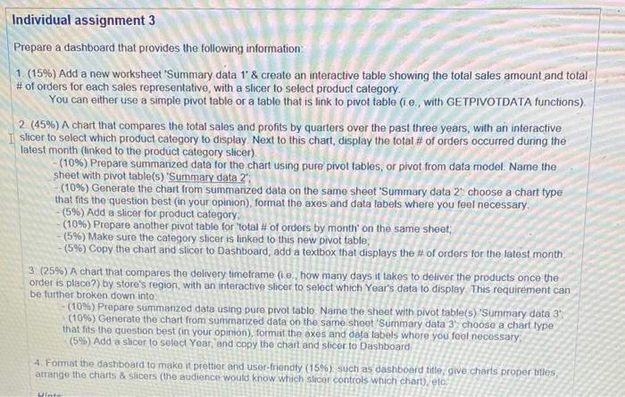
a Individual assignment 3 Prepare a dashboard that provides the following information: 1 (15%) Add a new worksheet 'Summary data 1' & create an interactive table showing the total sales amount and total # of orders for each sales representative, with a slicer to select product category You can either use a simple pivot table or a table that is link to pivot table (i e., with GETPIVOTDATA functions) 2 (45%) A chart that compares the total sales and profits by quarters over the past three years, with an interactive Slicer to select which product category to display. Next to this chart, display the total # of orders occurred during the latest month (linked to the product category slicer). (10%) Prepare summarized data for the chart using pure pivot tables, or pivot from data model. Name the sheet with pivot table(s) 'Summary data 2 (10%) Generate the chart from summanzed data on the same sheet 'Summary data 2 choose a chart type that fits the question best in your opinion), format the axes and data labels where you feel necessary - (5%) Add a slicer for product category (10%) Prepare another pivot table for 'total # of orders by month on the same sheet, - (5%) Make sure the category slicer is linked to this new pivot table, - (5%) Copy the chart and slicer to Dashboard, add a textbox that displays the # of orders for the latest month 3 (25%) A chart that compares the delivery timeframe (i.e. how many days it takes to deliver the products once the order is place?) by store's region, with an interactive slicer to select which Year's data to display This requirement can be further broken down into (10%) Prepare summarized data using pure pivot tablo Name the sheet with pivot table(s) 'Summary data 3" (10%) Generate the chart from summarized data on the same shoot 'Summary data 3 choose a chart type that fits the question best in your opinion), format the axes and data labels where you feel necessary (5%) Add a sicer to select Year, and copy the chart and Slicer to Dashboard 4. Format the dashboard to make it prettier and user-friendly (15%) such as dashboard title give charts proper titles arrange the charts & sicers (the audience would know which slicer controls which chart), etc. Winte a Individual assignment 3 Prepare a dashboard that provides the following information: 1 (15%) Add a new worksheet 'Summary data 1' & create an interactive table showing the total sales amount and total # of orders for each sales representative, with a slicer to select product category You can either use a simple pivot table or a table that is link to pivot table (i e., with GETPIVOTDATA functions) 2 (45%) A chart that compares the total sales and profits by quarters over the past three years, with an interactive Slicer to select which product category to display. Next to this chart, display the total # of orders occurred during the latest month (linked to the product category slicer). (10%) Prepare summarized data for the chart using pure pivot tables, or pivot from data model. Name the sheet with pivot table(s) 'Summary data 2 (10%) Generate the chart from summanzed data on the same sheet 'Summary data 2 choose a chart type that fits the question best in your opinion), format the axes and data labels where you feel necessary - (5%) Add a slicer for product category (10%) Prepare another pivot table for 'total # of orders by month on the same sheet, - (5%) Make sure the category slicer is linked to this new pivot table, - (5%) Copy the chart and slicer to Dashboard, add a textbox that displays the # of orders for the latest month 3 (25%) A chart that compares the delivery timeframe (i.e. how many days it takes to deliver the products once the order is place?) by store's region, with an interactive slicer to select which Year's data to display This requirement can be further broken down into (10%) Prepare summarized data using pure pivot tablo Name the sheet with pivot table(s) 'Summary data 3" (10%) Generate the chart from summarized data on the same shoot 'Summary data 3 choose a chart type that fits the question best in your opinion), format the axes and data labels where you feel necessary (5%) Add a sicer to select Year, and copy the chart and Slicer to Dashboard 4. Format the dashboard to make it prettier and user-friendly (15%) such as dashboard title give charts proper titles arrange the charts & sicers (the audience would know which slicer controls which chart), etc. Winte


