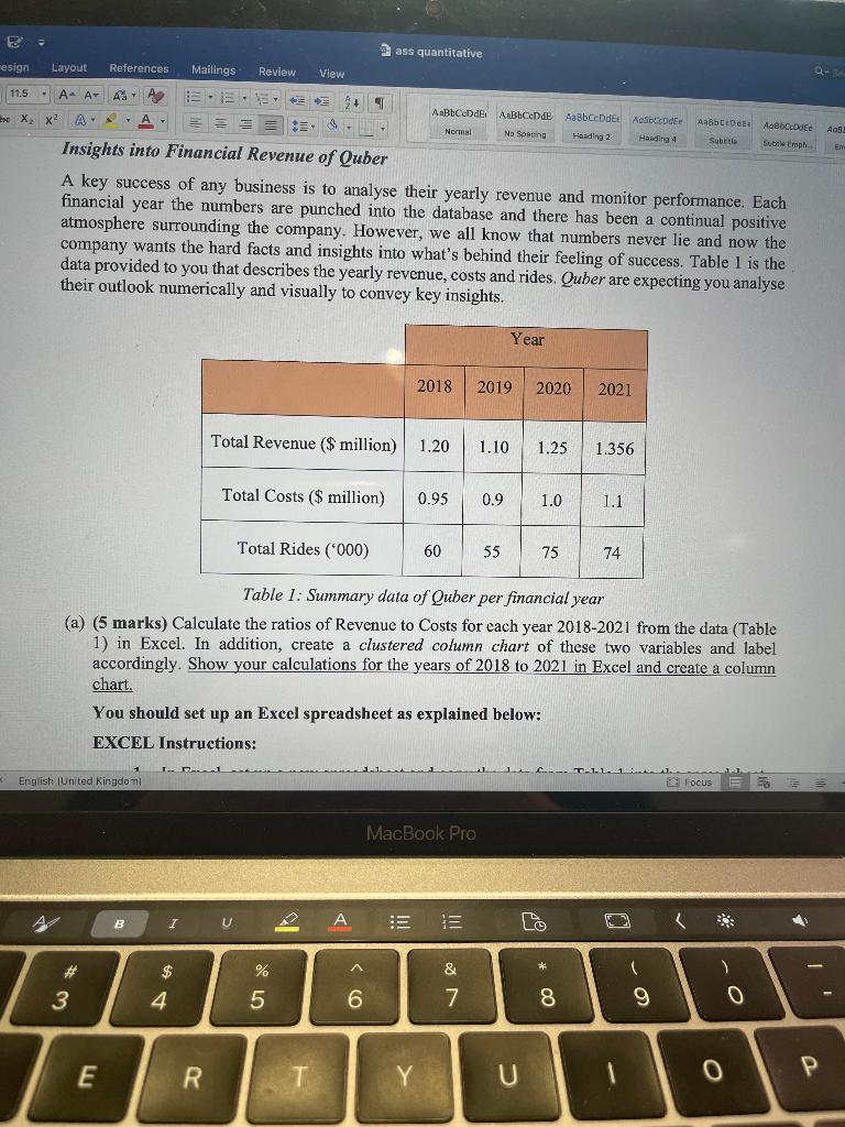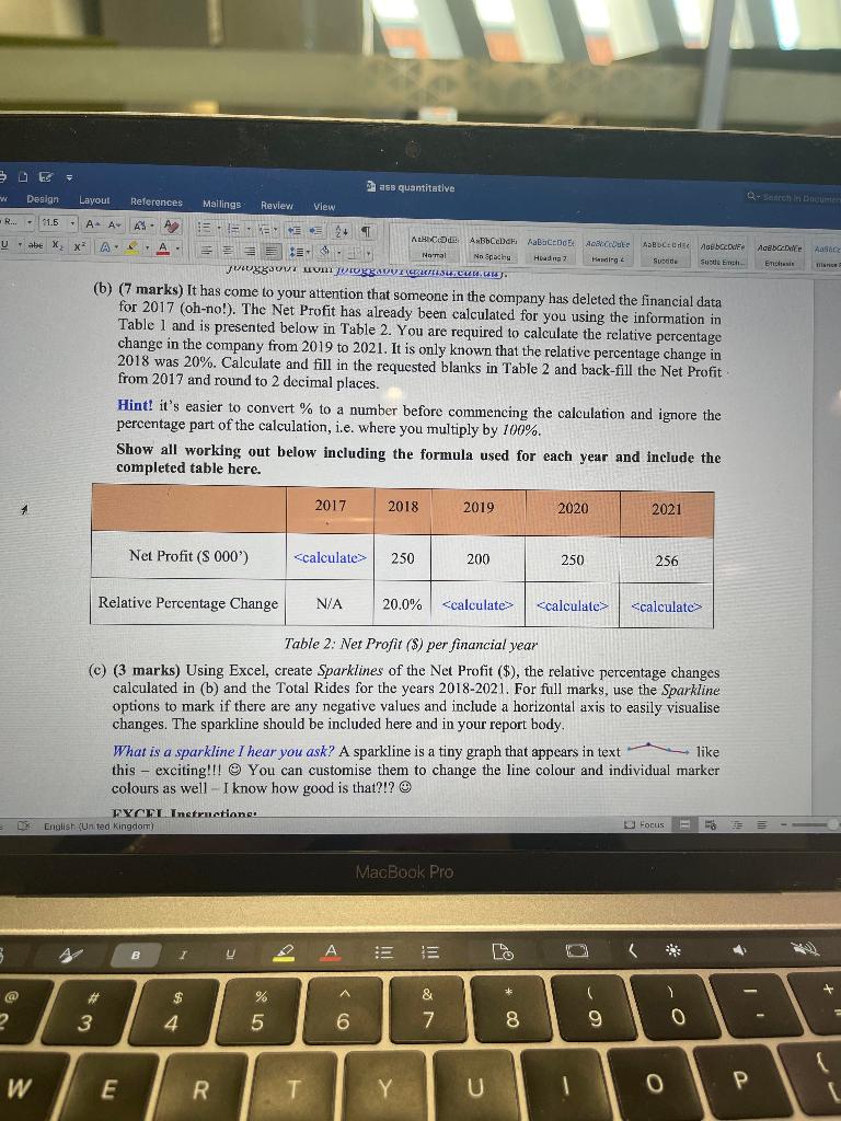

A key success of any business is to analyse their yearly revenue and monitor performance. Each financial year the numbers are punched into the database and there has been a continual positive atmosphere surrounding the company. However, we all know that numbers never lie and now the company wants the hard facts and insights into what's behind their feeling of success. Table 1 is the data provided to you that describes the yearly revenue, costs and rides. Quber are expecting you analyse their outlook numerically and visually to convey key insights. Table 1: Summary data of Quber per financial year (a) (5 marks) Calculate the ratios of Revenue to Costs for each year 2018-2021 from the data (Table 1) in Excel. In addition, create a clustered column chart of these two variables and label accordingly. Show your calculations for the years of 2018 to 2021 in Excel and create a column chart. You should set up an Excel spreadsheet as explained below: EXCEL Instructions: (b) ( 7 marks) It has come to your attention that someone in the company has deleted the financial data for 2017 (oh-no!). The Net Profit has already been calculated for you using the information in Table 1 and is presented below in Table 2 . You are required to calculate the relative percentage change in the company from 2019 to 2021 . It is only known that the relative percentage change in 2018 was 20%. Calculate and fill in the requested blanks in Table 2 and back-fill the Net Profit from 2017 and round to 2 decimal places. Hint? it's easier to convert \% to a number before commencing the calculation and ignore the percentage part of the calculation, i.e. where you multiply by 100%. Show all working out below including the formula used for each year and include the completed table here. Table 2: Net Profit (\$) per financial year (c) (3 marks) Using Excel, create Sparklines of the Net Profit (\$), the relative percentage changes calculated in (b) and the Total Rides for the years 2018-2021. For full marks, use the Sparkline options to mark if there are any negative values and include a horizontal axis to easily visualise changes. The sparkline should be included here and in your report body. What is a sparkline I hear you ask? A sparkline is a tiny graph that appears in text like this - exciting!!! @ You can customise them to change the line colour and individual marker colours as well - I know how good is that?!? (4)
