Question
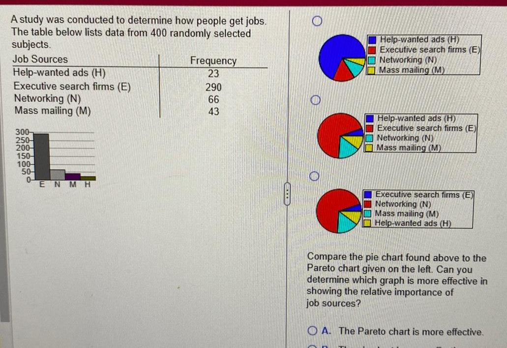
A study was conducted to determine how people get jobs The table below lists data from 400 randomly selected subjects Job Sources Help wanted ads


A study was conducted to determine how people get jobs The table below lists data from 400 randomly selected subjects Job Sources Help wanted ads H Executive search firms E Networking N Mass mailing M 300 250 200 150 100 50 0 ENMH Frequency 23 290 66 43 O O Help wanted ads H Executive search firms E Networking N Mass mailing M Help wanted ads H Executive search firms E Networking N Mass mailing M Executive search firms E Networking N Mass mailing M Help wanted ads H Compare the pie chart found above to the Pareto chart given on the left Can you determine which graph is more effective in showing the relative importance of job sources A The Pareto chart is more effective
Step by Step Solution
There are 3 Steps involved in it
Step: 1

Get Instant Access to Expert-Tailored Solutions
See step-by-step solutions with expert insights and AI powered tools for academic success
Step: 2

Step: 3

Ace Your Homework with AI
Get the answers you need in no time with our AI-driven, step-by-step assistance
Get Started


