Answered step by step
Verified Expert Solution
Question
1 Approved Answer
Bookmark Show all steps: ON Chapter 10.3. Problem 1CP Data Files needed for this Case Problem: NP_EX_10-3.xlsx, Support_EX_10_Yogurt.accdb Umai Frozen Yogurt Joan Amari is a
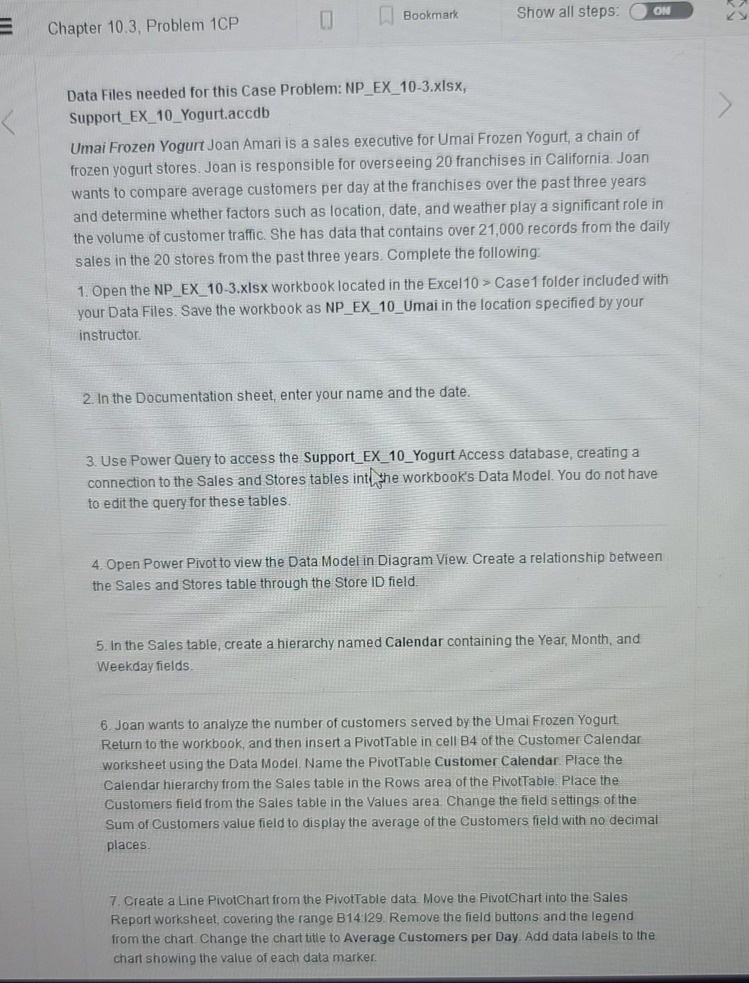
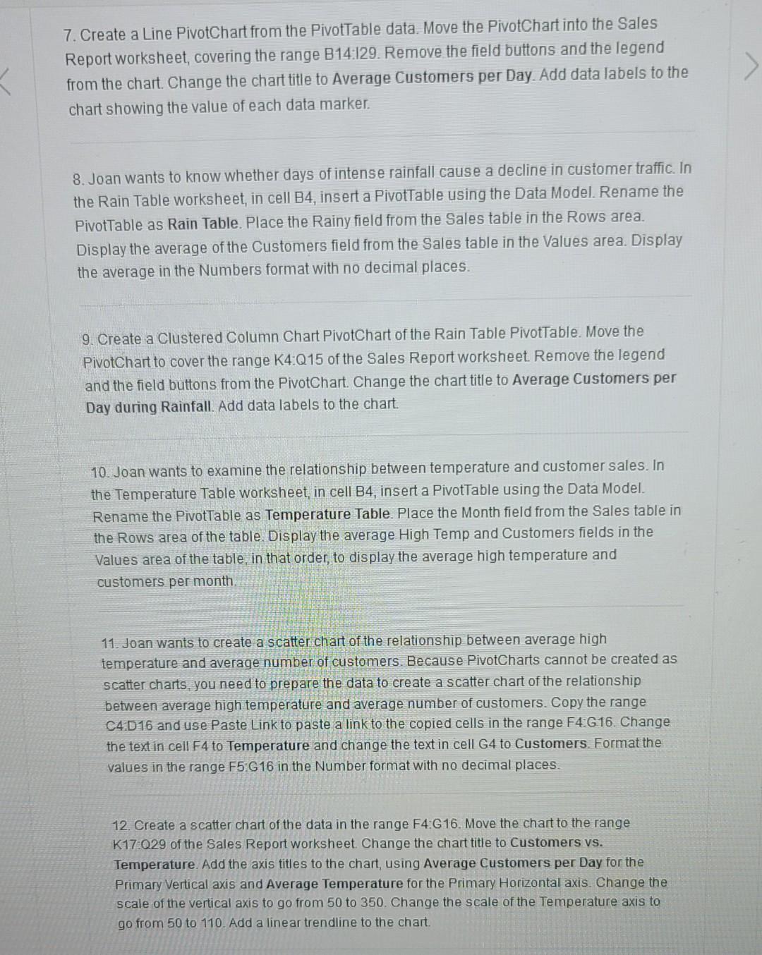
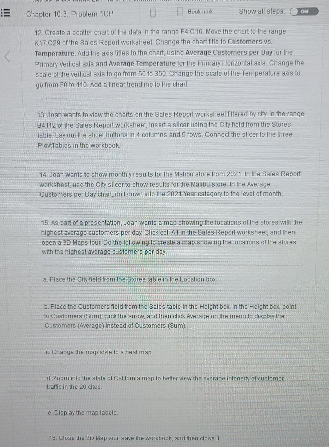
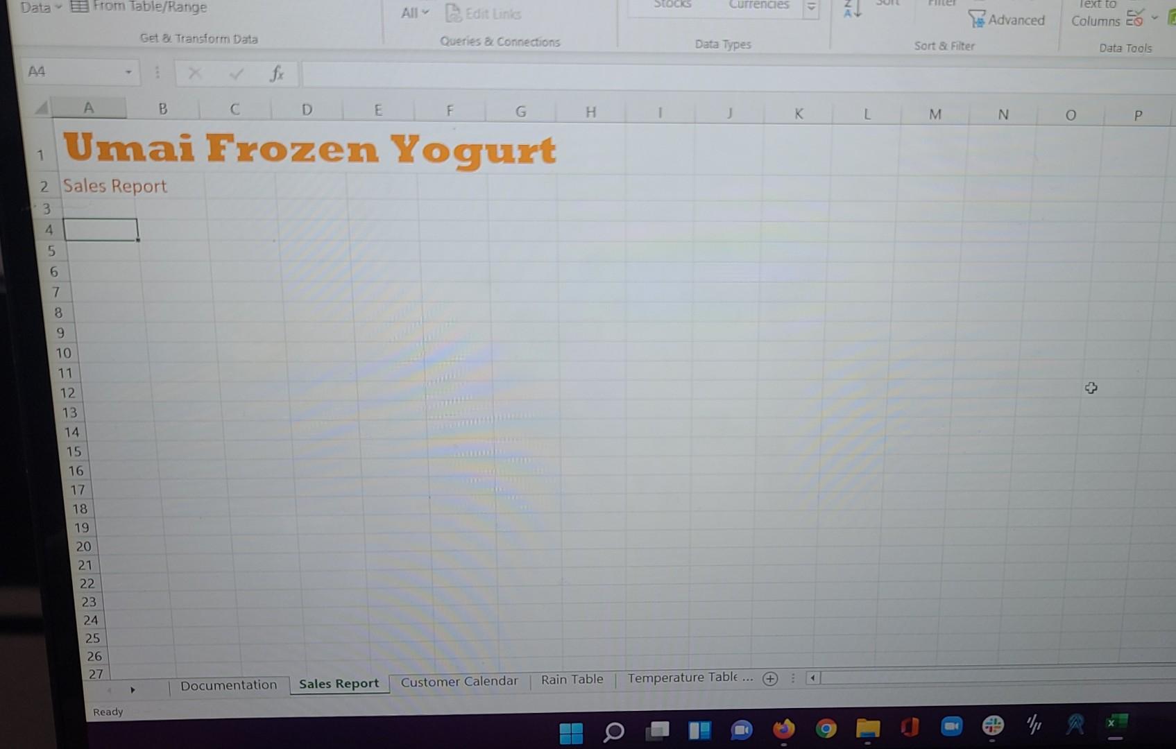
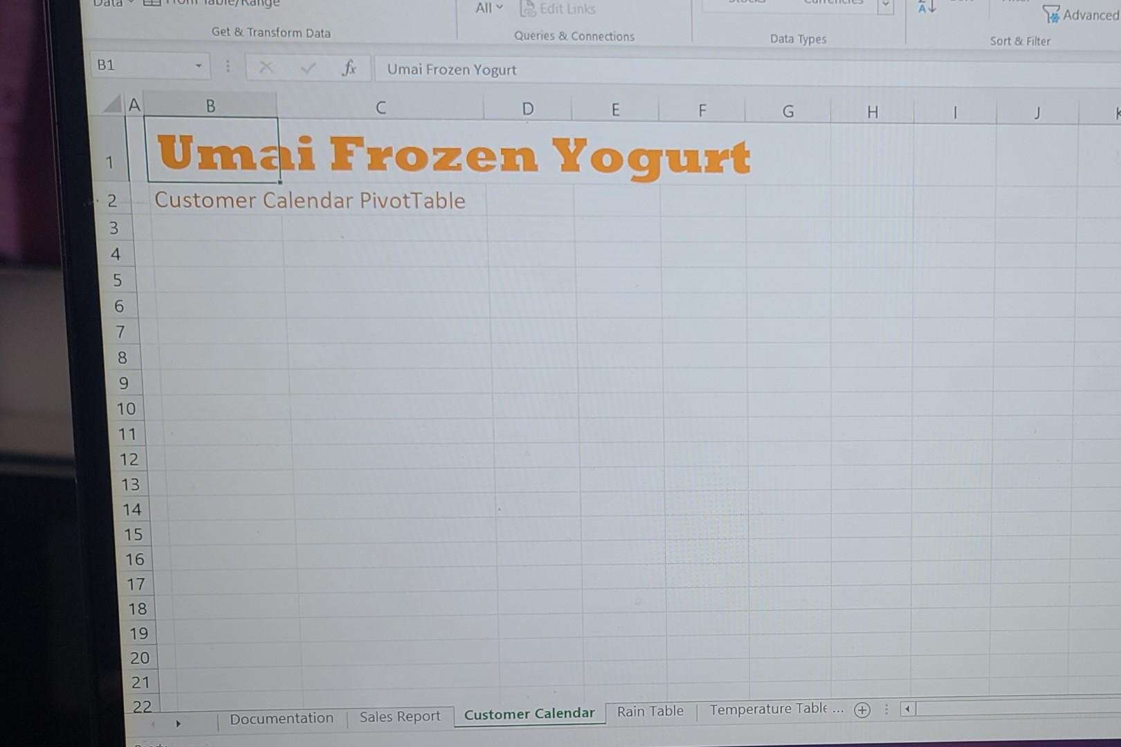
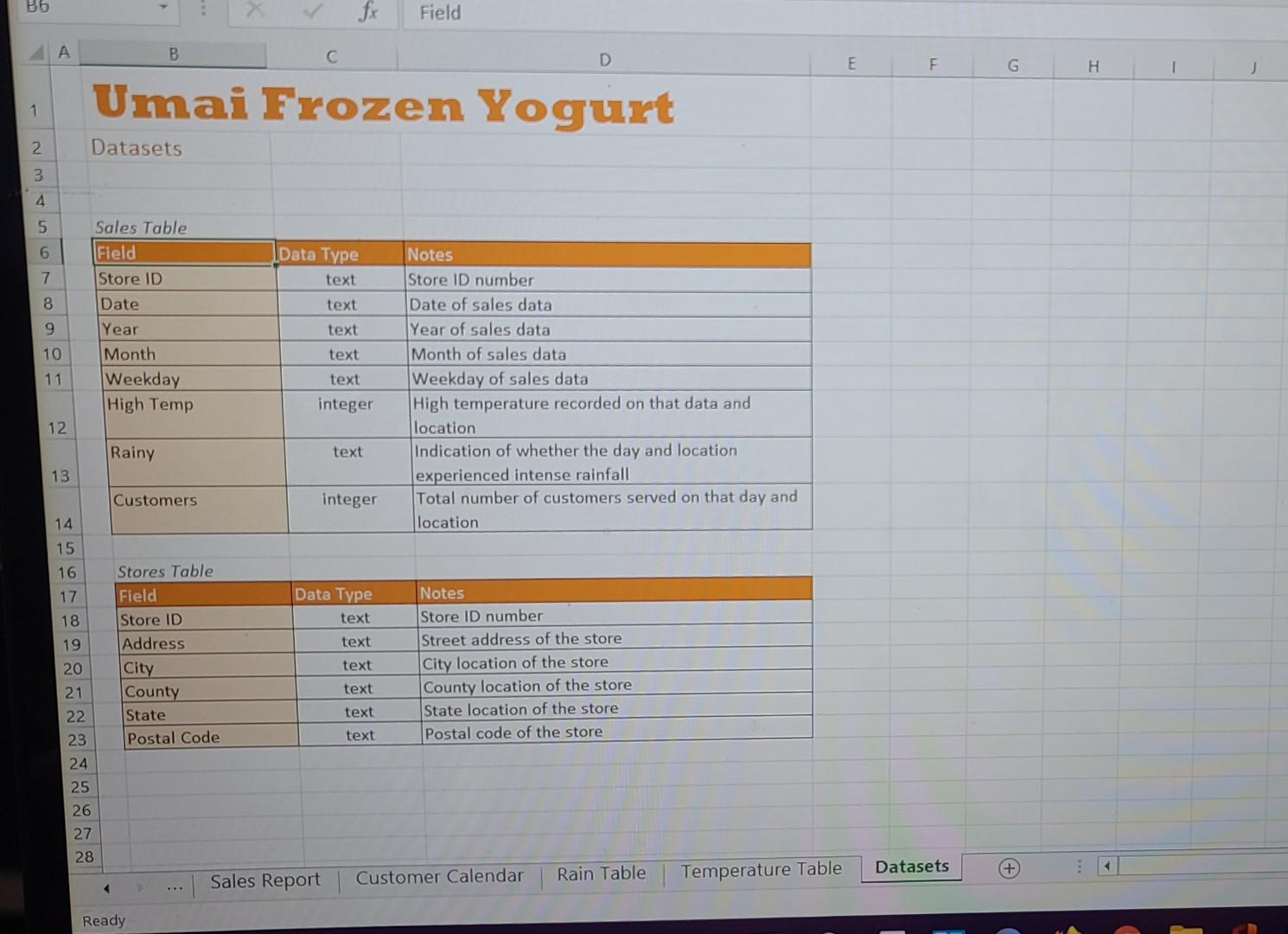
Bookmark Show all steps: ON Chapter 10.3. Problem 1CP Data Files needed for this Case Problem: NP_EX_10-3.xlsx, Support_EX_10_Yogurt.accdb Umai Frozen Yogurt Joan Amari is a sales executive for Umai Frozen Yogurt, a chain of frozen yogurt stores. Joan is responsible for overseeing 20 franchises in California. Joan wants to compare average customers per day at the franchises over the past three years and determine whether factors such as location, date, and weather play a significant role in the volume of customer traffic. She has data that contains over 21,000 records from the daily sales in the 20 stores from the past three years. Complete the following: 1. Open the NP_EX_10-3.xlsx workbook located in the Excel 10 > Case 1 folder included with your Data Files. Save the workbook as NP_EX_10_Umai in the location specified by your instructor 2. In the Documentation sheet, enter your name and the date. 3. Use Power Query to access the Support_EX_10_Yogurt Access database, creating a connection to the Sales and Stores tables int the workbook's Data Model. You do not have to edit the query for these tables 4. Open Power Pivot to view the Data Model in Diagram View. Create a relationship between the Sales and Stores table through the Store ID field. 5. In the Sales table, create a hierarchy named Calendar containing the Year, Month, and Weekday fields 6. Joan wants to analyze the number of customers served by the Umai Frozen Yogurt Return to the workbook, and then insert a PivotTable in cell B4 of the Customer Calendar worksheet using the Data Model. Name the PivotTable Customer Calendar. Place the Calendar hierarchy from the Sales table in the Rows area of the PivotTable. Place the Customers field from the Sales table in the Values area. Change the field settings of the Sum of Customers value field to display the average of the Customers field with no decimal places 7. Create a Line PivotChart from the PivotTable data. Move the PivotChart into the Sales Report worksheet, covering the range B14:129 Remove the field buttons and the legend from the chart. Change the chart title to Average Customers per Day. Add data labels to the chart showing the value of each data marker. Bookmark Show all steps: Chapter 10.3. Problem 1CP ON 12. Create a scatter chart of the data in the range F4:G16. Move the chart to the range K17:029 of the Sales Report worksheet. Change the chart title to Customers vs. Temperature. Add the axis titles to the chart, using Average Customers per Day for the Primary Vertical axis and Average Temperature for the Primary Horizontal axis. Change the scale of the vertical axis to go from 50 to 350. Change the scale of the Temperature axis to go from 50 to 110. Add a linear trendline to the chart. 13. Joan wants to view the charts on the Sales Report worksheet filtered by city. In the range B4112 of the Sales Report worksheet, insert a slicer using the City field from the Stores table. Lay out the slicer buttons in 4 columns and 5 rows. Connect the slicer to the three PiovtTables in the workbook. 14. Joan wants to show monthly results for the Malibu store from 2021. In the Sales Report worksheet, use the City slicer to show results for the Malibu store. In the Average Customers per Day chart, drill down into the 2021 Year category to the level of month. 15. As part of a presentation, Joan wants a map showing the locations of the stores with the highest average customers per day. Click cell A1 in the Sales Report worksheet, and then open a 3D Maps tour. Do the following to create a map showing the locations of the stores with the highest average customers per day a. Place the City field from the Stores table in the Location box b. Place the Customers field from the Sales table in the Height box. In the Height box, point to Customers (Sum), click the arrow, and then click Average on the menu to display the Customers (Average) instead of Customers (Sum). C. Change the map style to a heat map. d. Zoom into the state of California map to better view the average intensity of customer traffic in the 20 cites e. Display the map labels. 16. Close the 3D Map tour, save the workbook, and then close it Data E From Table/Range SOCIS Currencies Text to All Edit Links Advanced Columns E- Get . Transform Data Queries Connections Data Types Sort & Fiter Data Tools 44 3 fy A B D E F G H J K L M N P Umai Frozen Yogurt 1 2 Sales Report 3 4 5 6 7 8 9 10 11 12 13 14 15 16 17 18 19 20 21 22 23 24 25 26 27 Sales Report Customer Calendar Rain Table Documentation + + Temperature Table ... Ready Udld All Edit Links AU Advanced Get & Transform Data Queries & Connections Data Types Sort & Filter B1 fx Umai Frozen Yogurt B C D E F G H J Umai Frozen Yogurt 1 2. Customer Calendar PivotTable 3 4 5 6 7 8 9 10 11 12 13 14 15 16 17 18 19 20 21 No 22 Sales Report Customer Calendar Rain Table Documentation Temperature Table ... + Search File Home Insert Formulas Data Review View Help Draw Page Layout Recent Sources [Existing Connections La From Text/CSV [ From Web From Table/Range Di Queries & Connections S LILI Get Data E Properties Refresh All Edit Links El 2 7 clear Stocks Currencies Sort Filter Reapply Advanced Text to Columns ECO Get & Transform Data Queries & Connections Data Types Sort & Filter Data Tools A1 3 fx A B C D E F G H J K L M M Umai Frozen Yogurt 1 Rainy Day Data Nmt in 10 11 12 13 14 15 16 17 18 19 20 21 22 Sales Report Documentation Customer Calendar Rain Table Temperature Table ... + Ready DO spoon shawn_Umai - Saved O Search File Home Insert Draw Page Layout Formulas Data Review View Help Le From Text/CSV L From Web Get Data From Table/Range Recent Sources [ Existing Connections 10 Queries & Connections Refresh E Properties All Edit Links 21 12 8 R clear Be Stocks Currencies Sort Filter Reapply Advanced Text to Columns Co 9 Get & Transform Data Queries & Connections Data Types Sort & Filter Data Tools A1 fr A B D E F G H J Umai Frozen Yogurt 1 2 Temperature Data 3 4 5 6 7 8 9 10 11 12 13 14 15 16 17 18 19 20 21 22 Datasets Sales Report + Customer Calendar Rain Table Temperature Table Ready DO B6 fx Field A B D E F G H Umai Frozen Yogurt 1 Datasets : N 3 4 5 6 Data Type text 7 8 Sales Table Field Store ID Date Year Month Weekday High Temp text text 9 10 text 11 - text Notes Store ID number Date of sales data Year of sales data Month of sales data Weekday of sales data High temperature recorded on that data and location Indication of whether the day and location experienced intense rainfall Total number of customers served on that day and location integer 12 Rainy text 13 Customers integer 14 15 16 17 18 Data Type text 19 text Stores Table Field Store ID Address City County State Postal Code 20 text Notes Store ID number Street address of the store City location of the store County location of the store State location of the store Postal code of the store 21 text text 22 23 text 24 25 26 27 28 Datasets Sales Report Rain Table + Customer Calendar Temperature Table Ready
Step by Step Solution
There are 3 Steps involved in it
Step: 1

Get Instant Access to Expert-Tailored Solutions
See step-by-step solutions with expert insights and AI powered tools for academic success
Step: 2

Step: 3

Ace Your Homework with AI
Get the answers you need in no time with our AI-driven, step-by-step assistance
Get Started


