Can someone help me with these code please , the html for home page, classes page and the schedule page all in html, then the css page to link with the html. Thanks


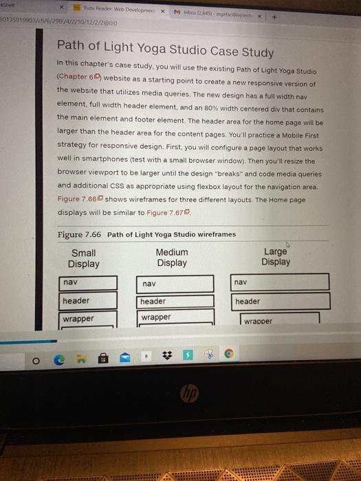
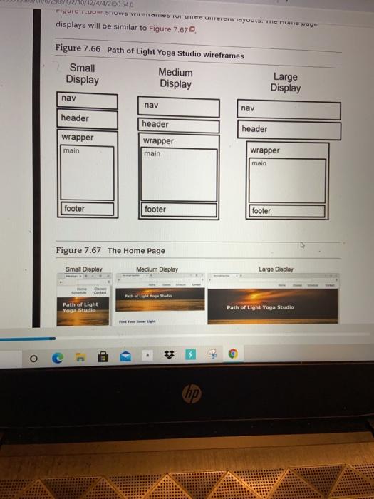
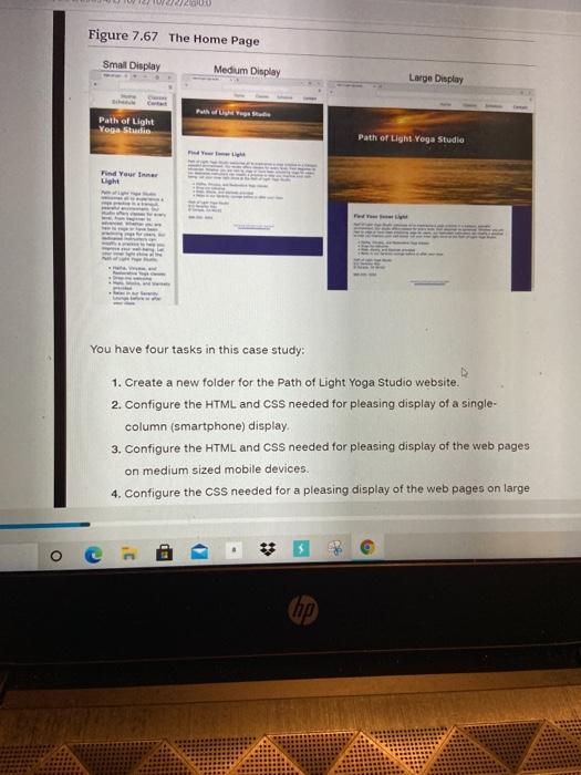
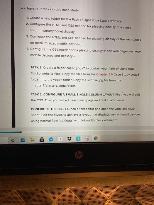
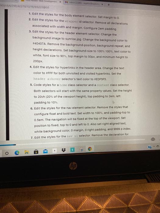
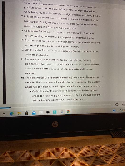
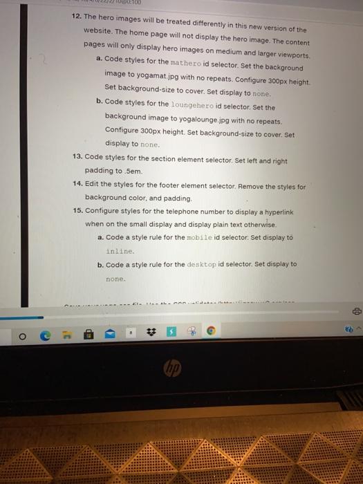
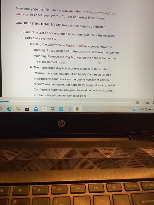
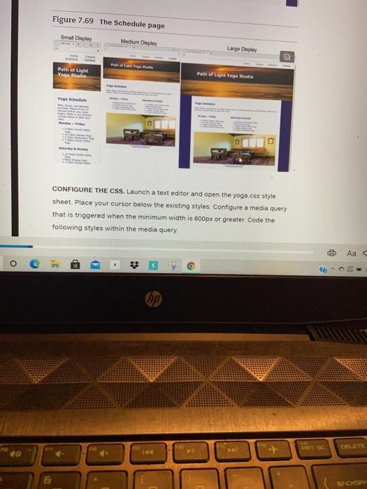
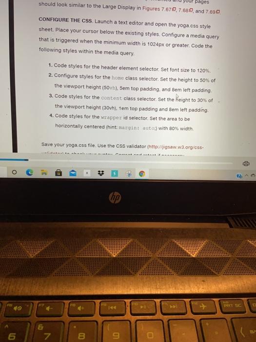
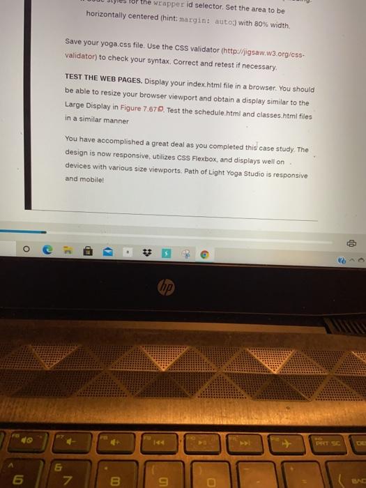
Yun Reader Web Development X Minbox 12.6451-cwted X 30135919903/61/6/2984/4/2/10/12/2/2000 + Path of Light Yoga Studio Case Study In this chapter's case study, you will use the existing Path of Light Yoga Studio (Chapter 6 website as a starting point to create a new responsive version of the website that utilizes media queries. The new design has a full width nav element, full width header element, and an 80% width centered div that contains the main element and footer element. The header area for the home page will be larger than the header area for the content pages. You'll practice a Mobile First strategy for responsive design. First, you will configure a page layout that works well in smartphones (test with a small browser window). Then you'll resize the browser viewport to be larger until the design "breaks and code media queries and additional CSS as appropriate using flexbox layout for the navigation area. Figure 7.660 shows wireframes for three different layouts. The Home page displays will be similar to Figure 7.670, Figure 7.66 Path of Light Yoga Studio wireframes Small Medium Display Display Large Display nav nav nav header header header wrapper wrapper wrapper HD - 10/12/4/4/200:54,0 . displays will be similar to Figure 7.670. Figure 7.66 Path of Light Yoga Studio wireframes Small Medium Display Display Large Display nav nav nav header header header wrapper main wrapper main wrapper main footer footer footer Figure 7.67 The Home Page Small Display Medium Display Large Display Path of Light Yoga Studio Path of Light Yoga Studio O * Figure 7.67 The Home Page Smail Display Medium Display Large Display Path of Light Yoga Studio Path of Light Yoga Studio Find Your Light You have four tasks in this case study: 1. Create a new folder for the Path of Light Yoga Studio website. 2. Configure the HTML and CSS needed for pleasing display of a single- column (smartphone) display 3. Configure the HTML and CSS needed for pleasing display of the web pages on medium sized mobile devices. 4. Configure the CSS needed for a pleasing display of the web pages on large o - * hp You have four tasks in this case study: 1. Create a new folder for the Path of Light Yoga Studio website. 2. Configure the HTML and CSS needed for pleasing display of a single- column (smartphone) display. 3. Configure the HTML and CSS needed for pleasing display of the web pages on medium sized mobile devices 4. Configure the CSS needed for a pleasing display of the web pages on large mobile devices and desktops. TASK 1: Create a folder called yoga7 to contain your Path of Light Yoga Studio website files. Copy the files from the Chapter 60 Case Study yoga folder into the yoga folder. Copy the sunrise.jpg file from the chapter7/starters/yoga folder. TASK 2: CONFIGURE A SMALL SINGLE-COLUMN LAYOUT. First, you will edit the CSS. Then you will edit each web page and test in a browser. CONFIGURE THE CSS. Launch a text editor and open the yoga.css style sheet. Edit the styles to achieve a layout that displays well on small devices using normal flow (no floats) with full-width block elements. . * O der Web Development X 903/0/6/29874/2/10/12/16/4/6/2/2000 Mbowe + 1. Edit the styles for the body element selector Set margin to o 2. Edit the styles for the wrapper id selector, Remove all declarations associated with width and margin. Configure 2em padding 3. Edit the styles for the header element selector. Change the background image to sunrise.jpg Change the background color to 40407A. Remove the background-position, background-repeat, and height declarations. Set background-size to 100% 100%, text color to white, font size to 90%, top margin to 50px, and minimum height to 200px 4. Edit the styles for hyperlinks in the header area. Change the text color to #FFF for both unvisited and visited hyperlinks. Set the header a:hover selector's text color to EDF5F5 5. Code styles for a home class selector and a content class selector. Both selectors will start with the same property values. Set the height to 20vh (20% of the viewport height), top padding to 2em, left padding to 10%. 6. Edit the styles for the nav element selector. Remove the styles that configure float and bold text. Set width to 100%, and padding-top to 0.5em. The navigation will be fixed at the top of the viewport. Set position to fixed, top to and left to O. Also set right-aligned text. white background color, o margin, o right padding, and 9999 z-index 7. Edit the styles for the nav ul selector Remove the declaration for * o e Jem vyuo We he LUC VO Vwort position to fixed, top to 0 and left to 0. Also set right-aligned text, white background color, o margin. O right padding, and 9999 z-index 7. Edit the styles for the nav ul selector, Remove the declaration for left padding Configure this selector as a fiex container which has rows that wrap. Set O margin, 1.2em font size. 8. Code styles for the nav li selector. Set 40% width, o top and bottom padding, tem left and right padding, and inline display 9. Edit the styles for the nav a selector, Remove the style declarations for text alignment, border, padding, and margin. 10. Edit the styles for nav a:hover selector. Remove the declaration that sets the border 11. Remove the style declarations for the main element selector, h1 element selector, one third class selector, onehalt class selector, clear class selector, floatieft class selector and heroid selector 12. The hero images will be treated differently in this new version of the website. The home page will not display the hero image. The content pages will only display hero images on medium and larger viewports. a. Code styles for the mathero id selector. Set the background image to yogamat.jpg with no repeats. Configure 300px height. Set background-size to cover. Set display to none. Aa 28 D . # 2 3 hp 12. The hero images will be treated differently in this new version of the website. The home page will not display the hero image. The content pages will only display hero images on medium and larger viewports. a. Code styles for the mathero id selector. Set the background image to yogamat.jpg with no repeats. Configure 300px height. Set background-size to cover. Set display to none. b. Code styles for the loungehero id selector. Set the background image to yogalounge.jpg with no repeats Configure 300px height. Set background-size to cover. Set display to none. 13. Code styles for the section element selector. Set left and right padding to .5em 14. Edit the styles for the footer element selector. Remove the styles for background color, and padding 15. Configure styles for the telephone number to display a hyperlink when on the small display and display plain text otherwise. a. Code a style rule for the mobile id selector. Set display to inline. b. Code a style rule for the desktop id selector, Set display to none. op o . thp Save your yoga.css file. Use the css validator (http://igsaw.w3.org/css- validator) to check your syntax Correct and retest if necessary CONFIGURE THE HTML. Modify areas on the pages as indicated. 1. Launch a text editor and open index.html. Complete the following edits and save the file a. Using the wireframe in Figure 7.680 as a guide, move the opening div tag assigned to the wrapper id above the opening main tag. Remove the img tag. Assign the header element to the class named home b. The home page displays a phone number in the contact information area. Wouldn't it be handy if a person using a smartphone could click on the phone number to call the resort? You can make that happen by using telt in a hyperlink Configure a hyperlink assigned to an id named mobile that contains the phone number as shown op BD - & hyperlink Configure a hyperlink assigned to an id named mobile that contains the phone number as shown: 888- 555-5555 But wait a minute, a telephone link could contuse those visiting the site with a desktop browser. Code another phone number directly after the hyperlink. Code a span element assigned to an id named desktop around the phone number as shown:
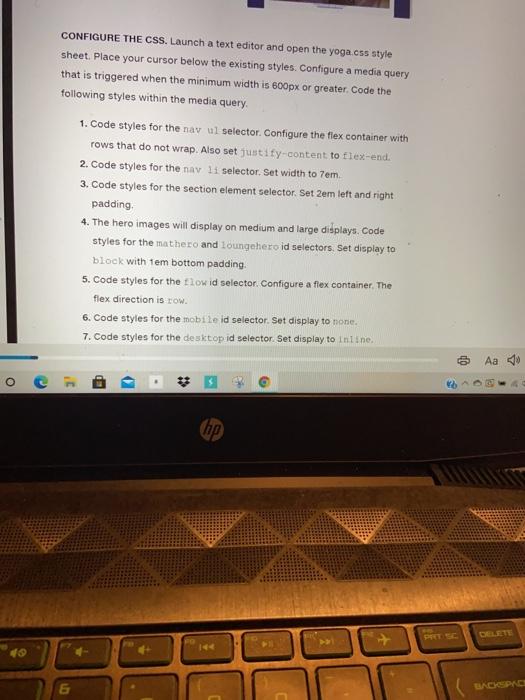
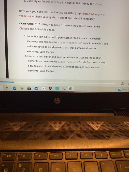
888-555-5555 c. Code a viewport meta tag in the head section that configures the width to the device-width and sets the initial-scale to 1.0. Tunch a tavatar and aron elaceae html care a runnet mata 0 Aa 70 - c. Code a viewport meta tag in the head section that configures the width to the device-width and sets the initial-scale to 1.0. 2. Launch a text editor and open classes.html. Code a viewport meta tag in the head section in the same manner as the Home page Use the wireframe in Figure 7.660 as a guide, and move the opening div tag assigned to the wrapper id above the opening main tag. Assign the header element to the class named content. Locate the div assigned to the hero id. Replace the value hero with mathero. Remove the img tag. Save the file. 3. Launch a text editor and open schedule.html, Code a viewport meta tag in the head section in the same manner as the Home page. Use the wireframe in Figure 7.66 as a guide and move the opening div tag assigned to the wrapper id above the opening main tag. Assign the header element to the class named content. Locate the div assigned to the hero id. Replace the value hero with loungehera Remove the img tag. Save the file. TEST THE WEB PAGES. Display your index.html file in a browser. This layout UP ED (hp the img tag. Save the file. TEST THE WEB PAGES. Display your index.html file in a browser. This layout is intended for narrow mobile screens. Resize your browser to be narrower until your display is similar to the Small Display shown in Figure 7.660, which simulates mobile display. Test the classes.html and schedule html files in a similar manner. TASK 3: CONFIGURE A MEDIUM LAYOUT. Edit the CSS and web pages to configure a more pleasing display on a wider viewport, setting 600px as the breakpoint for the first media query, you will configure flexbox layout for two areas: the main navigation and the columns of information on the content pages. When you test your web pages and trigger the media query. the layout in the Medium Display wireframe in Figure 7.66 will be implemented and your pages should look similar to the Medium Display in Figures 7.670.7.620 and 7,690 Figure 7.68 The Classes page Small Display Medium Display Large Display co Aa o hip implemented and your pages should look similar to the Medium Display in Figures 7.670, 7.680, and 7.690. Figure 7.68 The Classes page Small Display Medium Display Large Display Path of Light Path of Light Yoga Studio TA CHE Figure 7.69 The Schedule page co ED - # 7 hp) Figure 7.69 The Schedule page Smal Deplay Medium Display Large Display Path at Light Yogaland Path of Light Yoga Studio Yoga CONFIGURE THE CSS. Launch a text editor and open the yoga.css style sheet. Place your cursor below the existing styles. Configure a media query that is triggered when the minimum width is 600px or greater. Code the following styles within the media query Aa O BD hp DACSP CONFIGURE THE CSS. Launch a text editor and open the yoga.css style sheet. Place your cursor below the existing styles. Configure a media query that is triggered when the minimum width is 600px or greater. Code the following styles within the media query 1. Code styles for the nav ul selector. Configure the flex container with rows that do not wrap. Also set justify-content to flex-end. 2. Code styles for the nav li selector. Set width to 7em. 3. Code styles for the section element selector. Set 2em left and right padding 4. The hero images will display on medium and large didplays. Code styles for the mathero and loungahero id selectors. Set display to block with tem bottom padding. 5. Code styles for the flow id selector. Configure a fiex container, The flex direction is row 6. Code styles for the mobile id selector. Set display to none. 7. Code styles for the desktop id selector Set display to inline Aa 50 O C hip 09 & 7. Code styles for the desktop id selector. Set display to inline. Save your yoga.css file. Use the CSS validator (http://jigsaw.w3.org/css- validator) to check your syntax Correct and retest if necessary. CONFIGURE THE HTML. You need to rework the content area on the Classes and Schedule pages. 1. Launch a text editor and open classes.html. Locate the section elements and remove the class="onethird" code from each. Code a div assigned to an id named flow that contains al section elements. Save the file. 2. Launch a text editor and open schedule.html. Locate the section elements and remove the cass="onehall" code from each. Code a div assigned to an id named flow that contains both section elements. Save the file. o ED - (hp) BAC 6 7 8 9 TEST THE WEB PAGES, Display your index.html file in a browser. You should be able to resize your browser viewport and obtain a display similar to the Medium Display in Figure 7.660. Text the classes.html and schedule.html files in a similar manner TASK 4: CONFIGURE A LARGE LAYOUT. Edit the CSS and web pages to configure a second media query with a 1024px breakpoint. When you test your web pages and trigger the media query, the layout in the Large Display wireframe in Figure 7.66 will be implemented and your pages should look similar to the Large Display in Figures 7.670,7.680, and 7.890, CONFIGURE THE CSS. Launch a text editor and open the yoga.css style sheet Place your cursor below the existing styles. Configure a media query that is triggered when the minimum width is 1024px or greater. Code the QP O BD - * hp & 7 in 8 9 pages should look similar to the Large Display in Figures 7.670, 7.680 and 7,690 CONFIGURE THE CSS. Launch a text editor and open the yoga.css style sheet. Place your cursor below the existing styles. Configure a media query that is triggered when the minimum width is 1024px or greater. Code the following styles within the media query. 1. Code styles for the header element selector Set font size to 120% 2. Configure styles for the home class selector Set the height to 50% of the viewport height (50vh), Sem top padding, and Bem left padding. 3. Code styles for the content class selector Set the height to 30% of the viewport height (30vh), tem top padding and Bem left padding 4. Code styles for the wrapper id selector Set the area to be horizontally centered (hint; margin: auto) with 80% width Save your yoga.css file. Use the css validator (http:/jigsaw.w3.org/ess- OP o - hp E 5 7 8 9 of the wrapper id selector. Set the area to be horizontally centered (hint; margin: auto;) with 80% width Save your yoga.css file. Use the CSS validator (http://jigsaw.w3.org/ess- validator) to check your syntax Correct and retest if necessary TEST THE WEB PAGES, Display your index.html file in a browser. You should be able to resize your browser viewport and obtain a display similar to the Large Display in Figure 7.870. Test the schedule.html and classes.html files in a similar manner You have accomplished a great deal as you completed this case study. The design is now responsive, utilizes css Flexbox, and displays well on devices with various size viewports. Path of Light Yoga Studio is responsive and mobile! o BD top 6 7 B 9 Yun Reader Web Development X Minbox 12.6451-cwted X 30135919903/61/6/2984/4/2/10/12/2/2000 + Path of Light Yoga Studio Case Study In this chapter's case study, you will use the existing Path of Light Yoga Studio (Chapter 6 website as a starting point to create a new responsive version of the website that utilizes media queries. The new design has a full width nav element, full width header element, and an 80% width centered div that contains the main element and footer element. The header area for the home page will be larger than the header area for the content pages. You'll practice a Mobile First strategy for responsive design. First, you will configure a page layout that works well in smartphones (test with a small browser window). Then you'll resize the browser viewport to be larger until the design "breaks and code media queries and additional CSS as appropriate using flexbox layout for the navigation area. Figure 7.660 shows wireframes for three different layouts. The Home page displays will be similar to Figure 7.670, Figure 7.66 Path of Light Yoga Studio wireframes Small Medium Display Display Large Display nav nav nav header header header wrapper wrapper wrapper HD - 10/12/4/4/200:54,0 . displays will be similar to Figure 7.670. Figure 7.66 Path of Light Yoga Studio wireframes Small Medium Display Display Large Display nav nav nav header header header wrapper main wrapper main wrapper main footer footer footer Figure 7.67 The Home Page Small Display Medium Display Large Display Path of Light Yoga Studio Path of Light Yoga Studio O * Figure 7.67 The Home Page Smail Display Medium Display Large Display Path of Light Yoga Studio Path of Light Yoga Studio Find Your Light You have four tasks in this case study: 1. Create a new folder for the Path of Light Yoga Studio website. 2. Configure the HTML and CSS needed for pleasing display of a single- column (smartphone) display 3. Configure the HTML and CSS needed for pleasing display of the web pages on medium sized mobile devices. 4. Configure the CSS needed for a pleasing display of the web pages on large o - * hp You have four tasks in this case study: 1. Create a new folder for the Path of Light Yoga Studio website. 2. Configure the HTML and CSS needed for pleasing display of a single- column (smartphone) display. 3. Configure the HTML and CSS needed for pleasing display of the web pages on medium sized mobile devices 4. Configure the CSS needed for a pleasing display of the web pages on large mobile devices and desktops. TASK 1: Create a folder called yoga7 to contain your Path of Light Yoga Studio website files. Copy the files from the Chapter 60 Case Study yoga folder into the yoga folder. Copy the sunrise.jpg file from the chapter7/starters/yoga folder. TASK 2: CONFIGURE A SMALL SINGLE-COLUMN LAYOUT. First, you will edit the CSS. Then you will edit each web page and test in a browser. CONFIGURE THE CSS. Launch a text editor and open the yoga.css style sheet. Edit the styles to achieve a layout that displays well on small devices using normal flow (no floats) with full-width block elements. . * O der Web Development X 903/0/6/29874/2/10/12/16/4/6/2/2000 Mbowe + 1. Edit the styles for the body element selector Set margin to o 2. Edit the styles for the wrapper id selector, Remove all declarations associated with width and margin. Configure 2em padding 3. Edit the styles for the header element selector. Change the background image to sunrise.jpg Change the background color to 40407A. Remove the background-position, background-repeat, and height declarations. Set background-size to 100% 100%, text color to white, font size to 90%, top margin to 50px, and minimum height to 200px 4. Edit the styles for hyperlinks in the header area. Change the text color to #FFF for both unvisited and visited hyperlinks. Set the header a:hover selector's text color to EDF5F5 5. Code styles for a home class selector and a content class selector. Both selectors will start with the same property values. Set the height to 20vh (20% of the viewport height), top padding to 2em, left padding to 10%. 6. Edit the styles for the nav element selector. Remove the styles that configure float and bold text. Set width to 100%, and padding-top to 0.5em. The navigation will be fixed at the top of the viewport. Set position to fixed, top to and left to O. Also set right-aligned text. white background color, o margin, o right padding, and 9999 z-index 7. Edit the styles for the nav ul selector Remove the declaration for * o e Jem vyuo We he LUC VO Vwort position to fixed, top to 0 and left to 0. Also set right-aligned text, white background color, o margin. O right padding, and 9999 z-index 7. Edit the styles for the nav ul selector, Remove the declaration for left padding Configure this selector as a fiex container which has rows that wrap. Set O margin, 1.2em font size. 8. Code styles for the nav li selector. Set 40% width, o top and bottom padding, tem left and right padding, and inline display 9. Edit the styles for the nav a selector, Remove the style declarations for text alignment, border, padding, and margin. 10. Edit the styles for nav a:hover selector. Remove the declaration that sets the border 11. Remove the style declarations for the main element selector, h1 element selector, one third class selector, onehalt class selector, clear class selector, floatieft class selector and heroid selector 12. The hero images will be treated differently in this new version of the website. The home page will not display the hero image. The content pages will only display hero images on medium and larger viewports. a. Code styles for the mathero id selector. Set the background image to yogamat.jpg with no repeats. Configure 300px height. Set background-size to cover. Set display to none. Aa 28 D . # 2 3 hp 12. The hero images will be treated differently in this new version of the website. The home page will not display the hero image. The content pages will only display hero images on medium and larger viewports. a. Code styles for the mathero id selector. Set the background image to yogamat.jpg with no repeats. Configure 300px height. Set background-size to cover. Set display to none. b. Code styles for the loungehero id selector. Set the background image to yogalounge.jpg with no repeats Configure 300px height. Set background-size to cover. Set display to none. 13. Code styles for the section element selector. Set left and right padding to .5em 14. Edit the styles for the footer element selector. Remove the styles for background color, and padding 15. Configure styles for the telephone number to display a hyperlink when on the small display and display plain text otherwise. a. Code a style rule for the mobile id selector. Set display to inline. b. Code a style rule for the desktop id selector, Set display to none. op o . thp Save your yoga.css file. Use the css validator (http://igsaw.w3.org/css- validator) to check your syntax Correct and retest if necessary CONFIGURE THE HTML. Modify areas on the pages as indicated. 1. Launch a text editor and open index.html. Complete the following edits and save the file a. Using the wireframe in Figure 7.680 as a guide, move the opening div tag assigned to the wrapper id above the opening main tag. Remove the img tag. Assign the header element to the class named home b. The home page displays a phone number in the contact information area. Wouldn't it be handy if a person using a smartphone could click on the phone number to call the resort? You can make that happen by using telt in a hyperlink Configure a hyperlink assigned to an id named mobile that contains the phone number as shown op BD - & hyperlink Configure a hyperlink assigned to an id named mobile that contains the phone number as shown: 888- 555-5555 But wait a minute, a telephone link could contuse those visiting the site with a desktop browser. Code another phone number directly after the hyperlink. Code a span element assigned to an id named desktop around the phone number as shown:
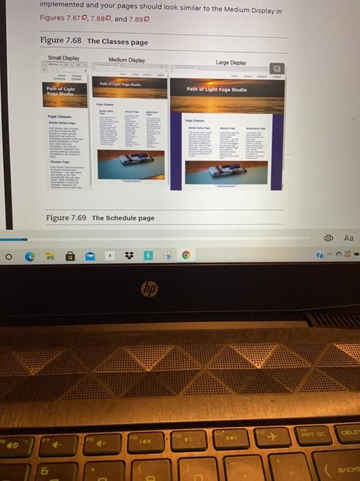
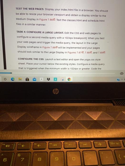
888-555-5555 c. Code a viewport meta tag in the head section that configures the width to the device-width and sets the initial-scale to 1.0. Tunch a tavatar and aron elaceae html care a runnet mata 0 Aa 70 - c. Code a viewport meta tag in the head section that configures the width to the device-width and sets the initial-scale to 1.0. 2. Launch a text editor and open classes.html. Code a viewport meta tag in the head section in the same manner as the Home page Use the wireframe in Figure 7.660 as a guide, and move the opening div tag assigned to the wrapper id above the opening main tag. Assign the header element to the class named content. Locate the div assigned to the hero id. Replace the value hero with mathero. Remove the img tag. Save the file. 3. Launch a text editor and open schedule.html, Code a viewport meta tag in the head section in the same manner as the Home page. Use the wireframe in Figure 7.66 as a guide and move the opening div tag assigned to the wrapper id above the opening main tag. Assign the header element to the class named content. Locate the div assigned to the hero id. Replace the value hero with loungehera Remove the img tag. Save the file. TEST THE WEB PAGES. Display your index.html file in a browser. This layout UP ED (hp the img tag. Save the file. TEST THE WEB PAGES. Display your index.html file in a browser. This layout is intended for narrow mobile screens. Resize your browser to be narrower until your display is similar to the Small Display shown in Figure 7.660, which simulates mobile display. Test the classes.html and schedule html files in a similar manner. TASK 3: CONFIGURE A MEDIUM LAYOUT. Edit the CSS and web pages to configure a more pleasing display on a wider viewport, setting 600px as the breakpoint for the first media query, you will configure flexbox layout for two areas: the main navigation and the columns of information on the content pages. When you test your web pages and trigger the media query. the layout in the Medium Display wireframe in Figure 7.66 will be implemented and your pages should look similar to the Medium Display in Figures 7.670.7.620 and 7,690 Figure 7.68 The Classes page Small Display Medium Display Large Display co Aa o hip implemented and your pages should look similar to the Medium Display in Figures 7.670, 7.680, and 7.690. Figure 7.68 The Classes page Small Display Medium Display Large Display Path of Light Path of Light Yoga Studio TA CHE Figure 7.69 The Schedule page co ED - # 7 hp) Figure 7.69 The Schedule page Smal Deplay Medium Display Large Display Path at Light Yogaland Path of Light Yoga Studio Yoga CONFIGURE THE CSS. Launch a text editor and open the yoga.css style sheet. Place your cursor below the existing styles. Configure a media query that is triggered when the minimum width is 600px or greater. Code the following styles within the media query Aa O BD hp DACSP CONFIGURE THE CSS. Launch a text editor and open the yoga.css style sheet. Place your cursor below the existing styles. Configure a media query that is triggered when the minimum width is 600px or greater. Code the following styles within the media query 1. Code styles for the nav ul selector. Configure the flex container with rows that do not wrap. Also set justify-content to flex-end. 2. Code styles for the nav li selector. Set width to 7em. 3. Code styles for the section element selector. Set 2em left and right padding 4. The hero images will display on medium and large didplays. Code styles for the mathero and loungahero id selectors. Set display to block with tem bottom padding. 5. Code styles for the flow id selector. Configure a fiex container, The flex direction is row 6. Code styles for the mobile id selector. Set display to none. 7. Code styles for the desktop id selector Set display to inline Aa 50 O C hip 09 & 7. Code styles for the desktop id selector. Set display to inline. Save your yoga.css file. Use the CSS validator (http://jigsaw.w3.org/css- validator) to check your syntax Correct and retest if necessary. CONFIGURE THE HTML. You need to rework the content area on the Classes and Schedule pages. 1. Launch a text editor and open classes.html. Locate the section elements and remove the class="onethird" code from each. Code a div assigned to an id named flow that contains al section elements. Save the file. 2. Launch a text editor and open schedule.html. Locate the section elements and remove the cass="onehall" code from each. Code a div assigned to an id named flow that contains both section elements. Save the file. o ED - (hp) BAC 6 7 8 9 TEST THE WEB PAGES, Display your index.html file in a browser. You should be able to resize your browser viewport and obtain a display similar to the Medium Display in Figure 7.660. Text the classes.html and schedule.html files in a similar manner TASK 4: CONFIGURE A LARGE LAYOUT. Edit the CSS and web pages to configure a second media query with a 1024px breakpoint. When you test your web pages and trigger the media query, the layout in the Large Display wireframe in Figure 7.66 will be implemented and your pages should look similar to the Large Display in Figures 7.670,7.680, and 7.890, CONFIGURE THE CSS. Launch a text editor and open the yoga.css style sheet Place your cursor below the existing styles. Configure a media query that is triggered when the minimum width is 1024px or greater. Code the QP O BD - * hp & 7 in 8 9 pages should look similar to the Large Display in Figures 7.670, 7.680 and 7,690 CONFIGURE THE CSS. Launch a text editor and open the yoga.css style sheet. Place your cursor below the existing styles. Configure a media query that is triggered when the minimum width is 1024px or greater. Code the following styles within the media query. 1. Code styles for the header element selector Set font size to 120% 2. Configure styles for the home class selector Set the height to 50% of the viewport height (50vh), Sem top padding, and Bem left padding. 3. Code styles for the content class selector Set the height to 30% of the viewport height (30vh), tem top padding and Bem left padding 4. Code styles for the wrapper id selector Set the area to be horizontally centered (hint; margin: auto) with 80% width Save your yoga.css file. Use the css validator (http:/jigsaw.w3.org/ess- OP o - hp E 5 7 8 9 of the wrapper id selector. Set the area to be horizontally centered (hint; margin: auto;) with 80% width Save your yoga.css file. Use the CSS validator (http://jigsaw.w3.org/ess- validator) to check your syntax Correct and retest if necessary TEST THE WEB PAGES, Display your index.html file in a browser. You should be able to resize your browser viewport and obtain a display similar to the Large Display in Figure 7.870. Test the schedule.html and classes.html files in a similar manner You have accomplished a great deal as you completed this case study. The design is now responsive, utilizes css Flexbox, and displays well on devices with various size viewports. Path of Light Yoga Studio is responsive and mobile! o BD top 6 7 B 9
